
As a beginner, Centering things is one of the most difficult aspects of CSS. You can center a div in a few different ways in CSS. We're trying to understand how to do such thing in easy way.
We'll see how can center a div or element, Horizontally and Vertically.
Let's get started!
Firstly, We consider two elements or containers or div, where one is parent div or container and the another one is child div or container as the below of html code -

Here, You must need to take any fixed height to the parent div element. Otherwise, you can't get proper layouts.
Using CSS Flexbox
The Flexible Box Layout Module, makes it easier to design flexible responsive layout structure without using float or positioning. The reason you'd choose to use flexbox is because you want to lay a collection of items out in one direction/dimension.
This allows elements to align and distribute space within a container. Using flexible widths and heights, elements can be aligned to fill a space or distribute space between elements, which makes it a great tool to use for responsive design systems.
You can use flexbox for a few main things as scaling, vertically and horizontally aligning, and re-ordering elements within a container. These are best used on page components within a parent element.
1. Flexbox on parent container
This technique is one of my favorite of all. Here, all the CSS properties are defined under the parent container.
We define the parent div with display: flex property along with justify-content (for horizontal placement) and align-items (for vertical placement) center. These properties come with Flex specifications.

2. Using Flexbox and margin property
The flex property sets the flexible length on flexible items.
So, We define the parent div with display: flex property. Besides, we need to add the child div with margin: auto property.
The margin property to auto used to horizontally center the element within its container. The element will then take up the specified width, and the remaining space will be split equally between the left and right margins.

3. Using Flexbox and align-self property
Again, We define the parent div with display: flex property along with justify-content: center (to justify items along the center of the parent div). Furthermore, we have to add align-self: center property to the child div.
The align-self CSS property specifies the alignment for the selected item inside the flexible container. Also, It overrides a flex item's align-items value.

Using CSS Grid
CSS Grid is a powerful tool that allows for two-dimensional layouts for columns and rows to be created responsive items on the web. The Grid items are arranged in columns, and you can easily position rows without having to mess around with the HTML code.
CSS Grid is very flexible and responsive. It makes it easy to create two-dimensional layouts. The features of CSS Grid Layout are Flexible Track Sizes, Item Placement, Alignment Controls and so on. CSS Grid Layout helps us build a more complex layouts using both columns and rows.
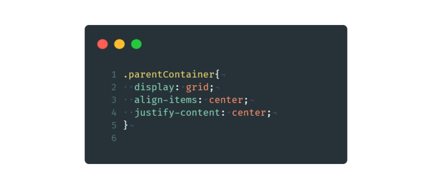
4. Using Grid on parent container
We define the parent div with display: grid property along with justify-content (for horizontal placement) and align-items (for vertical placement) center.
Grid layout enables to align elements into columns and rows. To justify items along the center of the parent div in vertically and horizontally, we use align-items and justify-content properties to center value of a grid layout.
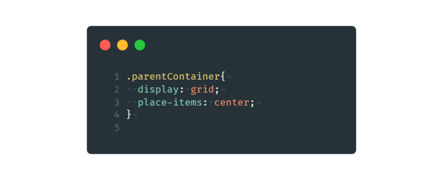
5. Using Grid and place-items property
Again, We define the parent div with display: grid property for grid layout. And place-items: center for vertical placement in center.
The place-items property in CSS Grid is shorthand for the align-items and justify-items properties, combining them into a single declaration.
6. Using Grid properties on parent and child containers
Similarly, we define display: grid to the parent div element here. Also, Add align-self and justify-self to center in the child div element.
The align-self CSS property overrides a grid item's align-items value. In Grid, it aligns (vertical alignment) the item inside the grid area.
Additionally, The CSS justify-self property sets the way a box is justified (horizontal alignment) inside its alignment container along the appropriate axis.

Using CSS Position
By default, the position property for all HTML elements in CSS is set to static. This means that if you don't specify any other position value or if the position property is not declared explicitly, it'll be static.
This property takes in five values: static, relative, absolute, fixed, and sticky .
7. Using CSS Position and Transform property
We use positioning and the transform property to vertically and horizontally center the child div or element.
We define position: relative to the parent div. Also, added position: absolute , top: 50% , left: 50% and transform: translate(-50%, -50%) to the child div.
In the parent div, we use position to relative because of positioning the child div into absolute position as its inner element.
In the child div, we use position to absolute for taking out of the regular flow of the element and giving it to a custom position. Top and left to 50%, it will leave 50% free space from the top left side of the parent div. And using the transform property, translate(x, y) , translateX and translateY to -50%, means the child element will take the backward space of its 50% width to vertically and horizontally center to the parent div.


Top comments (0)