
Just like the name 'Flex'~'Box', Flexibility in the given Box(flex container) .
I think it's a self explanatory word, to provide us with the flexibility in our layout and make it more responsive.
The main purpose of this post is to get familiarized with the main properties of Flexbox. There are many more out there to explore but that will be a little bit too much if I go through all of them.

Once you master it, I think the rest of the properties are just as easy as it gets.
5 Most basic properties of Flexbox, that is what we are going to dive into...
To make this happen, firstly we need to let the container apply its default value to distribute their children on its own including size and space between them.

No.☝🏼-display:flex
The default value of Flexbox is the block property of the children elements.
Here is the 3 span flex items; with its default value(Display:Block)
Block VS Flex:

Did you notice the effect of Display:Flex?
By simply applying Display:Flex, elements expanded to their available space in the container.

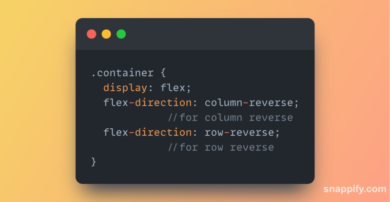
No.✌🏼-flex:direction
A Flexbox container has two axes: Main Axis & Cross Axis
By default, elements are arranged along the main axis, from left to right. This is why the elements are laid horizontally once display:flex has been applied and on the other hand flex:direction rotates the main axis.

This property is used to change the direction of the elements. The default value is set to row and additional value can be set to row-reverse, column, column-reverse.

Row VS Column:

Here the main axis moved from a horizontal to a vertical position.
Now let's reverse the elements 🔄
There are two options for that: row:reverse & column:reverse

No.❸-Justify Content
For this property 'main axis' is the playground, all the movement is around the main axis only.
The default value for this is flex-start and additional values are flex-end, flex-center, space-between, space-around, and space-evenly.

No.4️⃣ Align Items:
Align items is comparable to justify-content but it operates along the cross-axis. It automatically defaults to stretch and additional values are flex-start, flex-end, center, and baseline.
Remember, the start, end, and center operate the same as justify-content but on the cross-axis. Whereas stretch makes items take entire space of the cross-axis.
For the baseline, flexbox items align themselves at the baseline of the cross-axis. If there is a text tag on the items, then the text will be aligned to the horizontal line.
for the centering of elements and to meet the main-axis and cross-axis intercept point.
flex-direction:row ; justify-content:center ; align-items:center

flex-direction:column ; justify-content:centre ; align-items:centre

No.⑤ Flex wrap:
To avoid overflowing the items issue this can be a cheat code, if the item's size is too big for the available space, it will overflow and that is where this code comes in handy.

I was going to discuss only 5 properties but couldn't resist the temptation of sharing the fun one!
sorry..!!

and probably the most useful one.
Align-Self
Align-self gives freedom to manually manipulate any of the particular items from the multiple items.
Align-self property accepts flex-start, flex-end, center, baseline, and stretch.

========================================================
"You are here that means You are making a difference."
Until next time...
Happy Coding..!!
If you liked the post, pls do hit💖

Top comments (3)
Such a great post! You made it easy for beginners to understand and your posty looks colorful and fun! Keep it up and welcome to DEV.
Thank you Adnan!
Thanks Luke! 😊