Contrast attracts the eye, and you can use fonts to create contrast in your design.
Take a look at this.

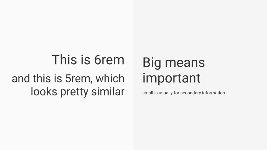
The example on the right is more “colorful” in a way that doesn’t utilize color. It’s interesting without overwhelming the eye.
Here are other examples.


It’s all about contrast—the more different the typeface or font is, the more interesting it becomes. There is, obviously, a fine line—when the fonts clashes really hard, it’s becomes confusing rather than interesting.
If you combine all the things above, it will look something like this.
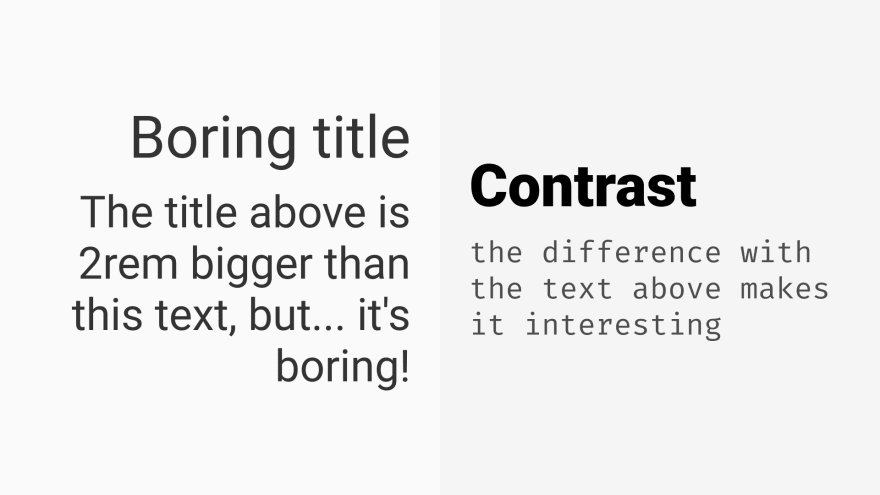
If you want to add another font to your single-font design in your website, there’s no point in adding a font that looks similar. At best, it will look like a design without conflict, but it confuses the eye when inappropriately applied.
Contrast attracts the eye; to create contrast, you can't be a wimp.

Top comments (0)