My CSS journey
CSS has been a constant thorn in my side. In the past I've gotten by with the "Throw everything at the wall and see what sticks" method. Although it's served it's purpose in the past, I feel I have reached the limits of what this technique has to offer.
Now I plan to conquer CSS one step at a time. In my research I've come up with a simple strategy for teaching myself:
- Practice styling a react app.
- Style the components with flex.
- Style the App page with grid.
I've concluded that this work flow will serve me best. My next step was to experiment with flex and Grid. I'll walk through what I did to style my practice App. Maybe as I show my process, you can learn something too.
First thing I did after creating a new react app, and naming it CSS_react_sandbox, was to create five components.
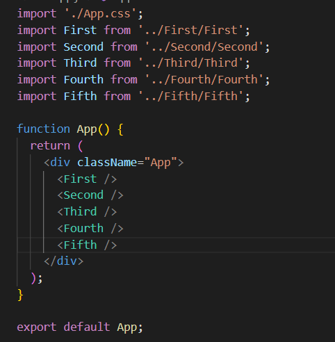
Each component was set up with an outer parent div, and 3 inner child divs. I gave them respective class names and each child a unique id.

I decided that my first component would serve as my header. I styled the div accordingly:

I chose a display of flex with flex-direction row. My thinking here was that as a header/nav component, this component should be sprawled across the top of the page. The 3 child divs represent, from left to right:
- The space allocated for the navigation.
- A personalized welcome message.
- A log out button.

I changed the size of each child element according to the amount of space I wanted each to take up. Using the flex-grow property I was able to determine how much space I wanted each element to take up. By imagining the div divided into 8 parts I allocated 6 parts to the largest element and the remaining two one part each.
Next I did similar styling for the other four components. I designated that the second and fourth would be asides, the third would be the main content, and the fifth would be the footer.
Left aside:


Right aside:


Footer:


And the Main:


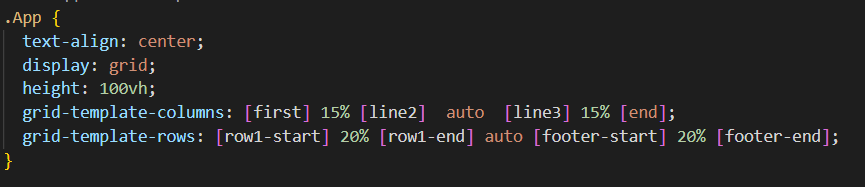
Now that I have all my components, it's time to move over to App.css and add grid.
First I set the display to grid and the height to 100vh. Since I want the app component to cover the whole screen.
Next I set up my grid parameters with grid-template-columns, and grid-template-rows.
With the columns I start from the left side of the screen. This will be my first columns edge, I label it "first". I label the right edge of the column line2. I want the first aside to take up 20% of the available space so I insert that between the first and second lines. The two remaining lines will be labeled line3 and end. Between line3 and end I set the percent to 20 once again. Then the space between line 2 and 3 is set to auto.

For the rows my four lines are:
- row1-start
- row1-end
- footer-start
- footer-end
Labeling it this way helps me remember what each line represents.
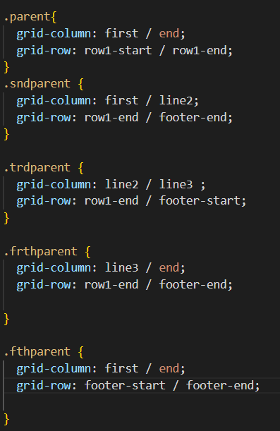
Now I need to set the grid-columns and grid-rows for the components. This tells them where on the page they should be.
The final result:

This is by no means an exhaustive exploration of what can be accomplished with Grid or Flex. But I certainly learned a few things that I can build upon. I hope you did as well.
Until next time.

Top comments (0)