
In the last post, we learned about the basics of Web Components. We ended with the code needed to build a basic example. With development, things are rarely ever ‘simple’. Building Web Components can involve a lot of boilerplate code. If your plan is to create multiple components, this can get to be pretty cumbersome.
Web Component tools are a perfect solution to this problem. They can help abstract some of that boilerplate into cleaner code and provide a more efficient workflow. Again, as with development, there are many tools to choose from, all based on different opinions on the best way to create Web Components.
In this post, we will go through a few of these tools and compare them. The same component will be built so that the differences in code can be highlighted. In addition to the code, other criteria we will be comparing are:
– Features: What do we get out of the box?
– Documentation: Examples? Clear instructions? Starter projects?
– Ease of set up: Are there a lot of steps to get a web component started?
– Support: Forums, Discord, Slack, Community, Blogs/articles, YouTube, GitHub
– Backing: Who’s maintaining the tool? Who’s using it?
Doing research, I came across a website that is a playground for developers building Web Components, https://WebComponents.dev. The sites list all of its many capabilities, but the one we will be utilizing is creating the same starter Web Component, a counter, with a single click. The site offers a wide variety of tools to use.
When starting to build on WebComponents.dev or in your research, you will see the terms “library” or “compiler” when describing a tool. The difference lies in when the Web Component gets used. For libraries, the component relies on the tool used to handle rendering and updating. In contrast, compilers have a build step when creating a component that will generate the code necessary to work without needing the tool later.
Now let’s get to comparing!
Vanilla JavaScript
As a baseline, let’s see what it takes to create the Counter component with Vanilla JavaScript.

https://webcomponents.dev/edit/sq69o4hRWDjdydMW1UZ2
First, we are extending the HTMLElement base class as a starting point for our Web Component.
The count value is set to 0.
The component’s template is then set as html and it’s styling as style.
The template and styling are then attached to the Shadow DOM of that we can see it on the page.
Once rendered, we can get references to the different parts and band the actions of the component.
Next, we define the functions of the component inc(),dec(), and update(). Notice how whenever inc() and dec() are called, update() is also activated. Otherwise, the counter value would never change.
Then we have the component’s connectedCallback() and disconnectedCallback() lifecycle methods. These are called when the component is appended or removed from the page. Here we are adding and removing event listeners from the buttons. This is really important, especially when doing things like timers, to prevent memory leaks. You can find more information on lifecycle callbacks on the MDN web docs.
Finally, the new Class is attached to the custom element name using customElements.define.
If the components you build are not much more complex than this example, the Vanilla JavaScript option may be for you. This way you don’t have to worry about “library lock-in”.
If this seems to be too much boilerplate and/or you want to create a lot of components with more functionality, a tool may be right for you.
Here are a few of the many options available.
hybrids

https://webcomponents.dev/edit/i9NF6BiUS4uwIUUpzSYE
At first glance at the code for the counter component, you may notice the lack of a Class.
The first line on their site explains this: “Hybrids is a UI library for creating web components with strong declarative and functional approach based on plain objects and pure functions.”
So if you are into functional programming, Hybrids may be the Web Component library for you.
Features
I really appreciate it when a tool’s documentation has a bullet point list of all its features. Here it is directly from their website:
– The simplest definition — just plain objects and pure functions – no class and this syntax
– No global lifecycle — independent properties with own simplified lifecycle methods
– Composition over inheritance — easy re-use, merge or split property definitions
– Super fast recalculation — built-in smart cache and change detection mechanisms
– Templates without external tooling — template engine based on tagged template literals
– Developer tools included — Hot module replacement support for a fast and pleasant development
Documentation
The documentation is powered by Gitbook which provides a very clean and organized layout. Since hybrids is taking such a novel approach to creating Web Components by using pure functions, some core concepts and other aspects need to be explained. The documentation does this really well with numerous code snippets (with copy to clipboard buttons) and links to experiment with samples on StackBlitz.
Ease of Set Up
You use hybrids like any other library.
Install it into your project
npm i hybrids
and import and use in your file
import { html, define } from 'hybrids';
Options to use ES Modules or a link to an unpkg file are also available.
Support
The main ways I found to follow along with the development of hybrids are GitHub and Gitter. At the time of this writing, the library is being actively developed.
The @hybridsjs Twitter account does not seem to be active.
Aside from a couple of presentations talking about hybrids, there is not a lot on building Web Components.
The documentation links to a few articles on dev.to
Backing
It seems as if the creator of hybrids, Dominik Lubański, is also the sole maintainer of the library.
I could not find a list of companies/organizations using hybrids in production.
Lightning Web Components

https://webcomponents.dev/edit/JgyHEWuF1wPxax8iL9dN
Comparing the code used to create counter with Lightning Web Components (LWC) against the Vanilla JavaScript one, you can see that A LOT has been abstracted. Notice how instead of extending an HTMLElement, the LWC extends a LightningElement.
Lightning Web Components is developed by Salesforce. Admittedly, I have no experience with Salesforce. So when researching, I kind of got turned around with all the different ways to integrate with the Salesforce platform. For this post, the focus will just be on creating Web Components with Lightning Web Components. But, if you are a Salesforce Developer and want to create Web Components for the ecosystem, I don’t think you can go wrong with LWC. More information on that can be found here.
Features
As listed on their site, Lightning web components (note: Lightning Web Components is the framework, Lightning web components are the components created. Capitalization matters.) are:
– Lightning Fast – Lean, 7kb runtime optimized for performance, with minimal boilerplate code.
– Standards-Based – Lightning Web Components uses standard HTML, modern JavaScript (ES6+), and the best of native Web Components.
– Easy to Learn – Leave abstractions behind and build custom elements with HTML, JavaScript, and CSS.
Seems like the standard claims made by a lot of Web Component tools.
Documentation
There is documentation on LWC located in different places on Salesforce.
There’s lwc.dev which has a guide with interactive code snippets. It gives you some information and presents small challenges to enter into a code editor and see the results immediately.
Another set of documentation is on the developer.salesforce.com domain. This may have been what was used before the lwc.dev site. Its information on LWC is more extensive but less interactive.
Other sources for information include component recipes, sample app gallery, and a code playground.
Ease of Set Up
Lightning Web Components has a scaffolding tool to get an application up and running with just a few commands:
npx create-lwc-app my-app
cd my-app
npm run watch
A Progressive Web App (PWA) can also be made by using the -t pwa flag.
Support
On this page, it lists ways to learn more about LWC. There are links to a Salesforce Stack Exchange forum to ask questions. You can take courses on Pluralsight and Salesforce Trailhead. Search on YouTube for Lightning Web Components and it will return a lot of results of people demonstrating how to create components.
Backing
As mentioned before, this is a Salesforce project and it looks like there is a team of engineers working on it.
As far as who is using it, Lightning Web Components is so compatible with their platform, a lot of Salesforce Developers are using it.
LitElement

https://webcomponents.dev/edit/26fiuc7iduwUCPDvGUDd
(Note: TypeScript can also be used to build Web Components with LitElement.)
A quick overview of the code may look as if there is very little difference between components built with Vanilla JavaScript and LitElement. A small but significant difference is the way the component’s template is updated.
As stated on the site, “LitElement uses lit-html to define and render HTML templates. DOM updates are lightning-fast, because lit-html only re-renders the dynamic parts of your UI – no diffing required.”
This is due in part to tagged template literals.
Features
To the question, “Why use LitElement?”, their answer includes:
– “Delightfully declarative” – Use JavaScript in your template.
– “Fast and light” – Like mentioned before, due to the method of updating where only the parts that change are rerendered, updates are much quicker.
– “Seamlessly interoperable” – Since LitElement adheres to the standards set by Web Components, its components can stand on their own or be compatible with any frontend framework or library.
Again, claims made by a lot of Web Component tools.
Documentation
The documentation is pretty minimalistic. Just three sections.
– Try: a step by step walkthrough of creating a Web Component with an embedded StackBlitz code editor.
– Guide: a more in-depth look into LitElement also with an inline code editor
– API: an API explorer
Ease of Set Up
The Getting Started section of the Guide states that you can create a standalone component or one that is meant to be specific to an application.
First step for creating a standalone component is to download a starter project (either JavaScript or TypeScript).
Install its dependencies.
If you are using the TypeScript version: npm run build or npm run build:watch.
Then npm run serve.
The process for adding LitElement to an existing project is standard.
Install the library: npm i lit-element
Create a component.
Import the component.
Use the component.
Another option to set up would be to use the Open Web Components generators. It’s an interactive CLI that will scaffold a single Web Component or a starter application.
Support
In the Community section of the LitElement website, there is a list of a few resources. This includes a Slack workspace, a pretty active Twitter account, a mailing list and of course, StackOverflow.
Backing
LitElement is a part of the Polymer Project which is developed by Google.
There’s a Wiki on Polymer’s GitHub that lists who has used Polymer / LitElement. This includes, of course, various Google properties, but also Coca-Cola, McDonald’s, Electronic Arts, and many more.
Stencil
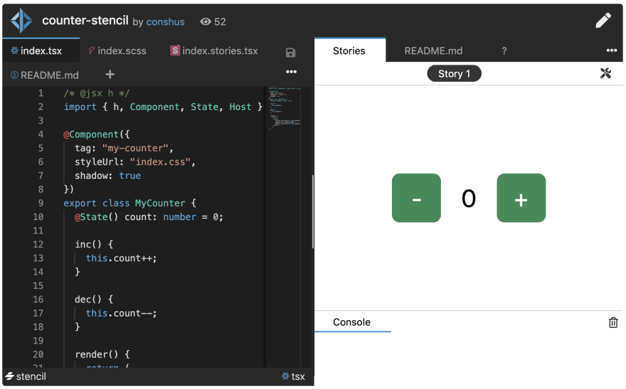
https://webcomponents.dev/edit/0fnDxieuQiDjhYNGGBEM
When looking at the code Stencil uses to create the counter component, there are some ‘@’ in the code. These are Decorators that come from TypeScript. Stencil uses them to abstract some of the boilerplate code.
Throughout their site, Stencil wants it to be known that a goal of the tool is to make creating Web Components as easy as possible.
“Compared to using Custom Elements directly, Stencil provides extra APIs that makes writing fast components simpler.”
Features
On the front page of the website and in the introduction, Stencil makes sure to note that it is a compiler. Once the Web Component is generated, it no longer relies on Stencil.
Stencil makes sure that it’s features are clearly stated:
– Web Component-based
– Asynchronous rendering pipeline
– TypeScript support
– One-way Data Binding
– Component prerendering
– Simple component lazy-loading
– JSX support
– Dependency-free components
– Virtual DOM
– Static Site Generation (SSG)
Documentation
One word to describe the Stencil documentation would be complete. You can tell that a lot of time and effort was placed into putting it together.
The first section, Introduction, starts off with why Stencil exists.
Following that, there are subsections:
– Goals and Objectives – Stencil’s aims and value proposition
– My First Component – a breakdown of a sample Stencil component
– FAQ – a quite long and well-organized list of answers
– What is a Design System? – the documentation takes the time to define what a Design System is!
– Stencil for Design Systems – In the previous section, they educate you and then tells you how Stencil can create them for you.
Again, that’s just the first section! The documentation goes into all the aspects of Components, how to integrate the generated components into popular FrontEnd Frameworks, Configuration Options, Guides, Testing and so much more. I have never had a question that was not answered by the documentation.
Ease of Set Up
In the Introduction portion of the documentation, there is a “Getting Started” section.
Stencil has an interactive CLI tool.
Running npm init stencil allows for the creation of a Web Component, a Stencil application, or a production-ready Progressive Web App.
Support
Under the Community section, there are links to Twitter, Slack and GitHub. There are also a lot of Stencil focused YouTube videos and articles/blog posts.
Backing
Stencil is maintained by the Ionic core team along with community submitted contributions.
Prominently displayed on the front page are the logos of companies that use Stencil. Listed are Apple, Amazon, Porsche, Arm, Panera, and Microsoft.
Conclusion
These are just a few of the ever-growing list of tools to build Web Components. If none of these check off what is on your developer checklist, I would take a look at what else is available on https://WebComponents.dev. As for us with Vonage, we have decided to use Stencil. With TypeScript support, great documentation, and the ability to create Design Systems we are most of the way to completing of Web Components project.
In the next post, we will build a Web Component with Stencil from beginning to end.
Have you built a Web Component using any of these tools listed? Maybe one we did not mention? What was your experience? Let us know in the comments section.
The post Web Components Tools: A Comparison appeared first on Vonage Developer Blog.

Top comments (0)