React is one of the most used and loved JavaScript libraries for building user interfaces and there's no shortage of UI frameworks out there to to help make developing great React apps quicker and simpler. You may have heard of a couple of the really popular ones like React Bootstrap or Material UI, but there is another one that doesn't get as much attention, Fabric React.
Fabric React is the framework built on top of Microsoft's Fluent Design language, much like Material UI is built off of Google's Material Design. It's used by Microsoft on a large variety of their products and sites, from Outlook,Word, and PowerPoint to SharePoint.
Personally I enjoy using it because I like how the styling is different than Bootstrap and the documentation is really helpful with great examples and best practices for all their components.
Getting Started
It's easy to get started with Fabric in your React projects, whether you are starting from scratch or you intend to add it to an existing project.
To get familiar with all the controls and components in various frameworks I usually like to spin up a demo environment in CodeSandbox. Its easy to add Fabric React to a projects dependencies by searching for "office-ui-fabric-react" from the Explorer panel in CodeSandbox.
If you want to add it to an existing React project you can add the package with npm with:
npm install office-ui-fabric-react
Fabric Component
When building your app with Fabric it is recommended that you wrap all your content in a Fabric component. This can be a replacement to your root div, and it brings default fonts and styling so your app looks consistent.
import { Fabric } from "office-ui-fabric-react";

function App() {
    return <Fabric>// All your components here</Fabric>;
}
Icons

Fabric has a great icon library but they aren't included in the Fabric React package by default. Many controls use the icons so you will need to add the package and initialize them at the root of the app.
import { initializeIcons } from "@uifabric/icons";

initializeIcons();
Go to Controls
Now that you're ready to start building with Fabric, lets start adding some controls. These are some of the Fabric controls I use most often. I've included their individual imports and components with minimal props to get you up and running.
Buttons
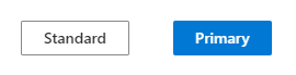
import { Fabric, DefaultButton, PrimaryButton } from "office-ui-fabric-react";

<DefaultButton
          text="Standard"
          onClick={() => console.log("You clicked Standard")}
        />
  <PrimaryButton
          text="Primary"
          onClick={() => console.log("You clicked Primary")}
        />
ChoiceGroup
import { ChoiceGroup } from "office-ui-fabric-react";

<ChoiceGroup
    defaultSelectedKey="Bears"
    options={[
        {
            key: "Lions",
            text: "Lions",
            disabled: true,
        },
        {
            key: "Tigers",
            text: "Tigers",
        },
        {
            key: "Bears",
            text: "Bears",
        },
        {
            key: "Ohh my",
            text: "Ohh my",
        },
    ]}
    label="Pick one"
    required={true}
/>;
Slider
import { Slider } from "office-ui-fabric-react";

<Slider
    label="Pizza Size"
    min={10}
    max={24}
    step={1}
    defaultValue={18}
    showValue={true}
    onChange={(value: number) => console.log(value)}
/>;
DatePicker

import { DatePicker } from "office-ui-fabric-react";

<DatePicker placeholder="Select a date..." ariaLabel="Select a date" />;
Panel
import { Panel } from "office-ui-fabric-react";

<Panel
    isOpen={isPanelOpen}
    onDismiss={() => setIsPanelOpen(false)}
    isLightDismiss={true}
    headerText="Panel Header"
    closeButtonAriaLabel="Close"
>
    <h3>Panel Content Goes Here</h3>
    <p>Throw in your form inputs or more details on what you clicked on here.</p>
</Panel>;
There a ton of other controls, and I highly encourage you to check out the Controls page of the Fabric React documentation for the full list of controls.
Theming

Fabric also has a theme designer that allows you to generate a theme by picking three colors and then preview the theme being applied to many of the Fabric controls.
It has a great accessibility checker built in that will flag issues where there isn't enough contrast between your selected colors. This will allow you to make changes to your selected colors on the fly to improve the accessibility of your application.
If you happen to be doing any SharePoint development one of the great things about the theme designer is that you can see all the Semantic Slots that are used throughout the controls. These semantic slots are used to allow your controls to dynamically change based on where they are used in SharePoint. For example; adding a list to a section of a page with a light background will have dark text, but if you were to add it to a dark background it will invert the text making it easier to read.
Give it a shot and after you have a theme that you like it's easy to export it to your app. You can just copy it to your app by clicking on the Export theme button and choosing how you would like to apply it to your app whether it being JavaScript, JSON, or PowerShell.
Final Words
Here is a sample sandbox with all the above mentioned controls being used. Go add more from the docs or update the theme palette with your own from the Theme Designer.
I hope you give Fabric React a try and maybe it will be the React framework that you reach for when you start your next project!

Top comments (0)