Sometimes programmer loss track of the CSS properties, especially the margin and padding. Yet the UI designers are always too smart to spot the difference.
In my last week of work, I got my ticket (Jira ticket) sending back twice because my code didn’t match the design. For me, it looked the same. But somehow the designer caught the minor difference.
So I asked them, how or what software do you use to compare the difference? In turns out, they are using simply Figma and Photoshop to overlay the screenshot of the final product I made on top of the design.
But, as the developer, we don’t always has access to edit Figma, so I need to find other solution. Here is the Perfect Pixel Chrome plugin! It allows to overlay the a photo on top of the current website. The difference can be found instantly by the developer without sending the ticket back and forth and slowing down the development process.
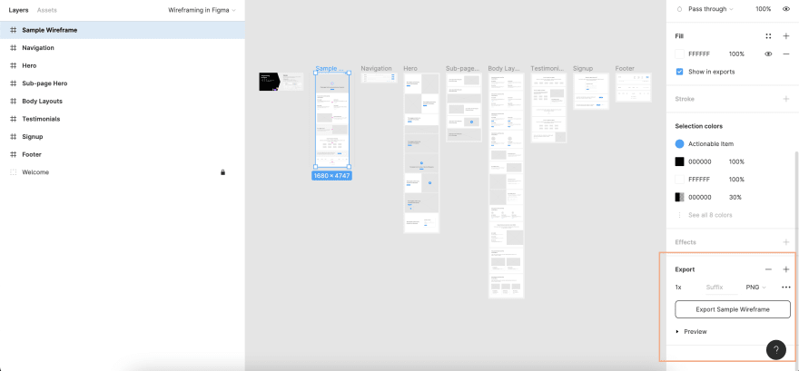
To use the plugin, first you need to have a screenshot of your design. Figma has the export function to export the design directly.
First select the layer, scroll down to the bottom of the design bar and you will find the export button.
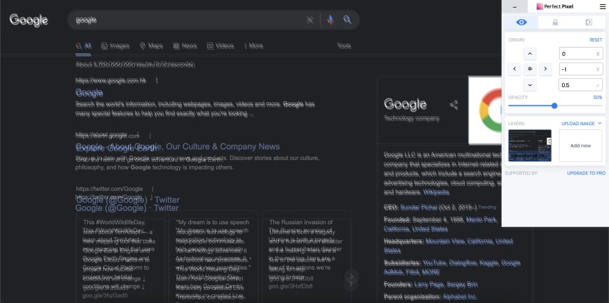
Then you add image to the plugin. Then it is done, you can now move around the image and experiment with it through the control panel.
By the laying on image on top of the website, the difference is easily spot. Just like this:
But make sure that the window size of your website is the same as your design. For example if the design is 1920 x 1080, then do make sure that your screen size is also 1920 x 1080. You can also use the inspector change the ration accordingly.
Thanks to Perfect Pixel, we as frontend developer could make less trouble for the UI and QA team!
Subscribe to the newsletter to receive the knowledge I have learnt in work each week!


Top comments (0)