
This post was originally published on my blog
This post's claim: client research is the most important step to take when designing a website. You should do it every time, before you make a single sketch or mockup, before you touch a single line of code. Your clients will be happier, your designs will be prettier, you'll become a better designer.
That's the actionable, practical form of the advice that I'm attempting to give. The underlying idea is the importance of design thinking. More than building pretty websites or graphics, design is about knowing as well as you can the problem that you want to solve or the message that you want to communicate. Only knowing this can your hands-on skills in Illustrator or CSS really come into use, producing valuable and ultimately visually appealing designs.
This was a realization I've come to with a few recent web design/development projects, notably redesigning and rebuilding The Phillipian's website, phillipian.net; in this post, I'll be using the simple website I built for food-rescue non-profit Stem4Free as an example.
Doing it wrong
A couple of my friends started Stem4Free in April. The organization worked to rescue food from restaurants and businesses that would otherwise go to waste, donating them instead to food pantries, homeless shelters, nursing homes, hospitals, etc.
I joined Stem4Free as what else but the website design team manager, except there wasn't anyone to manage, so it was just me working on the website. The WordPress website that one of the founders had put together used Elementor and a ton of other plugins. My job was to make it...better. I determined that a complete overhaul was in order, getting rid of Elementor and building a template from scratch. (After phillipian.net, this was a familiar task...)
So I got to work, playing around with the existing logo, pulling colors and trying font combinations:

For the website, I interpreted my task as making the website, well, look nicer. I looked through a bunch of other nonprofits' websites, looked over the copy on the existing website, and threw together a mockup in Illustrator:
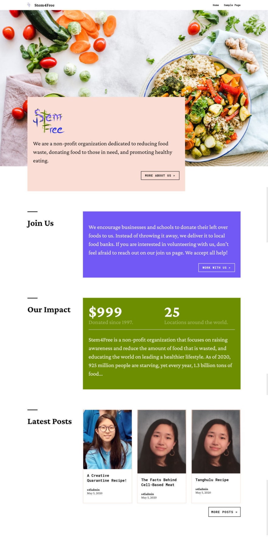
This was, more or less, the website that I built:
Alright, my WordPress/frontend skills are still pretty solid. Those blocks on the front page even use some lightly-styled Gutenberg blocks with a Custom Post Type to make them easy to update!
My design thinking, on the other hand, was taking a deep nap. Everything about this website, from the design process to the mockups, should have set off alarm bells. The visual hierarchy is hopelessly confused. There are long chunks of text with no clear purpose and multiple evenly-weighted buttons that leaves visitors with no idea what they should do.
This bad design soon began to cost me. The board requested changes each week. Some were easy to implement; others seemed to be asking for a redesign of the whole site — so eventually, that's exactly what I decided to do, doing it right this time.
Doing it right/the most important step: Client Research
The superweapon to doing design right is simple — do client research. Do it before you make a single mockup, write a single line of code.
What should you accomplish with client research? Get to actually know your client. Know their story, their purpose statement, the people they interact with, the impression they want to give off.
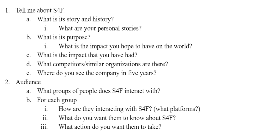
some questions

some answers
Immediately, this gives you a picture of what's actually important to communicate in the website. Walls of text elucidate into highlighted numbers and sentences. Knowing who you're communicating to tells you what was wrong before, what was missing or broken about the design.
The client usually isn't clear on every part of what they want to communicate — that's why they got you to help. The client research process, then, becomes a shared journey of discovering the client brand: you guiding them along with questions, both arriving together at a better understanding.
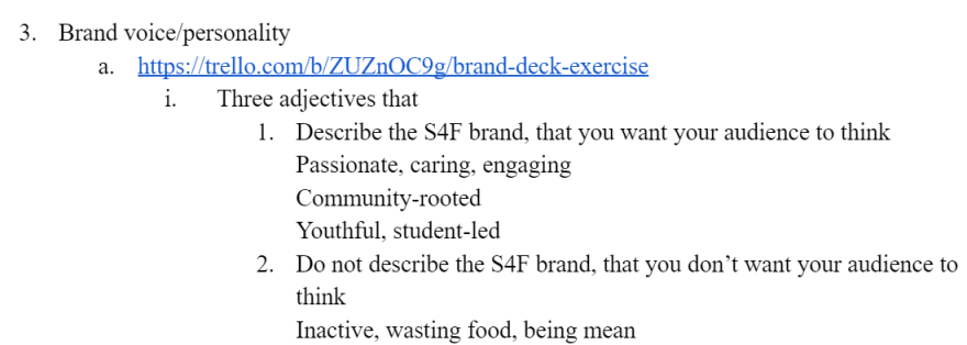
As an illustration of this, a powerful question is to ask for adjectives that do and don't (this is often where the real clarity come from) describe the client's brand. Vague ideas clarify into distinct characteristics:
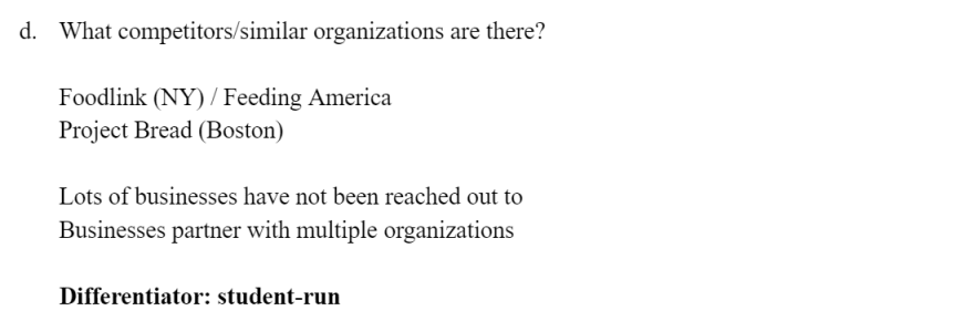
Asking about competition, too, identifies how to strengthen messaging:
Now we know what's important. We know what we want to say. Only now are you ready to do the rest of your job, building the way to say it.
Doing it right: Keep It Simple, Stupid
Forget the colors. Forget the fancy offset boxes. Forget the hero images.
Only put in what matters. Build a clear hierarchy. Visitors should know exactly where they should be looking, what they should be thinking.
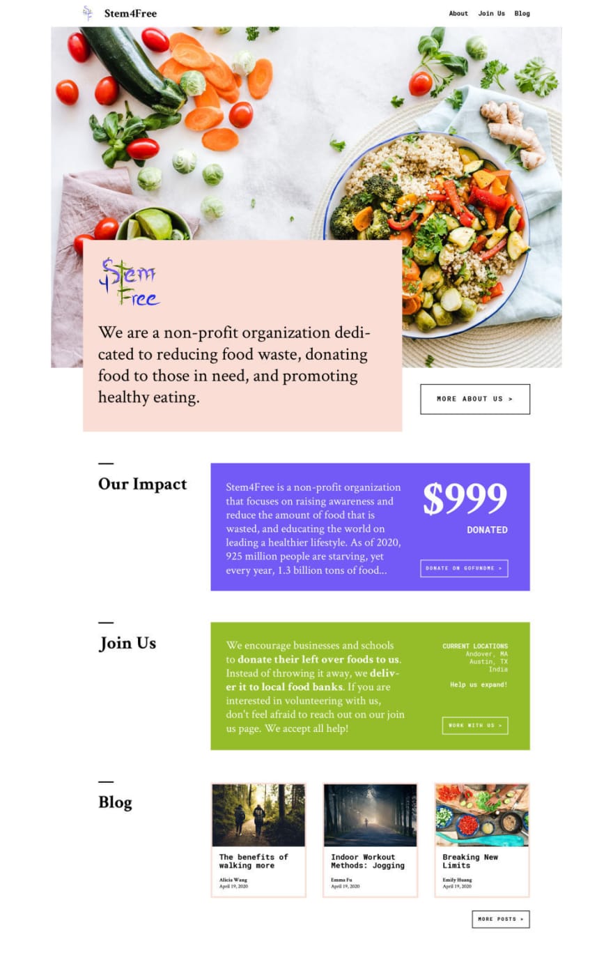
Here's the homepage that I designed the second time around, live at stem4free.org:

Bam, number to the face. We have a real impact. Above, a straightforward introduction. Below, live stats on donations, because we want to communicate that we're active and reputable. Below that, our clear main call to action — join as a volunteer! If you're a business, join as a partner! And then updates and blog posts, because again, we're active and reputable. The messaging is focused and clear.
There's no hero image. Why would you want a hero image? We don't have any good ones, our media comes from high schoolers taking pictures of donations with their phones, so that's what we put in a grid below. That's the good stuff, where the impact isn't in attention-grabbing quality, it's in quantity. We're active and reputable.
It's literally monochrome. Could colors have been tactfully used to make this website just a little better, the brand more distinctive and memorable? Yeah, for sure — but its absence really isn't significant, affirming that colors really wouldn't have been communicating that much in the first place. We avoid this complexity and focus on what matters: the copy, the typography, the layout.
Obviously these aren't generalized rules. Hero images and graphics can be really effective; colors are often critical to a brand or design. The important thing is to design not with arbitrary rules (or shiny Awwwards sites) as the starting point, but with understanding your client, figuring out what's actually meaningful and important to design around.
Aside from the homepage, branch pages were an important feature of the redesign:

They're really simple, but they contain the information that matters. The idea came from the client research, of course — give prospective volunteers and businesses a centralized branch info page. See the localized stats, see the directors' faces and contact info.
Conclusion
When I made the first version of the Stem4Free website, I wondered why it was so ugly. I attributed it to lack of time put into it — I didn't even make a mobile mockup before bashing out the WordPress template — or just my design skills being rusty.
When I made the second version of the website, I was really happy with how pretty and cohesive it looked. I wasn't trying to make it pretty, I was just trying to communicate. As I mentioned earlier, there weren't even colors or a hero image to the site; but when the core design and messaging of a website is clear, everything comes together around it. Your intuition can get to work without obstacles throwing it off at every step; small improvements add up into something bigger rather than going in a million different directions.
Requests for changes didn't stop, of course. This is a growing, changing student organization, and I'm one of their staff (a director, even); I didn't aim to make a thorough, for-forever package. What I did build, though, was a design with solid, well-researched foundations. The changes being requested now are minor corrections or iterative changes — they make sense, and extend the original design rather than compromising or diverging from it.
What allowed this to happen — as promised, making the second version of the website prettier, the client more happy, and me more sane — was that client research in the middle. That's because good design isn't about being able to make the prettiest things by magic; it's about making well-thought out things, asking the right questions and doing the work to get there. Design processes can get much more involved beyond client research: rounds of workshops and design sprints, for example. If you're a seasoned designer or developer who has worked with tons of clients, you already know these truths, but if you're just getting started or still figuring things out, it's never too early to strive to put design thinking at the center of your process.

Top comments (0)