![Cover image for "Don't Make Me Think" Summary for UI/UX designers [First Chapter]](https://media2.dev.to/dynamic/image/width=1000,height=420,fit=cover,gravity=auto,format=auto/https%3A%2F%2Fdev-to-uploads.s3.amazonaws.com%2Fi%2Fnahswv1t7eu42c8oa96i.jpg)
Hi there! I'm gonna write articles in which I explain the rules inside "Don't make me think" book as you saw from the title of this article.
Some stuff to know before starting:
- In each one, I'll summarize a chapter, until I finish all of them.
- After each point, I'm going to put an image from the book as an example [if exists]
- and finally, my English is not very good, so I'm sorry for any mistakes
Chapter number 1: Don't make me think [Krug’s First Law of Usability]
- The first ultimate principle is to make your website self-evident so that everyone can use it efficiently and easily even this one who barely knows how to use the back button.
Good One:

Bad One:

- Get rid of question marks: All kinds of things on a Web page can make us stop and think unnecessarily:
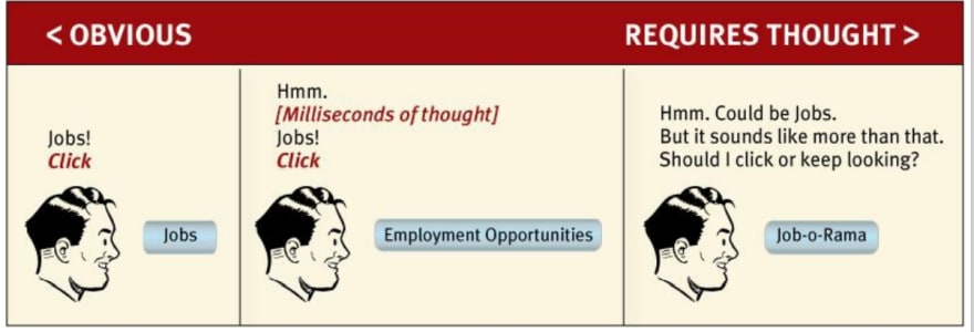
- Be careful when naming things: one of the things that make people confused and annoyed when they use anything, not just sites is to face ambiguous names
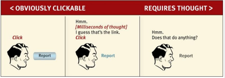
- Clickable things: User should never devote a millisecond trying to figure out whether a thing is clickable or not, so make it effortless to realize it. for instance, you can color all of the clickable stuff in the same color, or you can make all of them in the same shape, and so on
- Be careful when naming things: one of the things that make people confused and annoyed when they use anything, not just sites is to face ambiguous names
"They enjoy puzzles in their place—
when they want to be entertained or diverted or challenged—but not when they’re trying to find out what time their dry cleaner closes" :)
Great! that's the end of it. Hope you like it and get even a little benefit. See you next article:)

Top comments (0)