Hello everyone. Today I'm gonna speak about the third chapter. This chapter contains a lot of information, so let's immediately dive into it.
Chapter number 3: Billboard design 101 [Design for scanning, not reading]
1. Take advantage of conventions:
conventions like the logo identifying in the top-left corner, the search icon

Notice: We can break conventions when it is:
1. so clear and self-explanatory that there is no learning curve
2. or adds as much value that’s it’s worth a small learning curve
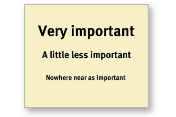
2. Create effectively visual hierarchy:
-
1. The more important something is, the more prominent it is
2. Things that are related logically are related visually
3. Things are "nested" visually to show what's part of what

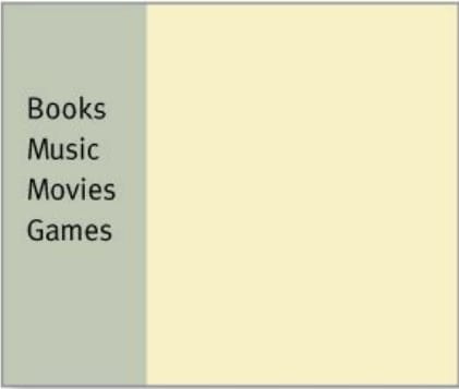
3. Break pages up into clearly defined areas
4. Make it obvious what's clickable
5. Eliminate distractions:
- Shouting: everything on the page is clamoring for your attention. resist your desire to make a lot of things necessary to be noticed
- Disorganization: use grids and organize everything
- clutter: a lot and a lot of things on the page: When you’re editing your Web
6. Format content to support scanning:
- Use plenty headlines
- Keep paragraphs short
- Use bulleted lists: Just look at your paragraphs for any series of items separated by commas or semicolons and you’ll find likely candidates
- Highlight key terms: Don’t highlight too many things, though, or the technique will lose its effectiveness. just the most important things

Top comments (0)