
You can write the best code in the world but if your website doesn't follow the most basic principles of design your app or page will probably fail in search score, user experience and much more so in this post we will dive into 3 design principles for developers or any other tech person who codes websites.
Hei, my name is Adrian and I'm a UX Developer for about a decade now (and yes, that sounds quite a lot when I say it out loud) - but anyways please let me know if you like this post by commenting down below.
Also I have created some Google Slides and also an Youtube Video on this exact post if you like like to consume this in other ways!
1. Master hierarchy, you master design
Hierarchy is a basic design principle which helps the viewer focus on key information. A good hierarchy will lead the viewer smoothly through processes like buying a product or finding the information they seek effortlessly.

Image source - React Material-ui Kit Pro

As you can probably tell, the key information on the version with the check mark is a lot more obvious.
First, the page title which is big enough to quickly read what the project is about and underneath we have the brief details which occupies most of the real estate and in this context is the key information. So first you need to know what's the thing your viewers or customers are looking for the most and use hierarchy to emphasize it.
So you can get away with hierarchy by just making the important stuff bigger, but keep in mind that if everything looks important nothing is important anymore, so hold your horses with to that font paddle.
Another way to make the most of this principle is to make use of colors, but attention, use three colors at most. One primary color (used for body text), one secondary color (a subtle color, muted) and one accent color which in my case is used for the most important purpose, to apply for the project.
Big doesn't necessarily mean obvious
There will be cases in which size can't save you. So what do we do then? Well, there's a thing called font weight which if used correctly your hierarchy will be on point. So let's see some examples:

I'd say these small details gives a stronger clarity to the viewer and that's really important for metrics like bounce rates and plus it looks like it has more space. So, next time instead of just throwing some sizes to your elements add some extra weights here and there, it will make a huge difference!
3. Flexibility is overrated
We as human beings hate chaos and uncertainty so that's why you should always work either with a library (design system) or create your own small one if the project is not that big. That way you will never waste time over decisions like "should I use 13 or 15px here?".
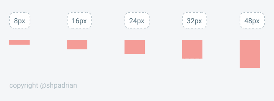
Define some paddings and margins from the beginning and just use those, avoid using values that are unusual. I usually work with multiples of 4 (8, 16, 24, 32, etc) and if something looks like it has too little padding, just go up one staircase at a time and vice versa.
A quick tip that I've learned is to start with a very big spacing between elements and just adjust from there. That way there's a high chance of giving your items more breathing room.
If you truly want to create a design system yourself which is more then just a choosing a typography and colors you might need to define the following:
• Font weight
• Line height
• Color
• Margin
• Padding
• Width
• Height
• Box shadows
• Border radius
• Border width
• Opacity
...that's why it sounds better to work with a library which offers all these out of the box.
Stick to your Typography
Use the same strategy with typography—and that is defining one from the beginning and sticking to it and you can use a tool like Typescale to ease your efforts in choosing the proper line-height, sizes, and so on.
In case you have to use more then one font in a project I suggest using a font pair tool like Typewolf because you need to try out many fonts in order to find a good balance and these guys know what they are doing.

Define your colors
When it comes to colors, you will need more shades than you think. There's cases where you need to use 3 different shades of a grey just in one screen and because that's pretty tough to choose the shades especially if you not a designer and what I recommend is using shades of colors from systems like Material or Tailwind—that way you can't go wrong as it takes a while to develop an eye for good color combinations—even today I'm still struggling finding the right balance between neutral colors and brand (accent colors).

3. Readability above everything else
Readability is mostly given by typography and white spacing so we'll explore a few solutions on how to make your page more digestible.
The rule of thumb when you have doubts weather your text should be centered or left aligned (or right if we're talking about a RTL website) go with left aligned, there's less change of screwing up. But here's a case when centered text looks like a good idea.
If your copy is small enough to fit inside a 2 lines, centering makes sense, otherwise left align all elements which are in the context.

That's it! Thanks for reading this to the end.
Follow me on:
⚡️ https://twitter.com/shpadrian
Subscribe to my newsletter on:
⚡️ https://devias.io

Top comments (3)
Thanks for the article. It is well written, and sufficiently broken-up.
Question: How many tones/shades of what types of colors do you have to have for any design (eg. light/medium/dark, danger/success/accent)? I always have trouble preemptively choosing shades.
I usually have around 5 shades for every color I use and it works really well. You can use this tool, maketintsandshades.com/ to generate your shades! Sorry for the late reply
Great tips, thanks for sharing it!