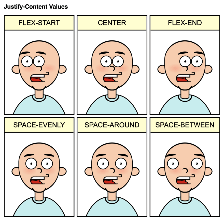
As part of the comiCSS webcomic, today I coded a cartoon about FlexBox and the values of justify-content:
I was trying to do something different and explain the concept in a fun way, illustrating the main options for justify-content:
-
flext-start: pack items at the beginning (by default, the left side). -
flex-end: pack the items at the end (right side). -
center: pack the items in the center. -
space-evenly: all items will have the same space around them (even with the start and end of the container.) -
space-around: the space between objects is the same, and the area at the beginning and end of the container will be half of that space. -
space-between: the distance between all items is equal, with the first and last item touching the container edges.
There are more options for justify-content (stretch, left, right, start, end, and different combinations with safe and unsafe.) But I had to keep the cartoon short and straightforward, plus they wouldn’t be much different from some of the others.
Also, the comic strip assumes the default flex-direction of row. If we changed the value to column, the cartoon character would look more like a Picasso 😅
Next grid... maybe?


Top comments (1)
That comiCSS idea is just brilliant. Bravo 👏