
Web accessibility means everyone can use the web. In addition, it is a way by which those with a disability access the web and use it. This is why User Experience Designers need to design a web that people with auditory, visual, and other disabilities can use.
There are several benefits of having an accessible website.
- Web accessibility ensures everyone, whether they have a disability or not, has equal access to information on the web and a good web experience.
- Inaccessible websites are at risk of litigation as web accessibility is a legal requirement in some countries.
- An accessible web provides excellent search engine optimization as web users will frequently go to websites that are more accessible.
When planning web designs, it is essential to put the visually impaired in mind to make the web accessible to them, and this will ensure that they can use the websites and navigate through them. In this article, we will understand the challenges of the visually impaired and the possible solutions to how they can navigate and interact with the web as every other web user. You will also know what to consider when designing a website for the visually impaired.
Who are the Visually Impaired?
Visual impairment is a condition where an individual's ability to see is hindered, affecting daily life. It is a loss of vision that one cannot use glasses to correct, affecting individuals differently and can also include blindness. In adults, there are several characteristics of visual impairment, including being unable to see peripheral objects, blurry vision, difficulty adjusting to dark rooms, trouble when trying to focus on near or distant objects, or double vision.
According to the World Health Organization, the estimation of people across the globe with visual impairment is 253 million, of which those who are blind are 36 million, and those with moderate to severe visual impairment are 217 million.
Visual impairment comprises various disabilities, the most common being low vision, color blindness, and blindness.
- Low vision is a visual impairment you cannot correct with glasses or surgery, and it is hard to perform daily activities. The most common types are Loss of central vision, Loss of peripheral vision, Night blindness, Blurry vision, and Hazy vision.
- Color Blindness involves difficulty differentiating colors and sometimes the inability to sense any color. Color blindness includes; Deuteranomaly, Protanomaly, Protanopia, deuteranopia, Tritanomaly, and Tritanopia.
- Blindness is a lack of vision and could be partial or total.
Challenges the visually impaired face when navigating the web
The visually impaired face some challenges when navigating the web, including
- The failure to structure the web page's content with headings.
- The headings on a website are disorganized.
- Areas on the web are not accessible with a screen reader.
- The missing Alt texts in images on web pages.
- Links and buttons do not have descriptions.
- The contents of the page are not visible to them.
- The presence of contents that are not accessible with the keyboard.
- Absence of language declaration.
Web Content Accessibility Guidelines (WCAG) layout techniques for making websites accessible. If your website is not WCAG compliant, you possibly risk litigation for not being accessible to others. To know if your website is accessible, you need to compare your website to specific standards that WCAG has placed.
For your web to be compliant with the WCAG, there are three levels of conformance, which are
- Level A: This requires meeting the barest minimum level of accessibility.
- Level AA: Involves every consideration in level A and a few additional requirements.
- Level AAA: Includes everything in levels A, AA, and a few other conditions.
There are four principles with thirteen guidelines on knowing an accessible website according to WCAGB version 2.1.
Let us review the first principle (Perceivable) as regards the visually impaired.
This principle explains that people must find your content. There are four guidelines here;
1.1. Requires that all non-text content has a text alternative.
1.2. Requires that there are alternatives for time-based media.
1.3. Requires presenting the content in different ways without losing context
1.4. Requires separating the content from the background.
For more detailed information on the principles and guidelines, see WCAG details.
Making websites accessible to the visually impaired
Designing an accessible website for the visually impaired is not difficult but requires some recommended design best practices. When designing an accessible website for the visually impaired, there are things to consider to make websites accessible to them. Taking into consideration the principles according to WCAG, others include:
Color use on your website
- Avoid using only color to convey meaning on your site. Instead of relying on colors, you can use texts, symbols, and shapes to give essence to your site. For example, the image from MissouriState below shows how wrong it is to use only colors to convey meaning because to someone who cannot perceive color, the colors will not display.

- For individuals who are color-blind, you should not depend on color so they can perceive the information. It is better to adhere to a few colors to avoid relying on color. In addition, it will be good to print your pages in black and white to see if the information still makes sense without confusion. For example, this design from Elementor is black and white, and you can still understand what is in it.

Simulate different color blindness
In designing a website that will be accessible to the visually impaired, review whether your content is visually accessible from other color blindness perspectives. For example, the Figma plugin "Color Blind" will show you how the different kinds of color-blind will see your designs.

The use of Alt Text
The alt text describes the appearance or relates the function of an image on a page. In making sites accessible to the visually impaired, Alt text can play different roles.
Ensure that you describe images. You will leave search engines guessing when there is an image on a page without Alt. In addition, visually impaired persons who use screen readers will not be able to access image content without an Alt text. For example, you do not need to say "An image of" or "a picture of" because the screen reader will say this.
In the image from Microsoft word 2010 508 Accessibility Checklist- Social Security below, the caption inside the dog does not do justice to the real meaning of the image.

- Ensure you describe images adequately to explain what is showing in the picture so that screen readers can understand. Here is an example of an Alt text with a good description from Mangools.

- Ensure you avoid using Alt text for decorative images. Use an empty Alt text
img alt=" ”when decorative images are on a page, as they are not crucial to the visually impaired. The idea is for screen readers to skip over them. Check out this Alt Decision Tree to know when to add Alt text to an image.
Evaluation of content legibility
It is necessary to assess the legibility of the content on your site for easier access. For example, too small texts will be complex for an individual with blurred vision to read. In addition, arrange your paragraphs well so users do not strain their eyes when using your site.
Here is an example of the exact sentences with different font sizes and weights. The image with little characters will be complex for someone with blurry vision to see. To ensure legibility, it is necessary to be intentional so the visually impaired can easily see the content of your page.

The use of links and buttons on your website
Links on a website can help improve accessibility for the visually impaired.
Ensure that you add descriptive link content to your site. Descriptive link content will show the action that will take place when you click a link. Use things that describes links to create links in texts instead of saying "click here."
Ensure that buttons on your site have descriptions and are clickable. The WCAG guide will help you know how best to work with buttons.
Confine the number of links on your web page, as this can discourage the visually impaired from using the sites. When you open a page with screen readers like Job Access With Speech (JAWS), it will first mention the number of links on the page.
Content placement
It is better to put the most vital information at the top of the page or the beginning of a paragraph. This will help users access the information quickly, and those that use screen readers will easily decide whether the information is essential to them.
The use of Headings
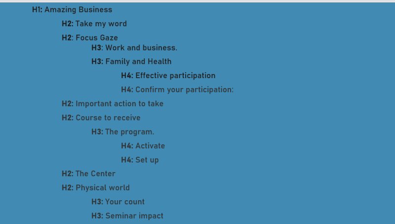
In making headings, make sure the headings on your website do not skip their heading level hierarchy, as this improves navigation. In addition, when you separate the segments of your webpage with the appropriate headings, the visually impaired will find it easier to navigate your site.
The <hi> heading should only be one on a page and must be similar to the <title>. Skipping the heading level causes disorganization on your page, and you should avoid such.
Here is an example to enable you to organize your heading levels.
Open Source Session Replay
OpenReplay is an open-source, session replay suite that lets you see what users do on your web app, helping you troubleshoot issues faster. OpenReplay is self-hosted for full control over your data.

Start enjoying your debugging experience - start using OpenReplay for free.
Accessibility Tools for the visually impaired
For the visually impaired to access the websites, many assistive technology and tools are available to help them. Some of these tools are for designers to make considerations for the visually impaired while designing the web and ensure they put measures in place to improve accessibility. Some of these tools are:
accessiBe
accessiBe is a web accessibility tool that makes websites accessible to those with disability. It adheres to the WCAG version 2.1 at the level AA success criteria and level AAA in some areas.
- Login to accessiBe to sign up.
- Create an account by selecting "start free trial."
- There is a seven days free trial and other paid plans.
- After entering your details, click "sign up."

What accessiBe does:
- Checks your website to assess some standards.
- It gives you a short report of whether your site is compliant.
- It shows you ways the website is not compliant with people with different disabilities.
- A wide range of disability profiles is present to change your website to fit in with any disability you want.
- You can change fonts, change contrast with colors and align your paragraphs.
- You can adjust your content to know what is clickable and what is not.
- You can hide images to avoid distractions.
You can watch this demo for an overview of what you can do with accessiBe.
Figma Plugins for Accessibility
There are a lot of plugins on Figma that designers can use to ensure their website is accessible to the visually impaired.
To load your plugins swiftly on your design page, press Ctrl + /
Some of the plugins include:
Adee Comprehensive Accessibility Tool: This is one of the best plugins for the visually impaired as it has a color contrast checker, Alt text generator, Color-blind Simulator, and Touch size checker.
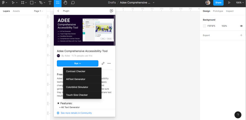
To use this plugin;
- Select Try it out
- Then Run.
- You can access the features by running them separately.
- It checks for different rectangles.
- For example, below is how someone with deuteranopia will view the design with this plugin.

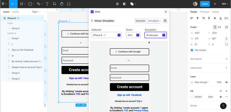
Stark: This plugin checks for accessibility in layers. Some features like checking for Typography, Alt text, Touch Targets, and Focus order is accessible using a pro or team plan, and you can upgrade to this plan.

To use this plugin;
- Select Try it out
- You will need to create an account on stark to use this plugin.
Then Run.
For example, see how Stark works and how someone with Protanopia will view this login page.
Able-Friction Free Accessibility: This plugin works by selecting two layers, and it will not work if you do not choose two layers, as it is basically for comparison. It shows how people will different visions will view the design.

To use this plugin;
- Select Try it out
- Then start selecting the layers you want to check in your designs.
- Below is an example of how Able-Friction Accessibility checks two layers. It will display the layers with their different colors, and you can check the preview of each layer with different visions and their contrast.

Color Blind: With this plugin, you can view your designs in the eight types of color blindness. Your designs will appear how someone with any of the types of color blindness will view them.
To use this plugin;
- Select Try it out
- Then, you select the kind of color blindness you want to view.
For example, below is how someone with Tritanomaly will view this login page.

Low Vision: This plugin helps you to assess your design with different visual impairments and acuity.
To use this plugin;
- Select Try it out
- Then, you select the field of vision and visual acuity you want to view.
Look at this design below; you will see that an individual with Peripheral Vision loss will find it difficult to see through the corners of the eyes.

Screen readers
Screen readers are assistive technologies that help the visually impaired access the computer as it turns text and image content into speech.
JAWS (Job Access With Speech), VoiceOver, and NonVisual Desktop Access (NVDA) are screen readers that help the blind and other visually impaired people access computers and allow developers to view their websites the way a visually impaired would.
Chrome extensions
Some chrome extensions like Color Contrast Analyzer and Funkify help ensure web accessibility for the visually impaired.
The Color Contrast Analyzer tests your web compliance regarding color contrast according to the requirements of WCAG 2 and the screen part you want to concentrate on.
To use this extension;
- When you are on a site you want to assess, click the extension icon at the top right corner.
- Then select Color Contrast Analyzer
- You will see different options for the areas you want to capture
- Select the one you want.
- Then allow scanning to 100%
Let us use Facebook to see how the Color contrast analyzer works.

Funkify helps you understand what the visually impaired pass through as it enables you to view your websites like the visually impaired by many disability simulations. To use this extension;
- When you are on a site you want to assess, click the extension icon at the top right corner.
- Then select Funkify- Disability Simulator.
- Select the kind of disability you wish to view with
- Then click start.
- You can check the meaning of the disabilities listed.
For example, let us check how the Linkedin website will appear to someone with normal vision and another with visual impairment.


Conclusion
If you do not experience visual impairment, sometimes it is difficult to know how your designs appear to those affected. Therefore, the availability of assistive technologies for the visually impaired to help them access the web is a smart move, and every web designer needs to make them a priority when designing a web. Start using these tools to design an inclusive website.
A TIP FROM THE EDITOR: For more considerations on accessibility, please look at An Overview Of Web Accessibility and Psychology In Design Of Products For Users With Disabilities.


Top comments (1)
Сongratulations 🥳! Your article hit the top posts for the week - dev.to/fruntend/top-10-posts-for-f...
Keep it up 👍