Building My First Website
Over the past couple of months I've built quite a few webpages, however they were mostly based on source material from my bootcamp. This is my first attempt at starting a personal website for myself from the very beginning, using everything I've learned along the way and incorporating a lot of new knowledge I came across while building it. The following is a detailed step-by-step of my process and how it all came to be.
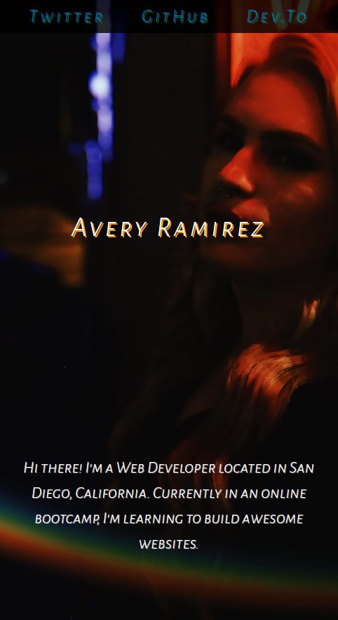
Admittingly, this took a little bit longer than I wanted it to because I scrapped an older version of the site after I was displeased with how it was going. I was overthinking things and it became more complicated than it needed to be. So I started over. The first thing I did was choose my background image, a photo of myself, and figure out the positioning of it. By doing this I was able to mentally map out where I planned to lay out everything on the page. For the most part all of the content is justified and aligned in the center, I wanted to make sure that it looked good on both desktop and mobile. However, I learned a lot about media queries and flexbox while creating this site, so I plan on getting more creative with the layout as time goes on.

I wanted to keep it simple and clean so I just opted for a statement h1, which I figured should just be simply my name, Avery Ramirez. A lot of the other personal websites I was seeing used some artsy cursive scripts, I tried a few of those fonts but realized they weren't really my style, so I went with the font 'Alegreya Sans SC'. I chose to do a text shadow that complimented the colors in the background, adding some dimension. For the paragraphs I chose a simple white font, with all capital lettering. Since there's only a few sentences I wanted the text to appear starkly against the dark background, but still differ from the headers. This is where I also started to add in more margins and padding.

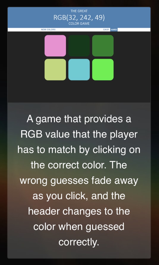
I decided to share a few of the projects I've completed from my bootcamp, which I detailed in my previous post, Bootcamp 50 Days In Review. Ultimately I chose to use cards to display the projects, I liked that they offered easy styling while keeping everything in order and contained. I kept the screenshots opaque, but wanted the card background to be semi-clear so you could still see the background image underneath. Clicking the image results in the projects folder on GitHub in a new tab.
The final thing I did was add the navbar and style it. I like when websites have various opacities to them, so I went with a fixed navbar that was just slightly sheer black. I added in links for my Twitter, GitHub and Dev.to pages and created a text-shadow effect similar to the one on the header. I really like how the links look in the mobile version, appearing to have a sort of 3-D effect.

Overall, I'm really proud of myself for executing something this solid on my own. I look forward to this ongoing project and am excited to see how my webpage changes as I learn more. Feel free to check out the finished product, linked below!

Top comments (2)
Your thoughts really need an appreciation from my side..
Just a suggestion, use the
beginnerstag so that it could reach out to more learnersThanks for the tip! I'll go ahead and add that tag.