
Thanks to Brendan Gregg's work in visualizing stack traces, flame graphs have become a popular tool for analysing performance. They provide a simple and intuitive way to understand complex data by showing the relationship between function calls and resource consumption. The graph makes it easier to identify areas of improvement and optimize various systems, from CPU and memory to I/O subsystems. Flame graphs have significantly impacted software performance engineering, enabling developers to fine-tune their applications. Similarly, there is a need for a similar approach to tackle the challenge of managing Cloud costs across multiple accounts, teams and resource usage.
Managing cloud costs can be challenging, especially when it comes to understanding the hierarchical relationships between accounts, resources, and team/cost centers. While there are cloud cost management tools that help visualize cloud costs and identify areas of overspending, they often fall short when it comes to displaying this information clearly and comprehensively. It becomes even more challenging when multiple teams work across different services and manage them across different accounts. But don't worry - there's a solution! Icicle graphs are a powerful tool that can be leveraged to break down cloud costs hierarchically, making it easier to understand and manage your spending.
What is an Icicle Graph?
Icicle graphs, a type of rectangular sector visualization, are variation of flame graphs. They are highly effective in presenting hierarchical data that flows from the root to the leaves in four directions: up, down, left, or right. With this feature, icicle graphs make it easier to identify clusters and comprehend their hierarchy level. Moreover, these graphs are great in recognizing relationships in data.
It is worth noting that icicle graphs may not be the most suitable option for visualizing large hierarchies as it can be challenging to examine individual data points in detail. However, when dealing with smaller hierarchies such as AWS cloud bill across multiple accounts, these graphs are incredibly effective and particularly useful in identifying correlations and clusters within the data.
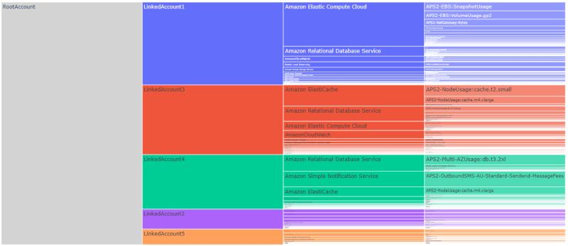
AWS Bill Visualization Example Using Icicle Graph
Below is an example of hierarchical cost data of AWS services. It can become challenging if you want to identify cost patterns and relationships across different dimension. This is where visualization such as Icicle graphs become useful.

Check out visualization below of cloud costs using an icicle graph to show hierarchical relationships. The leftmost node represents the organization, and it has five child nodes representing the accounts (LinkedAccount1 to LinkedAccount5) sorted by the highest spend account at the top. Each account node then breaks down further to AWS product/service nodes, with the service that had the highest spent at the top. This pattern continues until you get to the usage type, allowing for a clear breakdown of cloud costs.
Here is the video visualizing the AWS cloud bill using icicle graph.
Thanks for reading!
If you enjoyed this article feel free to share on social media 🙂
Say Hello on: Linkedin | Twitter
Github repo: hseera

Top comments (0)