


Making Login Pages Feel Alive with Micro-Animations

See Higher Quality Mp4: https://streamable.com/nyou0z
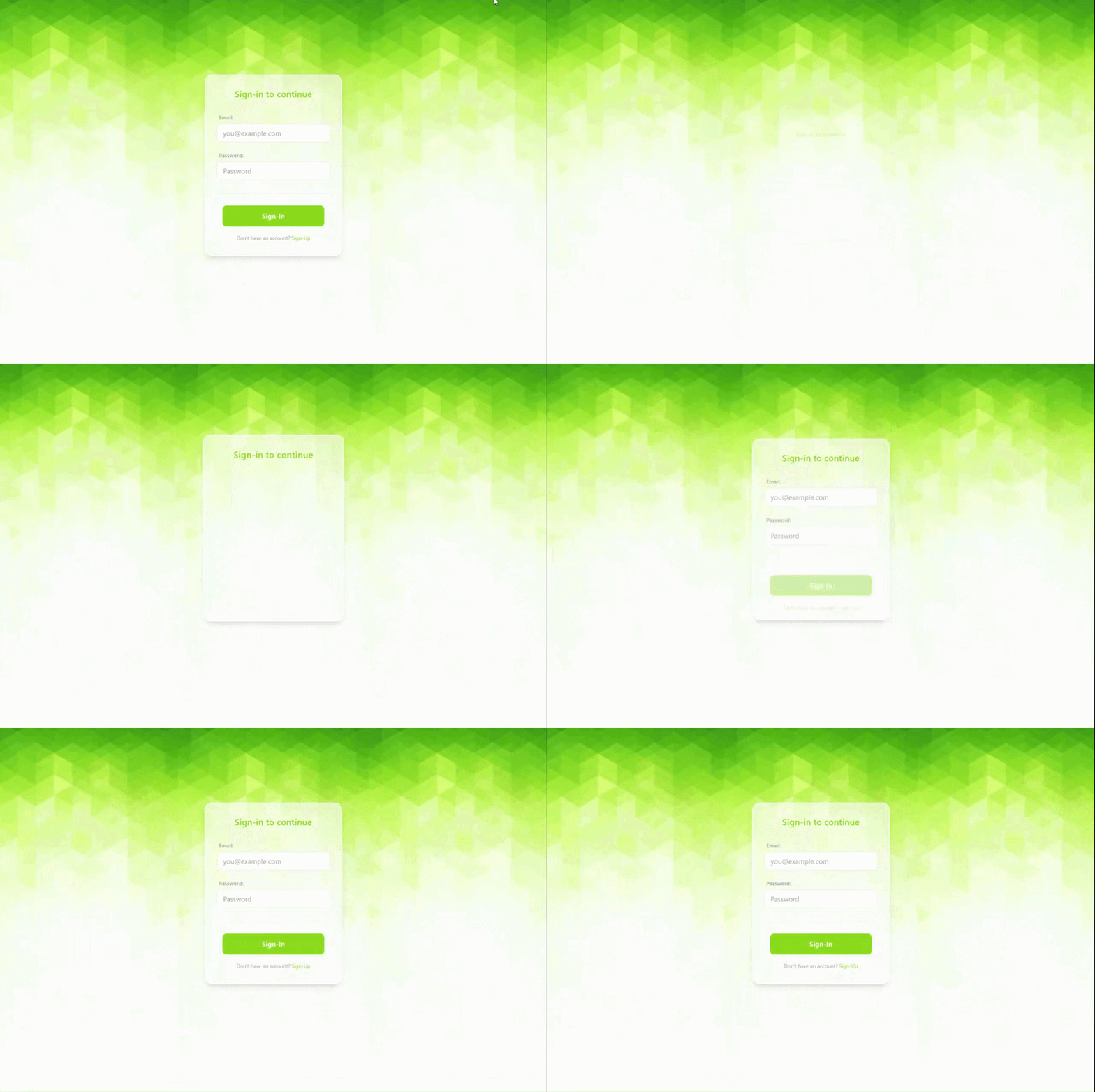
Great UI is felt before it's noticed. The difference between a login form that works and one that delights often comes down to micro-interactions — those tiny, purposeful animations that guide the user's attention and make the interface feel responsive. Here are four distinct animations that layer together to create that effect.
1. The Form Entrance — Bounce-In
The login card doesn't just appear — it springs onto the screen. By animating scale, translateY, and opacity together with a custom cubic-bezier timing function, the form feels like it's settling into place with a natural, physical rhythm.
.loginCard {
  animation: bounce-in 0.4s cubic-bezier(0.03, 0.81, 0.7, 1.22) forwards;
}

@keyframes bounce-in {
  0% {
    transform: scale(0.5) translateY(100px);
    opacity: 0;
  }
  100% {
    opacity: 1;
    transform: translateY(0);
  }
}
The overshoot in the bezier curve (0.81 on the y-axis) is what gives it that subtle spring — the card eases past its final position just slightly before snapping back, mimicking real-world momentum.
2. Staggered Field Reveal
Once the card is in view, the form fields and action buttons fade in one by one. Each element is delayed relative to the last, creating a cascading reveal that draws the eye downward through the form in a natural reading order.
@keyframes appear-up {
  0% {
    opacity: 0;
    transform: translateY(20px);
  }
  100% {
    opacity: 1;
    transform: translateY(0);
    overflow: visible;
  }
}

.formSection div:nth-child(1) {
  animation-delay: 0.4s;
}

.formSection div:nth-child(2) {
  animation-delay: 0.7s;
}

.formSection div:nth-child(3) {
  animation-delay: 0.9s;
}
Paired with incremental animation-delay values on each child, this turns a flat list of inputs into a guided visual journey.
3. Background Breathing
Animating only the form component can feel disconnected from the rest of the page. A subtle background shift — scaling the page's background image from 90% to 100% — ties the whole frame together, making the page itself feel alive rather than just the card sitting on it.
@keyframes bg-scroll {
  0% {
    background-size: auto 90%;
  }
  100% {
    background-size: auto 100%;
  }
}
It's a small touch, but it grounds the form animation in a living, breathing viewport.
4. 3D Card Flip — Login to Sign-Up
Switching between login and sign-up modes is handled with a 3D card flip, giving the transition a tactile, physical metaphor.

Two CSS properties make this possible:
backface-visibility: hidden;
transform-style: preserve-3d;
The parent container gets a perspective value to establish the 3D space, and toggling a class flips the card 180° around its Y-axis. The back face starts hidden and becomes visible only after the rotation completes.
Accessibility note: When the card flips, the hidden form must not trap keyboard focus. Dynamically set tabindex="-1" on the off-screen form's inputs so screen readers and tab navigation skip them entirely.
5. Validation Shake
Finally, when a user submits invalid data, a brief horizontal shake provides immediate, intuitive feedback — no tooltip or toast required.

@keyframes shake {
  0%, 100% { transform: translateX(0); }
  20%, 60% { transform: translateX(-10px); }
  40%, 80% { transform: translateX(10px); }
}
The alternating direction creates a jitter that feels urgent but not aggressive — just enough to say "something's wrong here" without shaking the user's confidence in the interface itself.
Additional Notes
Remember to check if the user has a prefers-reduced-motion directive and disable these animations accordingly
Check out the entire code on gitHub for more info:

Making Login Pages Feel Alive with Micro-Animations
Great UI is felt before it's noticed. The difference between a login form that works and one that delights often comes down to micro-interactions — those tiny, purposeful animations that guide the user's attention and make the interface feel responsive. Here are four distinct animations that layer together to create that effect.
1. The Form Entrance — Bounce-In
The login card doesn't just appear — it springs onto the screen. By animating scale, translateY, and opacity together with a custom cubic-bezier timing function, the form feels like it's settling into place with a natural, physical rhythm.
.loginCard {
  animation: bounce-in 0.4s cubic-bezier(0.03, 0.81, 0.7, 1.22) forwards
}

@keyframes bounce-in {
  0% {
    transform: scale(0.5) translateY(100px);
    opacity: 0
…


Top comments (0)