
Introduction
Bootstrap is a popular front-end framework that makes it easier to create responsive, mobile-first websites and web applications. It provides a range of styles and components that can be easily customized to fit the needs of your project. Whether you're a seasoned web developer or just starting, this article will help you quickly reference the various elements and features of the framework.

Bootstrap is a free open-source, front-end framework for faster and easier web development. It was developed by Twitter in 2010 and has since become the most widely-used front-end framework in the world. Bootstrap includes a set of CSS and JavaScript files that provide a range of styles and components, such as buttons, navbars, forms, and alerts. These styles and components can be easily customized with your CSS to fit the look and feel of your project.

Navbar
The navbar is a top navigation bar that helps users navigate through your website or web application. It typically includes links to the different pages or sections of your site, as well as branding, and mostly, has search functionality. To create a navbar in Bootstrap, you will need to use the nav element with the navbar class and a series of navbar-* classes to customize its appearance. For example:
<nav class="navbar navbar-expand-lg navbar-light bg-light d-lg-inline-flex">
  <!-- navbar content goes here -->
</nav>
To create a navbar brand (usually an image or text or logo), use the a element with the navbar-brand class. For example:
<a class="navbar-brand d-lg-inline-flex" href="#">Bootstrap</a>
Example Usage of Navbar
To create navbar links, you can use the ul element with the navbar-nav class. Each list item should use the li element and the nav-item class. The link should be an a element with the nav-link class. For example:
<ul class="navbar-nav d-lg-inline-flex">
  <li class="nav-item">
    <a class="nav-link" href="#">Home</a>
  </li>
  <li class="nav-item">
    <a class="nav-link" href="#">About</a>
  </li>
  <li class="nav-item">
    <a class="nav-link" href="#">Contact</a>
  </li>
</ul>
You can customize the appearance of the navbar by using the various Bootstrap navbar classes, such as navbar-light for a light-colored navbar or navbar-dark for a dark-colored navbar. You can also use the bg-* classes to change the background color of the navbar.
Dropdown Menu
Dropdowns are toggleable, contextual menus that can be used to display a list of links or other content. They are a useful way to add additional navigation options or provide access to more detailed content without taking up too much space on the page.
Creating a Dropdown
You can also create dropdown menus in the navbar by using the div element with the dropdown class and the a element with the dropdown-toggle class. The dropdown menu should be a div element with the dropdown-menu class, and the menu items should be a elements with the dropdown-item class.
For example:
<div class="dropdown d-lg-inline-flex">
  <a class="dropdown-toggle" href="#" role="button" id="dropdownMenuLink" data-toggle="dropdown" aria-haspopup="true" aria-expanded="false">
    Dropdown
  </a>
  <div class="dropdown-menu" aria-labelledby="dropdownMenuLink">
    <a class="dropdown-item" href="#">Action</a>
    <a class="dropdown-item" href="#">Another action</a>
    <a class="dropdown-item" href="#">Something else here</a>
  </div>
</div>
The dropdown-menu element is where you'll place your dropdown menu items. You can add menu items by using a elements with the dropdown-item class.
Customizing the Dropdown Button
The dropdown button is the element that controls the dropdown menu. By default, it is a button element with the btn-secondary class. You can customize the appearance of the button by using different Bootstrap button classes, such as btn-primary or btn-danger. You can also add additional classes to the button element to further customize its appearance.
Example Usage of Bootstrap Dropdown
<button class="btn btn-primary btn-lg dropdown-toggle" type="button" id="dropdownMenuButton" data-toggle="dropdown" aria-haspopup="true" aria-expanded="false">
  Large Primary Dropdown Button
</button>

Customizing the Dropdown Menu
- To customize the appearance of the dropdown, you can use the
.dropdownclass and various other Bootstrap classes to style the menu and its elements. - To change the background color of the dropdown, you can use the
.bg-*class where*is a color from the Bootstrap color palette. For example, to set the background color to primary, you can use the.bg-primaryclass. - To change the text color of the dropdown, you can use the
.text-*class where*is a color from the Bootstrap color palette. For example, to set the text color to white, you can use the.text-whiteclass. - To change the width of the dropdown, you can use the
.width-*class where*is a size from the Bootstrap width scale. For example, to set the width to 300px, you can use the.width-300class. - To change the alignment of the dropdown, you can use the
.align-*class where*is an alignment option from the Bootstrap alignment scale. For example, to align the menu to the right, you can use the.align-rightclass. - To change the border of the dropdown menu, you can use the
.border-*class where*is a color from the Bootstrap color palette. For example, to set the border color to primary, you can use the.border-primaryclass. - To add a dropdown toggle button to the dropdown menu, you can use the
.dropdown-toggleclass and add adata-toggle="dropdown"attribute to the toggle button element. - To customize the appearance of the dropdown toggle button, you can use various Bootstrap classes such as
.btn,.btn-*, and.btn-*-outlineto style the toggle button. - To customize the appearance of the dropdown items, you can use the
.dropdown-itemclass and various other Bootstrap classes to style the menu items.
Bootstrap Icons
Bootstrap icons are scalable vector graphics (SVG) that can be easily customized with CSS. They are designed to be used with the Bootstrap navbar, dropdown, and button components, but they can also be used on their own in any project.
Bootstrap provides a variety of styles and components, including icons, that can be easily included in your web projects. Here's a list of some of the most common Bootstrap icons:
-
<i class="bi bi-search"></i>: search icon -
<i class="bi bi-envelope"></i>: envelope icon -
<i class="bi bi-bell"></i>: bell icon -
<i class="bi bi-heart"></i>: heart icon -
<i class="bi bi-trash"></i>: trash icon -
<i class="bi bi-pencil"></i>: pencil icon -
<i class="bi bi-check"></i>: checkmark icon -
<i class="bi bi-x-lg"></i>: times (close) icon -
<i class="bi bi-arrow-left"></i>: left arrow icon -
<i class="bi bi-arrow-right"></i>: right arrow icon

Learn more about Bootstrap Icons here.
Forms
With Bootstrap, you can also create clean and responsive web forms.
Below are some of the most commonly used Bootstrap form classes and what each class does:
-
form-group: This class is used to wrap form controls, such as input, select, and textarea elements, and apply styles to them. -
form-control: This class is used to apply styles to form controls, such as input, select, and textarea elements. It is usually applied to individual form controls.
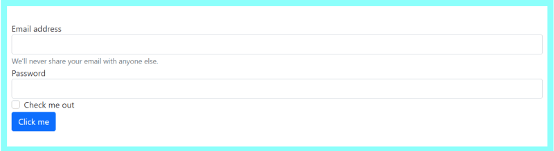
Here is an example of a simple Bootstrap form:
<form>
  <div class="form-group">
    <label for="exampleInputEmail1">Email address</label>
    <input type="email" class="form-control" id="exampleInputEmail1" aria-describedby="emailHelp">
    <small id="emailHelp" class="form-text text-muted">We'll never share your email with anyone else.</small>
  </div>
  <div class="form-group">
    <label for="exampleInputPassword1">Password</label>
    <input type="password" class="form-control" id="exampleInputPassword1">
  </div>
  <div class="form-group form-check">
    <input type="checkbox" class="form-check-input" id="exampleCheck1">
    <label class="form-check-label" for="exampleCheck1">Check me out</label>
  </div>
  <button type="submit" class="btn btn-primary">Submit</button>
</form>
This form consists of three form controls: an email input, a password input, and a checkbox. Each form control is wrapped in a form-group element and styled with the form-control class. The checkbox is styled with the form-check and form-check-input classes, and its label is styled with the form-check-label class. Finally, a submit button is included to allow the user to submit the form.
More information about Bootstrap Form can be found on the official Bootstrap Form documentation.
Input Groups
Bootstrap input groups are a component of the Bootstrap framework that allows you to group and align input fields and buttons together. They are used to add icons, buttons, or text to an input element. They are useful for creating search boxes, login forms, and other types of user input fields.
To create an input group with Bootstrap, you can use the .input-group class on a div element that wraps the input field and any additional elements you want to include in the group.
-
input-group: This class is used to wrap the input element and any associated icons, buttons, or text. -
input-group-prependandinput-group-append: These classes are used to add icons, buttons, or text before or after the input element. -
input-group-text: This class is used to style the text within an input group. -
input-group-lgandinput-group-sm: These classes are used to increase or decrease the size of the input group.
Example Usage of Bootstrap Input Group
<div class="input-group">
  <div class="input-group-prepend">
    <span class="input-group-text" id="basic-addon1">@</span>
  </div>
  <input type="text" class="form-control" placeholder="Username" aria-label="Username" aria-describedby="basic-addon1">
</div>
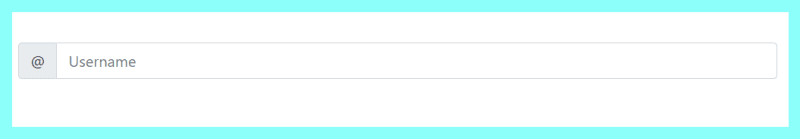
In this example, an input group is created with a span element containing the text "@" before the input element. The span element is styled with the input-group-text class, and the input element is styled with the form-control class.
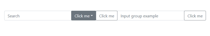
You can also add buttons to an input group using the input-group-prepend and input-group-append classes. For example:
<div class="input-group">
  <div class="input-group-prepend">
    <button class="btn btn-primary" type="button">Button</button>
  </div>
  <input type="text" class="form-control" placeholder="Input group example" />
</div>

In this example, a button is added before and after the input element. The buttons are styled with the btn and btn-outline-secondary classes.
You can also use input groups to add dropdown menus to your input fields. You can use the .input-group-append class to add a div element with the .input-group-btn and .dropdown classes. Inside the div, you can add a button element with the .btn and .btn-secondary classes, and a .dropdown-menu element to contain the dropdown menu items. For example:
<div class="input-group">
  <input type="text" class="form-control" placeholder="Search" aria-label="Search" aria-describedby="basic-addon3">
  <div class="input-group-append">
    <div class="input-group-btn dropdown">
      <button class="btn btn-secondary dropdown-toggle" type="button" data-toggle="dropdown" aria-haspopup="true" aria-expanded="false">Options</button>
      <div class="dropdown-menu">
        <a class="dropdown-item" href="#">Option 1</a>
        <a class="dropdown-item" href="#">Option 2</a>
        <a class="dropdown-item" href="#">Option 3</a>
      </div>
    </div>
  </div>
Alerts
Bootstrap alerts allow you to display messages to your users such as information, warnings, or tips. They are often used to inform users about important information, errors, or success messages, and can be easily integrated into your web pages.
To create a Bootstrap alert, you can use the .alert class on a div element. You can also use one of the contextual classes, such as .alert .alert-primary, .alert .alert-secondary, .alert .alert-success, .alert .alert-danger, .alert .alert-warning, .alert .alert-info, or .alert .alert-light, .alert .alert-dark, .alert .alert-link, .alert .alert-dismissible, .alert .alert-heading to specify the color of the alert.
An example could be:
<div class="alert alert-success text-success" role="alert">
  <strong>Congratulations!</strong> You have successfully read this important article from Berline.
</div>
This creates an alert with a green background and the text "Congratulations! You have successfully read this important article from Berline."
You can also use the .alert-dismissible class to add a dismiss button to your alert. This allows your users to close the alert by clicking the close button. To do this, you can add a button element with the .close class inside the div element like so:
Example Usage of Bootstrap Alert
<div class="alert alert-warning alert-dismissible fade show" role="alert">
    <strong>Warning!</strong> Please read the terms and conditions before
    proceeding
    <button
      type="button"
      class="close text-success"
      data-dismiss="alert"
      aria-label="Close"
    >
      <span aria-hidden="true">×</span>
    </button>
  </div>

This creates an alert with a yellow background and a dismiss button. When the button is clicked, the alert will be dismissed. You can also use the .alert-link class to create a link within an alert. This can be useful for providing additional information or actions to your users. To learn more about Bootstrap Alerts, please read the official documentation here.
Badges
Badges in Bootstrap are small, rectangular components that are used to display small pieces of information, such as numbers or labels. They are often used to highlight new or unread items or to provide additional context for certain content.
To create a Bootstrap badge, you can use the .badge class on a span element. You can also use one of the contextual classes, such as .badge-primary, .badge-secondary, .badge-success, .badge-danger, .badge-warning, .badge-info, or .badge-light, to specify the color of the badge.
Example Usage of Bootstrap Badge
<span class="badge badge-danger">Hot</span>
This creates a badge with a red background and the text "Hot". You can also use the .badge-pill class to create a rounded, pill-shaped badge. For example:
<span class="badge badge-success badge-pill text-success">5</span>

<span class="badge badge-secondary badge-pill text-success">50</span>
Breadcrumbs in Bootstrap
Breadcrumbs in Bootstrap are a navigation aid used to show your user's location within a hierarchy of web pages on your website. They are often displayed as a list of links, with the current page represented as the last item in the list.
In Bootstrap, you can use the .breadcrumb class on a nav element to create breadcrumb navigation. Each page in the hierarchy is represented by a li element with the .breadcrumb-item class, and the current page is indicated by the .active class. They provide a backlink to each previous page the user navigates through.
Example Usage of a Breadcrumb
<nav aria-label="breadcrumb">
  <ol class="breadcrumb">
    <li class="breadcrumb-item"><a href="#">Home</a></li>
    <li class="breadcrumb-item breadcrumb-item-before"><a href="#">Blog</a></li>
    <li class="breadcrumb-item breadcrumb-item-after active" aria-current="page">About</li>
  </ol>
</nav>

With Bootstrap breadcrumbs, you can easily add a navigational aid to your web pages to help users understand their location within a hierarchy of pages. For more information, you can refer to the Bootstrap documentation on breadcrumbs.
Bootstrap Cards
Bootstrap Cards are flexible and extensible content containers that can be used to display a wide variety of content, such as images, text, lists, and more. They are a popular design element in modern user interfaces and can be easily created with the Bootstrap card.
Bootstrap Card is used to create responsive content on your website. It comes in handy when aligning articles among others on a blog page. The building block of a card is the card-body and card. The card header bottom provides a header to the cards and the card footer provides a footer to the cards.
<div class="card d-lg-inline-flex">
  <div class="card-body">
    <h5 class="card-title">Your Card Title</h5>
    <p class="card-text">Your Card content goes here</p>
  </div>
</div>
Bootstrap Carousel
Bootstrap carousel is a component that allows you to create a slideshow of images or other content. It is a popular choice for displaying a large number of images or other media in a visually appealing and organized way.
Once you have the Bootstrap files included in your project, you can use the .carousel class to create a basic carousel. The carousel element should contain a .carousel-inner element, which in turn should contain one or more .carousel-item elements. Each .carousel-item element should contain the content that you want to display in the carousel, such as an image or a block of text.
Example Usage of a Basic Bootstrap Carousel Structure
<div id="myCarousel" class="carousel slide d-lg-inline-flex" data-ride="carousel">
  <div class="carousel-inner d-lg-inline-flex">
    <div class="carousel-item active">
      <img src="https://i.imgur.com/3VP33rK.png" class="d-block w-100" alt="First slide">
      <div class="carousel-caption d-none d-md-block">
        <h5>First slide label</h5>
        <p>Lorem ipsum dolor sit amet, consectetur adipiscing elit.</p>
      </div>
    </div>
    <div class="carousel-item">
      <img src="https://i.imgur.com/3VP33rK.png" class="d-block w-100" alt="Second slide">
      <div class="carousel-caption d-none d-md-block">
        <h5>Second slide label</h5>
        <p>Lorem ipsum dolor sit amet, consectetur adipiscing elit.</p>
      </div>
    </div>
    <div class="carousel-item">
      <img src="https://i.imgur.com/3VP33rK.png" class="d-block w-100" alt="Third slide">
      <div class="carousel-caption d-none d-md-block">
        <h5>Third slide label</h5>
        <p>Lorem ipsum dolor sit amet, consectetur adipiscing elit.</p>
      </div>
    </div>
  </div>
  <a class="carousel-control-prev" href="#myCarousel" role="button" data-slide="prev">
    <span class="carousel-control-prev-icon" aria-hidden="true"></span>
    <span class="sr-only">Previous</span>
  </a>
  <a class="carousel-control-next" href="#myCarousel" role="button" data-slide="next">
    <span class="carousel-control-next-icon" aria-hidden="true"></span>
    <span class="sr-only">Next</span>
  </a>
</div>
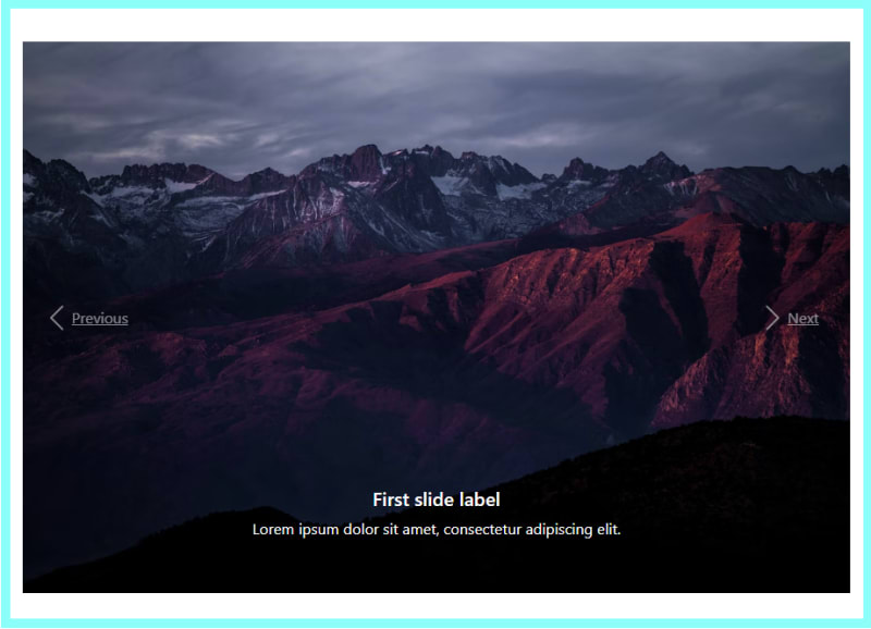
In this example, the carousel has three slides, each containing an image and a caption. The .active class on the first .carousel-item element indicates that this slide should be displayed first.
Conclusion
Bootstrap is a popular front-end framework that provides a set of tools for building responsive, mobile-first websites and web applications. It includes a variety of pre-designed components such as navbars, dropdowns, button groups, buttons, icons, forms, input groups, alerts, badges, breadcrumbs, cards, carousels, and grids. These components can be easily integrated into a website or web application to add functionality and improve the user experience.

Top comments (0)
Some comments may only be visible to logged-in visitors. Sign in to view all comments. Some comments have been hidden by the post's author - find out more