
The CSS clamp() function is a small and maybe a bit unknown function, but I think it's pretty awesome. It works by clamping a value between an upper and lower range.
It can be used for various things such as border size or padding values, but so far I have only used it for font sizes.
The usual way to create fluid typography involves playing around with different calculations around the viewport size and for some reason, I have never liked doing it that way. The clamp() however, has nice readability and it's easy to control.
Here's a small snippet of using clamp():
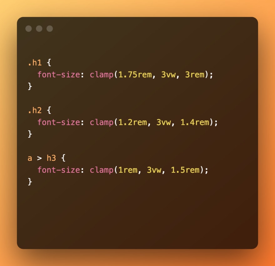
As you can see, it takes three values. Those values are:
- A minimum value
- A preferred value
- A maximum value
In the snippet above, I set the minimum size as 1.75rem and the maximum size as 3rem for the h1. For h2 we have 1.2rem and 1.4rem, and the h3 has 1rem and 1.5rem.
Here's the result, when used in the front page of dev.to:
Mobile:

Desktop:

Cool and easy, huh? No need for complex calculations or media queries.
You can play around with the middle value (preferred size), as it controls the fluidity. You can use vw units that allow the font to scale with the size of the display but stay within your ranges.
Follow me on Twitter for more: https://twitter.com/bjakyt

Top comments (0)