
Written by Peter Ekene Eze✏️
In React, a reusable component is a piece of UI that can be used in various parts of an application to build more than one UI instance. For instance, we can have a button component display with different colors in several parts of our application. Although it is the same button component when we provide it with a dataset (e.g color, or a function), it modifies itself and outputs a UI instance of the element.
This pattern of creating React components is necessary for scaling. It helps save time by ensuring less code is written, development is faster, the codebase is simpler, and maintenance is stress-free.
In this tutorial, we will build reusable React components that can be used throughout your projects to maintain consistency in logic and presentation. We’ll use Hooks for managing and manipulating state data.
This post assumes you that you have a basic understanding of React. If you don’t have any experience using React, you can refer to the documentation here to get started. All the examples used in this project is available on this sandbox.

Getting started
In this part of the tutorial, we will create various HTML elements as reusable components. We’ll be using CodeSandbox. You can create a new sandbox here to get started.
Input component
One advantage of creating a reusable input component is that you maintain the appearance of the input in various parts of your application. You can also determine what type of input component should be rendered (text, email, etc) by passing it a prop. Although we won’t go deep into styling in this tutorial, you can customize your components to suit your visual needs.
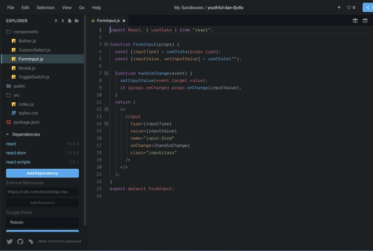
In your newly created sandbox project, create a components folder with a FormInput.js file and add the following code to it:
// ./components/FormInput.js
import React, {useState} from "react";

function FormInput(props) {
  const [inputType] = useState(props.type)
  const [inputValue, setInputValue] = useState('')

  function handleChange(event){
    setInputValue(event.target.value);
    if(props.onChange) props.onChange(inputValue)
  }
  return (
    <>
      <input type={inputType} value={inputValue} name="input-form" onChange={handleChange} class="inputclass"/>
    </>
  );
}
export default TextInput;
For a component to be reusable, it has to take in data or data sets (via props) and return an output (usually through a function passed via props). It is recommended that mutable state should be kept in the state property of a component to ensure they work correctly.
The FormInput() component above receives an input type to determine what type of input element to render (email, text, etc). It also takes in a method onChange() to receive the value sent back out from the input.
The component manages its value locally, and only returns the updated state value to the component it is called from.
To achieve this, we created a local function handleChange(). The function checks if a method to receive the state data is available via props then sends the current state data to it for further processing.
Custom select component
In your components folder, create a CustomSelect.js file and add the following code to it:
// ./components/CustomSelect.js
import React, { useState } from "react";
function CustomSelect(props) {
  const [data] = useState(props.data);
  const [selectedData, updateSelectedData] = useState("");
  function handleChange(event) {
    updateSelectedData(event.target.value);
    if (props.onSelectChange) props.onSelectChange(selectedData);
  }
  let options = data.map(data => (
    <option key={data.id} value={data.id}>
      {data.name}
    </option>
  ));
  return (
    <select
      name="customSearch"
      className="custom-search-select"
      onChange={handleChange}
    >
      <option>Select Item</option>
      {options}
    </select>
  );
}
export default CustomSelect;
Above, we receive the data set needed for the options tag in the select element via props. To build the option tags, we looped through the data set via props to construct it before rendering it as part of the select tag.
The state of the tag (the currently selected option) is stored locally and updated and sent back as an output when it changes via our local function handleChange().

Button component
A reusable button can be used to display different color variants or sizes everywhere it is used in your application. In your components folder, create a Button.js file and add the following code to it:
// ./components/Button.js
import React, { useState } from "react";
function Button(props) {
  const [size] = useState(props.size);
  const [variant] = useState(props.variant);
  return (
    <button className={`btn-${variant} btn-${size}`}>{props.children}</button>
  );
}
export default Button;
Our button receives three properties via props. The variant (used to determine the button color), the size (lg, xs, sm) to determine the size of the button. We display the button content dynamically using React’s built-in children property (props.children).

Modal component
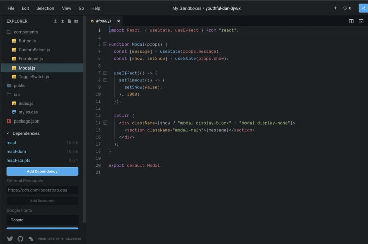
A modal component is suitable for sending alerts in your application. In your components folder, create a Modal.js file and add the following code to it:
// ./components/Modal.js
import React, { useState, useEffect } from "react";
function Modal(props) {
  const [message] = useState(props.message);
  const [show, setShow] = useState(props.show);
  useEffect(() => {
    setTimeout(() => {
      setShow(false);
    }, 3000);
  });
  return (
    <div className={show ? "modal display-block" : "modal display-none"}>
      <section className="modal-main">{message}</section>
    </div>
  );
}
export default Modal;
Our modal component does two things:
- It receives a boolean value that determines if it pops up or not
- It also receives the message to be displayed when it pops up
To close the modal, we’d need to set the show state to false. We can do that by calling a setTimeout() function in the useEffect() hook after a few seconds.
Toggle component
A toggle component is used in situations where a true or false answer is necessary. It is an essential form component.
In your components folder, create a ToggleSwitch.js file and add the following code to it:
// ./components/ToggleSwitch.js
import React, { useState } from "react";
function ToggleSwitch(props) {
  const [checked, setChecked] = useState(props.defaultChecked);
  const [Text] = useState(props.Text);
  function onChange(e) {
    setChecked(e.target.value);
    if (props.onToggleChange) props.onToggleChange(checked);
  }
  return (
    <div className={"toggle toggle-switch"}>
      <input
        type="checkbox"
        name={props.Name}
        className="toggle-switch-checkbox"
        id={props.id}
        defaultChecked={checked}
        onChange={onChange}
      />
      {props.id ? (
        <label className="toggle-switch-label" htmlFor={props.id}>
          <span
            className={
              props.disabled
                ? "toggle-switch-inner toggle-switch-disabled"
                : "toggle-switch-inner"
            }
            data-yes={Text[0]}
            data-no={Text[1]}
          />
          <span
            className={
              props.disabled
                ? "toggle-switch-switch toggle-switch-disabled"
                : "toggle-switch-switch"
            }
          />
        </label>
      ) : null}
    </div>
  );
}
export default ToggleSwitch;
Our toggle component receives the following props:
- ID (required): this is the ID that’s going to be passed to the checkbox input control. Without this, the component won’t render
- Text (required): The Toggle Switch contains an array of two values, which signify the text for True and False
- Name (optional): this will be label text of the checkbox input
- onChange (optional): this will used to receive the returned data from the components
- Checked (optional): this will be directly passed to the element to get its current state
- Disabled (optional): this will be be used to set the state of the button
When it changes, we update the state and send the value to the event listener sent via props from the parent component.

Using the components
To use the components we just created, we need to render them from a parent component and pass the relevant data to them. Add the following to your index.js:
// ./index.js
import React, { useState } from "react";
import ReactDOM from "react-dom";
import FormInput from "../components/FormInput.js";
import CustomSelect from "../components/CustomSelect.js";
import ToggleSwitch from "../components/ToggleSwitch.js";
import Button from "../components/Button.js";
import Modal from "../components/Modal.js";
import "./styles.css";
function App() {
  const data = [
    {
      id: "1",
      name: "One"
    },
    {
      id: "2",
      name: "Two"
    },
    {
      id: "3",
      name: "Three"
    },
    {
      id: "4",
      name: "Four"
    }
  ];
  function handleChange(event) {
    console.log(event.target.value);
  }
  function onSelectChange(event) {
    console.log(event.target.value);
  }
  function onToggleChange(event) {
    console.log(event.target.checked);
  }
  return (
    <div className="App">
      <form>
        <Modal show={true} message={"Hello"}>
          <p>THIS IS A MODAL</p>
        </Modal>
        <FormInput type={"text"} onChange={handleChange} />
        <FormInput type={"email"} onChange={handleChange} />
        <div>
          <CustomSelect data={data} onSelectChange={onSelectChange} />
        </div>
        <div>
          <ToggleSwitch
            id="id"
            defaultChecked={false}
            disabled={false}
            Text={["Yes", "No"]}
            onToggleChange={onToggleChange}
          />
        </div>
        <Button variant="danger" size={"sm"} >Small Button</Button>
        <Button variant="primary" size={"lg"} >Smaller Button</Button>
        <Button variant="warning" size={"xs"} >Big Button</Button>
      </form>
    </div>
  );
}
const rootElement = document.getElementById("root");
ReactDOM.render(<App />, rootElement);
And you should see the following:
Conclusion
In this tutorial, we learned how to create reusable React components. This knowledge can be applied to create highly scalable and consistent React applications. We also worked with Hooks to manage and manipulate state data. You can find all the code samples used in this post in the this CodeSandbox project.
To read more about Hooks and React components check out the docs here.
Editor's note: Seeing something wrong with this post? You can find the correct version here.
Plug: LogRocket, a DVR for web apps

LogRocket is a frontend logging tool that lets you replay problems as if they happened in your own browser. Instead of guessing why errors happen, or asking users for screenshots and log dumps, LogRocket lets you replay the session to quickly understand what went wrong. It works perfectly with any app, regardless of framework, and has plugins to log additional context from Redux, Vuex, and @ngrx/store.
In addition to logging Redux actions and state, LogRocket records console logs, JavaScript errors, stacktraces, network requests/responses with headers + bodies, browser metadata, and custom logs. It also instruments the DOM to record the HTML and CSS on the page, recreating pixel-perfect videos of even the most complex single-page apps.
Try it for free.
The post Building reusable UI components with React Hooks appeared first on LogRocket Blog.

Top comments (0)