
Written by Vlado Tesanovic✏️
Stencil is a compiler for generating web components developed by the Ionic team. Web components in Stencil can be used as standalone components, as a part of a Stencil web application, and as part of Ionic progressive web applications.
According to the Ionic team, Stencil should not be called a framework, but it looks like a framework to me.
A web component (in case you missed it) is nothing more than a custom HTML tag () packed with additional logic written in JavaScript.
Components in Stencil are written in TypeScript and then compiled into various versions of JavaScript. Various bundles produced by a compiler are meant to be used in different scenarios. Everything is covered, from older browsers with polyfills to the newer ones with all of the shiny JavaScript features included. It is the same as Differential Loading in Angular.
Stencil looks like a mixture of React and Angular. Developers from both teams will find many familiar concepts and keywords, and because of that, learning Stencil should be easy-peasy.
In this introductory example, we can spot a component decorator with a render method using JSX.
import { Component, Prop, h } from '@stencil/core';

@Component({
  tag: 'my-first-component',
})
export class MyComponent {

  // Indicate that name should be a public property on the component
  @Prop() name: string;

  render() {
    return (
      <p>
        My name is {this.name}
      </p>
    );
  }
}
And the Prop is similar to the Input tag in Angular.
Stencil:
- Can be combined with all major front-end frameworks, as well as with other JavaScript libraries or with no library at all
- It does not require run-time (like Angular, React, Vue…). A produced JavaScript bundle is all that is needed in order for it to be used
- It is fully aligned with the implementation of Custom Elements v1
- Production bundle size start from ~100 kb and with polyfills ~133 kb (we can gzip it)

Browser support
In general, web components (and Stencil) are supported across all major browsers. They’re only not supported by Edge versions from 12 to 18 (that is before the WebKit implementation). Anyway, it is only 2% of all used browsers in the world.
The main user of Stencil is Ionic framework and all it’s UI components are built using Stencil. Go through a few of them, from the previous link, see how they did it. Reading quality code can be a great way to learn.
Getting started
Stencil provides great tooling out of the box. It comes with an integrated development server, a generator for components, a compiler for all sorts of bundles, a doc generator, and a testing suite.
Prerequisites
We have to install the latest LTS version of Node and NPM in order to work with it. You should validate what you have first with:
node -v
npm -v
Ensure that we have Node.js ≥ 12 and NPM version ≥ 6.
We have to install Stencil as a global package:
npm install -g stencil
Extensions of components are TSX because it uses JSX as a templating language.
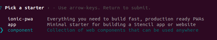
Now, if we want to generate our project, we will have to use an interactive wizard provided by Stencil trough NPM init:
npm init stencil
To demonstrate its usage, let’s build a simple cryptocurrency widget.
We want to build a reusable component so we will choose the third option, component.
And after a few seconds you should see:

Creating a component
First, we will remove the generated component my-component from the code. Feel free to delete it.
After, using npm run generate , we will generate our first component:
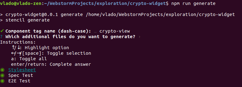
It’s important that our component has a name with a dash. In our case, it is crypto-view. This will be the name of our custom HTML tag .
Manually, we have to replace references from my-component to crypto-view in src/index.html in order to get the development server working again:
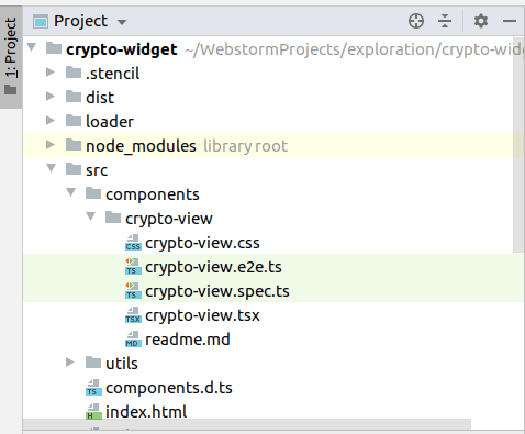
This is what our generated component looks like:
import { Component, Host, h } from '@stencil/core';

@Component({
  tag: 'crypto-view',
  styleUrl: 'crypto-view.css',
  shadow: true
})
export class CryptoView {

  render() {
    return (
      <Host>
        <slot></slot>
      </Host>
    );
  }

}
Immediately we can spot in our @Component decorator setting shadow: true. It’s very important that our main (entry ) component has this setting. Basically, it means that this element will be isolated from the rest of the DOM in our page with the shadow root:
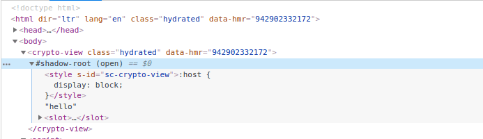
It further means that styles defined in crypto-view.css will not be applied to any element outside of the crypto-view component.
In the render method we have:
render() {
  return (
    <Host>
      <slot></slot>
    </Host>
  );
}
Host, as its name implies, refers to a host component. In our case, it is the element. Check out this quick example:
render() {
  return (
    <Host class={'hello'}>
      <slot></slot>
    </Host>
  );
}
This will append class hello on crptyo-view component.

In JSX we must have root (wrapping ) element. By default, it is Host in Stencil, but it can be DIV as well.
Among Host, we have slot. If you are coming from the Angular ecosystem, slot is ng-content. It will project any content passed between … tags. We can pass HTML, child components or text, and it will be projected on the place we define .
We can have multiple slots as well, take a look at this example:
<ui-component>
  <p slot='my-title'>Title</p>
  <p slot='my-description'>Description</p>
</ui-component>
It can be rendered using the name attribute in slot:
render () {
  return (<div>
    <slot name='my-title' />
    <slot name='my-description' />
  </div>)
}
CSS
Now let’s open the CSS file crypto-view.css:
:host {
  display: block;
}
We will see that only :host is defined. Similar to the Host element in JSX code, :host refers to a host component , which has default display: block. Note that the majority of elements in HTML have display: block. Now when this is set, we can apply any CSS style to a host element through :host directive.
Props (attributes)
As we have to fetch crypto data from somewhere, we will use API from cryptocompare.com as it offers usage with free API Key.
The first prop that we will define will be apiKey. Prop names with camel case resolve to two words with a dash in between, because camel case is not supported in HTML, while in JSX it is supported.

And in our component:
import { Component, Host, h, Prop } from '@stencil/core';

@Component({
  tag: 'crypto-view',
  styleUrl: 'crypto-view.css',
  shadow: true
})
export class CryptoView {

  /**
   * Valid API key obtained from cryptocompare.com
   */
  @Prop() apiKey: string;

  componentDidLoad() {
    console.log(this.apiKey);
  }

  render() {
    return (
      <Host>
        <slot></slot>
      </Host>
    );
  }

}
Lifecycle methods (Hooks)
Notice the componentDidLoad function, and console.log in it. If we run the application now, we will see our apiKey logged in the console.
Class method componentDidLoad is a lifecycle hook. Which means that it is triggered at a defined point in the life of the component. Developers from a React background will recognize the name.
Here are some commonly used Hooks ( lifecycle methods in Stencil ):
- componentWillLoad() is triggered before rendering
- componentDidLoad() is triggered after rendering ( inserting into the DOM)
- componentWillUpdate() is triggered before updating
- componentDidUpdate() is triggered after updating
- componentDidUnload() is triggered after unmounting ( removing from the DOM)
We can find the full list and explanation on Stencil doc page for Lifecycle Methods.
In our case, as the apiKey is not asynchronously set we can use the componentDidLoad Hook to get its value and call the API. Note that componentDidLoad is called only once, while some lifecycle methods can be called multiple times.
We will create, in src/utils/utils.ts , the function getCryptoData which will fetch the latest price in USD and EUR for Bitcoin, Etherum, and Ripple.
import { CryptoInterface } from '../components/crypto-view/crypto.interface';

export function getCryptoData(apiKey: string): Promise<CryptoInterface> {
  return fetch(`https://min-api.cryptocompare.com/data/pricemulti?fsyms=BTC,ETH,XRP&tsyms=USD,EUR&api_key=${apiKey}`)
    .then(response => response.json());
}
The response from the API is mapped to the interface in order to get typing support from the IDE ( in my case it is WebStrom).
export interface CryptoInterface {
  BTC: IPrices;
  ETH: IPrices;
  XRP: IPrices;
}

interface IPrices {
  USD: number;
  EUR: number;
}
State
Response from the server is stored in the variable cryptoData which is decorated by @State.
import { Component, Host, h, Prop, State } from '@stencil/core';
import { getCryptoData } from '../../utils/utils';
import { CryptoInterface } from './crypto.interface';

@Component({
  tag: 'crypto-view',
  styleUrl: 'crypto-view.css',
  shadow: true
})
export class CryptoView {

  /**
   * Valid API key obtained from cryptocompare.com
   */
  @Prop() apiKey: string;

  @State() cryptoData: CryptoInterface;

  componentDidLoad() {
    getCryptoData(this.apiKey).then((data) => {
      this.cryptoData = data;
    });
  }

  render() {
    return (
      <Host>
        <slot></slot>
      </Host>
    );
  }

}
Each change on a variable is annotated with the decorator State which will trigger the re-rendering of the component. It is the same as in React. In Angular, it is a different (and much longer) story.
In React, setting state is done with the internal method setState, which is equal to assigning value to the cryptoData variable in Stencil ( it is not a normal variable, it is state variable ).
In our case, we asynchronously get crypto data, and upon receiving it in the component, we assign it to the state variable cryptoData.
To present data, we will create another component called crypto-table:

The crpyto table is a presentational component. Such a component only receives things through props and displays them into JSX. No internal state, no local computations and etc.
It looks like this:
import { Component, Host, h, Prop } from '@stencil/core';

import { CryptoInterface } from '../crypto-view/crypto.interface';

@Component({
  tag: 'crypto-table',
  styleUrl: 'crypto-table.css',
  shadow: false,
  scoped: true
})
export class CryptoTable {

  @Prop() cryptoData: CryptoInterface;
  @Prop() cryptoCurrencies: string[];

  render() {
    return (
      <Host>
        <table class={'crypto'}>
          <tr>
            <td></td>
            <td>USD</td>
            <td>EUR</td>
          </tr>
          {this.cryptoCurrencies.map((item) => {
            return this.cryptoData && item in this.cryptoData ? <tr>
              <td>{item}</td>
              <td>{this.cryptoData[item].USD}</td>
              <td>{this.cryptoData[item].EUR}</td>
            </tr> : null
          })}
        </table>
      </Host>
    );
  }

}
Now, if you are familiar with React, Stencil uses JSX and the same principles for displaying data. If you come from Angular, forget about ngIf and ngFor directives, get used to JSX as soon as possible.
In this component, we will set shadow to false, as we don’t need to isolate this component further in the DOM. The new setting here is scoped: true, which adds additional CSS classes to each element in this component ( cs-crypto-table ):

A combination of scoped and shadow attributes in the component decorator from Stencil are similar to ViewEncapsulation in Angular.
For creating dumb ( presentational ) components, we can useFunctional Components approach. They are arrow functions that accept props as a parameter and return JSX.
In the CryptoView component we will inject CryptoTable and pass data through props bindings:
import { Component, Host, h, Prop, State } from '@stencil/core';
import { getCryptoData } from '../../utils/utils';
import { CryptoInterface } from './crypto.interface';

@Component({
  tag: 'crypto-view',
  styleUrl: 'crypto-view.css',
  shadow: true
})
export class CryptoView {

  /**
   * Valid API key obtained from cryptocompare.com
   */
  @Prop() apiKey: string;

  @State() cryptoData: CryptoInterface;

  cryptoCurrencies = ['BTC', 'ETH', 'XRP'];

  componentDidLoad() {
    getCryptoData(this.apiKey).then((data) => {
      this.cryptoData = data;
    });
  }

  render() {
    return (
      <Host>
        <b>Crypto data on date: {new Date().toLocaleDateString()}</b>
        <crypto-table cryptoData={this.cryptoData} cryptoCurrencies={this.cryptoCurrencies} />
        <slot></slot>
      </Host>
    );
  }

}
Note that we didn’t have to import CryptoTable anywhere, that is all done by the Stencil compiler.
I grabbed CSS from W3school, and our crypto table looks something like this: 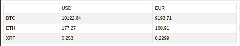
Methods
If we imagine a scenario where the host application wants to refresh crypto data in our component. We must somehow expose method which will trigger re-fetching crypto data.
Stencil introduced the Method decorator for that purpose:
@Method()
async refreshCryptoData() {
  getCryptoData(this.apiKey).then((data) => {
    this.cryptoData = data;
  });
}
The exposed class method must be marked as an async function. It is a requirement by Stencil.
Now, in index.html we can call it with:
<!DOCTYPE html>
<html dir="ltr" lang="en">
<head>
  <meta charset="utf-8">
  <meta name="viewport" content="width=device-width, initial-scale=1.0, minimum-scale=1.0, maximum-scale=5.0">
  <title>Stencil Component Starter</title>

  <script type="module" src="/build/crypto-widget.esm.js"></script>
  <script nomodule src="/build/crypto-widget.js"></script>

</head>
<body>
    <crypto-view api-key="fd937be4428d64cf4dd1b51146aef28e46d224aea7ea5bdfbbb6d296a05ec1a9"></crypto-view>

    <script>
        document.addEventListener('DOMContentLoaded', (event) => {
            const cryptoView = document.querySelector('crypto-view');
            setTimeout(() => {
                cryptoView.refreshCryptoData();
            }, 2000);
        })
    </script>
</body>
For the sake of the demo, we are waiting for two seconds and then calling method to refresh crypto data in our component.
Events
In Stencil, events are similar to Output in Angular where child component can emit something, and parent component can catch that. Events are used to push data from child components to parent components. That is similar to what we do every day in Angular and React.
There are two ways of catching events. One with an attribute on the component and the second one with Listen decorator.
First, let’s try to notify the parent component from the child component:

Here is the code:
import { Component, Host, Event, h, EventEmitter } from '@stencil/core';

@Component({
  tag: 'crypto-refresher',
  styleUrl: 'crypto-refresher.css',
})
export class CryptoRefresher {

  @Event() refreshCryptoData: EventEmitter;

  refresh() {
    this.refreshCryptoData.emit(true);
  }

  render() {
    return (
      <Host>
        <button onClick={() => this.refresh()}>Refresh Crypto Data</button>
      </Host>
    );
  }

}
Our refreshCryptoData is decorated with the Event decorator ( don’t forget to import it from @stencil/core ) and then emitted upon clicking on the button.
import { Component, Host, h, Prop, State, Method, Listen } from '@stencil/core';
import { getCryptoData } from '../../utils/utils';
import { CryptoInterface } from './crypto.interface';

@Component({
  tag: 'crypto-view',
  styleUrl: 'crypto-view.css',
  shadow: true
})
export class CryptoView {

  /**
   * Valid API key obtained from cryptocompare.com
   */
  @Prop() apikey: string;

  @State() cryptoData: CryptoInterface;

  cryptoCurrencies = ['BTC', 'ETH', 'XRP'];

  componentDidLoad() {
    this.fetchData();
  }

  fetchData() {
    getCryptoData(this.apikey).then((data) => {
      this.cryptoData = data;
    });
  }

  @Method()
  async refreshCryptoData() {
    this.fetchData();
  }

  @Listen('refreshCryptoData')
  listen(event) {
    console.log(event)
  }

  render() {
    return (
      <Host>
        <b>Crypto data on date: {new Date().toLocaleDateString()}</b>
        <crypto-table cryptoData={this.cryptoData} cryptoCurrencies={this.cryptoCurrencies} />
        <crypto-refresher onRefreshCryptoData={() => this.fetchData()} />
        <slot></slot>
      </Host>
    );
  }

}
Notice that we use the shortened version of invoking component , it is the preferred way as we don’t project any data into it.
Let’s catch this event with an attribute on the component first.
In Stencil, we should name the attribute which catches our event with the prefix on. If our event is called, the attribute for catching it is onRefreshCryptoData. In our case, onRefreshCryptoData is an arrow function that will call the fetchData method.
In case we pass some data with the Event, we will have that data in arrow function parameters.
The second way to catch events is with the Listen decorator. It accepts the name of event as a parameter and calls the function bellow after catching it. The Listen decorator is handy when it comes to listening on system events like resize, scroll, etc. It is similar to HostListener in Angular.
Watch (reactivity)
Now, if want to listen on Props changes and call other methods or compute other things upon it, we have to use the Watch decorator.
If we, for example, want to compute the sum of prices in the crytpo table component and present that, we will have to wait for cryptoData to be fetched and passed, then compute the sum.
import { Component, Host, h, Prop, Watch, State } from '@stencil/core';

import { CryptoInterface } from '../crypto-view/crypto.interface';

@Component({
  tag: 'crypto-table',
  styleUrl: 'crypto-table.css',
  shadow: false,
  scoped: true
})
export class CryptoTable {

  @Prop() cryptoData: CryptoInterface;
  @Prop() cryptoCurrencies: string[];

  @State() sum: { USD: number, EUR: number };

  @Watch('cryptoData')
  watching(cryptoData: CryptoInterface) {
    this.sum = {
      USD: Math.round(cryptoData.BTC.USD + cryptoData.ETH.USD + cryptoData.XRP.USD),
      EUR: Math.round(cryptoData.BTC.EUR + cryptoData.ETH.EUR + cryptoData.XRP.EUR),
    }
  }

  render() {
    return (
      <Host>
        <table class={'crypto'}>
          <tr>
            <td></td>
            <td>USD</td>
            <td>EUR</td>
          </tr>
          {this.cryptoCurrencies.map((item) => {
            return this.cryptoData && item in this.cryptoData ? <tr>
              <td>{item}</td>
              <td>{this.cryptoData[item].USD}</td>
              <td>{this.cryptoData[item].EUR}</td>
            </tr> : null
          })}
          {this.sum ?
          <tr>
            <td></td>
            <td>{this.sum.USD}</td>
            <td>{this.sum.EUR}</td>
          </tr> : null }
        </table>
      </Host>
    );
  }

}
In the example above, each time cryptoData is changed, the component will calculate the sum of all currencies.
Building and using
In order to build this project and produce shareable bundles, we have to run
npm run build
The build will produce a dist folder and crypto-widget folder inside of it.

It’s safe to grab this folder and copy it to a place where we want to include our component.
In HTML it is enough to include two files, first one is crypto-widget.js, it is an es5 bundle (with polyfills) meant to be used in older browsers (IE 11).
The second one is crypto-widget.esm.js, it comes with all new JavaScript features like code-splitting, async-await, etc.
<script type="module" src="/build/crypto-widget.esm.js"></script>
<script nomodule src="/build/crypto-widget.js"></script>
Browsers are smart today, and they will load only what they need.
Conclusion
Stencil is a great library. It is well developed, well documented, battle-tested, backed by a big company, aligned with standards, and is very easy to learn.
Use cases for Stencil include:
- Creating design systems for large projects and organizations ( shareable UI components )
- Creating portable parts of applications that can be shared and used in many different places. ( viewers, widgets, integrations, etc. )
You can find the GitHub repo for this project here.
Happy coding!
Editor's note: Seeing something wrong with this post? You can find the correct version here.
Plug: LogRocket, a DVR for web apps

LogRocket is a frontend logging tool that lets you replay problems as if they happened in your own browser. Instead of guessing why errors happen, or asking users for screenshots and log dumps, LogRocket lets you replay the session to quickly understand what went wrong. It works perfectly with any app, regardless of framework, and has plugins to log additional context from Redux, Vuex, and @ngrx/store.
In addition to logging Redux actions and state, LogRocket records console logs, JavaScript errors, stacktraces, network requests/responses with headers + bodies, browser metadata, and custom logs. It also instruments the DOM to record the HTML and CSS on the page, recreating pixel-perfect videos of even the most complex single-page apps.
Try it for free.
The post Building reusable web components with Stencil.js appeared first on LogRocket Blog.

Top comments (1)
Thanks For Sharing This