
Written by Raymond Camden✏️
When it comes to client-side charting libraries, developers have a wealth of options — some free, some paid, some focused on specific types of charts, and some with numerous different types.
I’d like to share my experience working with a few different chart engines and my favorite frontend framework, Vue.js. But before we dive in, let’s establish some ground rules:
- For all the libraries, I’ll use the same set of JSON data. This will be “imaginative” data from a blog stats engine. I’m curious how much each chart solution will make me change my data to work properly.
- For all the libraries I’m going to build — or attempt to build — I’ll use the same set of charts: a line chart, a bar chart with two sets of data, and a pie chart.
- While not a deal-breaker, I want to see which projects will let me work with “non-Vue applications” — that’s my awkward way of describing support for folks who use Vue to progressively enhance a simple HTML page as opposed to building an entire application. It’s something of a pet peeve of mine; since Vue supports both scenarios, I like my code to support both as well.
The data
To support my three charts, I have a JSONBin.io endpoint at https://api.jsonbin.io/b/5e2b4f673d75894195de48ff/1 that looks like this:
{
  "pageViews": [
    { "date": "Jan2019", "views": 39101 },
    { "date": "Feb2019", "views": 42983 },
    { "date": "Mar2019", "views": 58741 },
    { "date": "Apr2019", "views": 48071 },
    { "date": "May2019", "views": 46391 },
    { "date": "Jun2019", "views": 62001 },
    { "date": "Jul2019", "views": 61829 },
    { "date": "Aug2019", "views": 22412 },
    { "date": "Sep2019", "views": 78547 },
    { "date": "Oct2019", "views": 72190 },
    { "date": "Nov2019", "views": 53291 },
    { "date": "Dec2019", "views": 69341 }
  ],
  "pageViewsByCategory": {
    "vue": 51290,
    "javascript": 89125,
    "movies": 10892,
    "music": 7901,
    "cats": 49901
  },
  "newVsReturning": [
    { "date": "Jul2019", "new": 1543, "old": 581 },
    { "date": "Aug2019", "new": 4713, "old": 374 },
    { "date": "Sep2019", "new": 6531, "old": 475 },
    { "date": "Oct2019", "new": 8031, "old": 913 },
    { "date": "Nov2019", "new": 6725, "old": 1032 },
    { "date": "Dec2019", "new": 4781, "old": 731 }
  ]
}
The first set of data represents 12 months of page views on a blog. This will be displayed in a line graph. The second set includes stats about page views for unique categories. I’ll use a pie chart for this.
Finally, there is a set of stats that represent whether or not a visitor is new or returning to the blog. For that, I’ll create a stacked bar chart in which each bar displays both values so you can compare and see the change over time. If stacking the bars proves difficult, two bars next to each other will do the trick, as long as you can still tell what you’re looking at.
Let’s look at some examples.

vue-chartjs
vue-chartjs is a wrapper for the Chart.js project. Chart.js is a powerful and beautiful charting library that includes myriad chart types — more than enough to satisfy my requirements for this project.
Installation supports both app- and script-based support, which covers all the bases. But because of how it works, my gut tells me this project will be much more appropriate for Vue apps than in script-based scenarios.
The library, at its core, doesn’t do a whole lot out of the box. The docs make this clear:
The idea behind vue-chartjs is to provide easy to use components, with maximum flexibility and extensibility. To achieve this, you need to create your own Chart Component and extend it with the provided vue-chartjs components.
So whereas I went into this thinking I’d simply drop a <pie> tag into my code, vue-chartjs requires you to build your own component first.
That isn’t necessarily a bad thing; it enforces a level of flexibility that you’ll appreciate later. But in my case, I had to take some extra time to figure things out.
I also had some difficulty determining what to pass. Since the library provides a minimal set of features out of the box, you need to know more about how Chart.js works. Again, I’m not saying this is bad, but if I had known this, I would have spent more time in Chart.js by itself first before looking at the library. I also wish the vue-chartjs docs included more complete demos.
As an example, the “Creating your first Chart” section of the docs doesn’t actually tell you everything you need to know. I would have provided more context and sample code here, ideally leading to a CodePen or CodeSandbox demo that users could run. Again, if you already know Chart.js, then this won’t be a problem. But it was for me.
Having said that, once I got past the initial learning hump, I was pretty darn impressed. Let’s look at the code I built.
First, the top-level component is responsible for getting my data and then using the components I built for my charts. Here’s the simple layout:
><template>
  <div id="app">
    <h2>Page Views</h2>
    <LineChart v-if="loaded" :data="pageViews" :styles="styles"/>
    <h2>Views by Category</h2>
    <PieChart v-if="loaded" :data="pageViewsByCategory" :styles="styles"/>
    <h2>New vs Returning Visitors</h2>
    <BarChart v-if="loaded" :data="visitors" :styles="styles"/>
  </div>
</template>
Each chart component is passed the data it needs and a consistent set of styles, and it will be displayed after my data is loaded.
Here’s the JavaScript code:
import LineChart from "./components/LineChart";
import PieChart from "./components/PieChart";
import BarChart from "./components/BarChart";

export default {
  name: "App",
  components: {
    LineChart,
    PieChart,
    BarChart
  },
  data() {
    return {
      loaded: false,
      pageViews: null,
      pageViewsByCategory: null,
      visitors: null,
      styles: {
        width: "650px",
        height: "400px",
        position: "relative"
      }
    };
  },
  async created() {
    let resp = await fetch(
      "https://api.jsonbin.io/b/5e2b4f673d75894195de48ff/1"
    );
    let data = await resp.json();
    this.pageViews = data.pageViews;
    this.pageViewsByCategory = data.pageViewsByCategory;
    this.visitors = data.newVsReturning;
    this.loaded = true;
  }
};
This simply hits the remote API (which is just a hosted JSON packet) and then assigns the resultant data to the appropriate place.
Now let’s look at the chart components.
<script>
import { Line } from "vue-chartjs";

export default {
  extends: Line,
  name: "LineChart",
  props: ["data"],
  mounted() {
    // reformat in the way the lib wants
    let chartData = {
      labels: [],
      datasets: [
        {
          label: "Page Views",
          backgroundColor: "#f87979",
          data: []
        }
      ]
    };

    for (let i = 0; i < this.data.length; i++) {
      chartData.labels.push(this.data[i].date);
      chartData.datasets[0].data.push(this.data[i].views);
    }

    this.renderChart(chartData, {
      responsive: true,
      maintainAspectRatio: false
    });
  }
};
</script>
Note that there isn’t a <template>. That’s because the component I wrap will handle the layout. My component takes in the original data and reformats it to the form Chart.js needs. To get this working, I consulted the Chart.js docs for each relevant chart type.
That’s basically it. My pie chart simply switched out how it handled the data.
<script>
import { Pie } from "vue-chartjs";

export default {
  extends: Pie,
  name: "PieChart",
  props: ["data"],
  mounted() {
    // color list below came from https://stackoverflow.com/a/45489530/52160
    // reformat in the way the lib wants
    let chartData = {
      labels: [],
      datasets: [
        {
          label: "Views by Category",
          data: [],
          backgroundColor: [
            "#0074D9",
            "#FF4136",
            "#2ECC40",
            "#FF851B",
            "#7FDBFF",
            "#B10DC9",
            "#FFDC00",
            "#001f3f",
            "#39CCCC",
            "#01FF70",
            "#85144b",
            "#F012BE",
            "#3D9970",
            "#111111",
            "#AAAAAA"
          ]
        }
      ]
    };

    for (let category in this.data) {
      chartData.labels.push(category);
      chartData.datasets[0].data.push(this.data[category]);
    }

    this.renderChart(chartData, {
      responsive: true,
      maintainAspectRatio: false
    });
  }
};
</script>
Note that Chart.js does not provide default coloring out of the box (as far as I know). That meant I needed to provide a list of colors for my chart. It would have been nice if the library had a default set of colors I could apply.
Finally, here’s the bar chart. By default, the chart isn’t stacked, but you can see the options at the bottom to enable that.
<script>
import { Bar } from "vue-chartjs";

export default {
  extends: Bar,
  name: "BarChart",
  props: ["data"],
  mounted() {
    // reformat in the way the lib wants
    let chartData = {
      labels: [],
      datasets: [
        {
          label: "New",
          backgroundColor: "#f87979",
          data: []
        },
        {
          label: "Old",
          backgroundColor: "#c0c0c0",
          data: []
        }
      ]
    };

    for (let i = 0; i < this.data.length; i++) {
      chartData.labels.push(this.data[i].date);
      chartData.datasets[0].data.push(this.data[i].new);
      chartData.datasets[1].data.push(this.data[i].old);
    }

    this.renderChart(chartData, {
      responsive: true,
      maintainAspectRatio: false,
      scales: {
        xAxes: [
          {
            stacked: true
          }
        ],
        yAxes: [
          {
            stacked: true
          }
        ]
      }
    });
  }
};
</script>
We could make all three of these components look nicer. For example, I hardcoded some of the labels.
How do they look? Let’s see:
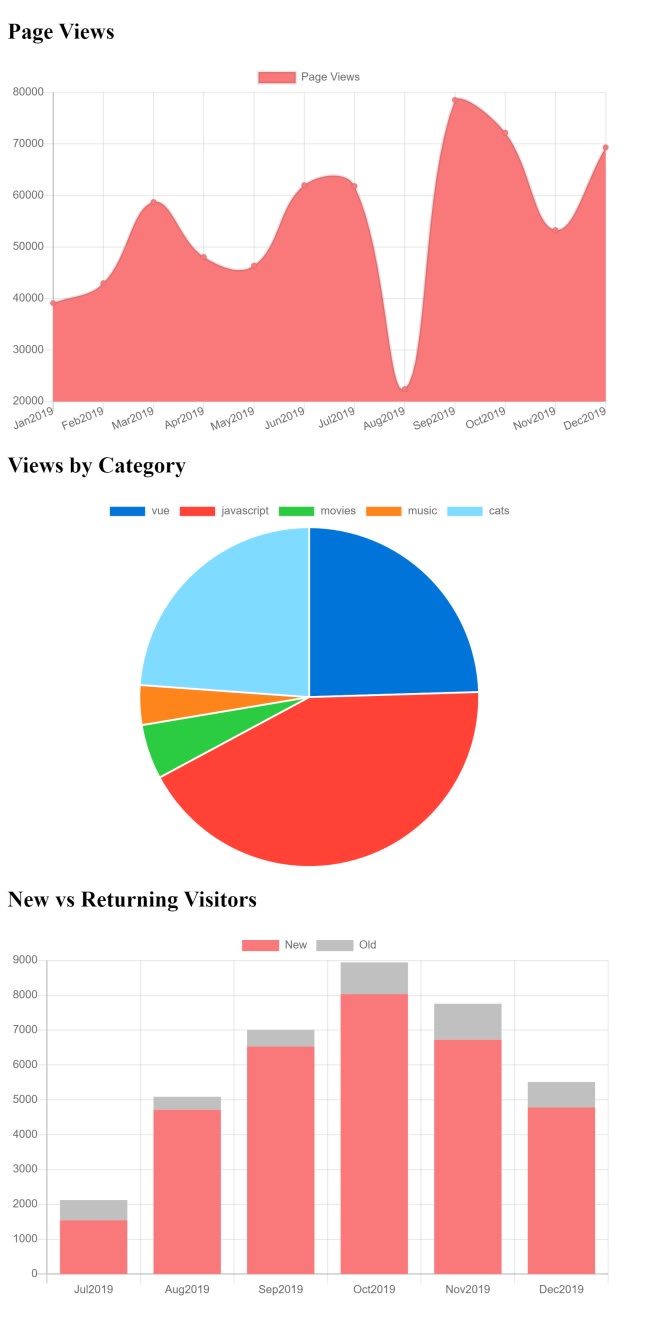
Remember, I didn’t spend any time trying to make these pretty. You can find the full source code (and working demo) at my CodeSandbox.
vue-plotly

Next up is vue-plotly, which bills itself as a “thin wrapper” for Plotly, a charting library I had previously never heard of. vue-plotly only supports installation via npm, so you won’t be using this in script-based Vue applications.
Once installed, you only get one component, <Plotly>, which works with a few properties. This makes it really quick to get started. You can simply specify your data and layout properties (which can be blank when you start) and begin coding. While my vue-chartjs demo took a while to write, this one was a breeze.
I tried to follow the same pattern and layout from the previous example. First, let’s look at the HTML.
<template>
  <div>

    <h2>Page Views</h2>
    <Plotly v-if="loaded"
    :data="pageViewData"
    :layout="layout"
    :display-mode-bar="false" />

  <h2>Views by Category</h2>
    <Plotly v-if="loaded"
    :data="pageViewsByCategoryData"
    :layout="layout"
    :display-mode-bar="false" />

  <h2>New vs Returning Visitors</h2>
    <Plotly v-if="loaded"
    :data="visitorsData"
    :layout="layout"
    :display-mode-bar="false" />

  </div>
</template>
As you can see, I’m using the same <Plotly> tag repeatedly and only changing out the data I’m binding to the chart. Now let’s look at the code.
import { Plotly } from 'vue-plotly'

export default {
    components: { Plotly },
    data() {
        return {
            loaded: false,
            pageViewData:null,
            pageViewsByCategoryData: null,
            visitorsData: null,
            layout: {
                autosize: false,
                width:750,
                barmode:'stack'
            }
        }
    },
    async created() {
        let resp = await fetch("https://api.jsonbin.io/b/5e2b4f673d75894195de48ff/1");
        let data = await resp.json();

        let pageViews = data.pageViews;
        let pageViewsByCategory = data.pageViewsByCategory;
        let visitors = data.newVsReturning;

        // setup data for line chart
        this.pageViewData = [
            { x:[], y:[], type:'scatter' }
        ];

        pageViews.forEach(pv => {
            this.pageViewData[0].x.push(pv.date);
            this.pageViewData[0].y.push(pv.views);
        });

        // setup data for pie chart
        this.pageViewsByCategoryData = [
            {
                values: [],
                labels: [],
                type: 'pie'
            }
        ];

        for(let cat in pageViewsByCategory) {
            this.pageViewsByCategoryData[0].labels.push(cat);
            this.pageViewsByCategoryData[0].values.push(pageViewsByCategory[cat]);
        }

        this.visitorsData = [
            {
                x: [],
                y: [],
                name:'New Users',
                type:'bar'
            },
            {
                x: [],
                y: [],
                name:'Old Users',
                type:'bar'
            }
        ]

        // setup data for stacked bar
        visitors.forEach(v => {
            this.visitorsData[0].x.push(v.date);
            this.visitorsData[0].y.push(v.new);
            this.visitorsData[1].x.push(v.date);
            this.visitorsData[1].y.push(v.old);
        });

        this.loaded = true;
    }
}
My core data contains null values for my chart data and one layout value that they all share. Note, however, that barmode only applies to the bar chart.
My created hits my fake API again and then, one by one, formats the data for each chart. The Plotly JavaScript docs are well-done and a bit more direct than Chart.js. Note that I didn’t have to specify any colors; I could have if I wanted to, but Plotly has some good defaults.
Here’s the finished product.
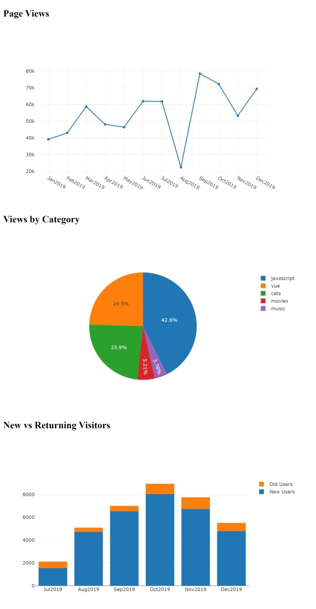
Unfortunately, the vue-plotly package had issues running on CodeSandbox. I fired up a copy on Zeit, though, and you can run it here.
vue-apexcharts
![]()
For my third and final charting library I used vue-apexcharts, a wrapper for the ApexChart.js charting library that, like vue-plotly, I had never heard of before. This library was the simplest for me to use — although, to be fair, I’d had plenty of practice building charts by this point.
AppChart.js is only installable via npm. Follow that up with a quick addition to your main.js file:
import VueApexCharts from "vue-apexcharts";
Vue.use(VueApexCharts);
Vue.component("apexchart", VueApexCharts);
Next, use the <apexcharts/> tag in your components.
Even though I found this library easiest to use, I still found the organization of the arguments to be counterintuitive. We’ll take a look at the sample, but first, the tag:
<apexchart width="500" type="bar" :options="chartOptions" :series="series"></apexchart>
So far, so good.
I like specifying the type and width as top-level attributes, but note the two properties chartOptions and series. Those values look like this:
chartOptions: {
  chart: {
    id: 'vuechart-example'
  },
  xaxis: {
    categories: [1991, 1992, 1993, 1994, 1995, 1996, 1997, 1998]
  }
},
series: [{
  name: 'series-1',
  data: [30, 40, 35, 50, 49, 60, 70, 91]
}]
}
The axis information seems tied to the data values, but it’s in the options block as opposed to the data block. It might seem like I’m nitpicking, and I’m sure not all developers would agree, but this seems odd to me. Having said that, it didn’t really slow me down. Here’s how my layout turned out:
<h2>Page Views</h2>
<apexchart v-if="loaded" width="500" type="line"
:options="pvOptions" :series="pvSeries"></apexchart>

<h2>Views by Category</h2>
<apexchart v-if="loaded" width="500" type="pie"
:options="catOptions" :series="catSeries"></apexchart>

<h2>New vs Returning Visitors</h2>
<apexchart v-if="loaded" width="500" type="bar"
  :options="visitorOptions" :series="visitorSeries"></apexchart>
Very readable, very easy to understand. The code is pretty similar to the previous versions — it gets the data and then transforms it.
export default {
  name: "App",
  data() {
    return {
      loaded: false,
      pvOptions: null,
      pvSeries: null,
      catOptions: null,
      catSeries: null,
      visitorOptions: null,
      visitorSeries: null
    };
  },
  async created() {
    let resp = await fetch(
      "https://api.jsonbin.io/b/5e2b4f673d75894195de48ff/1"
    );
    let data = await resp.json();

    let pageViews = data.pageViews;
    let pageViewsByCategory = data.pageViewsByCategory;
    let visitors = data.newVsReturning;

    this.pvOptions = {
      xaxis: {
        categories: []
      }
    };

    this.pvSeries = [
      {
        name: "Page Views",
        data: []
      }
    ];

    pageViews.forEach(pv => {
      this.pvOptions.xaxis.categories.push(pv.date);
      this.pvSeries[0].data.push(pv.views);
    });

    this.catOptions = {
      labels: []
    };

    this.catSeries = [];

    for (let cat in pageViewsByCategory) {
      this.catOptions.labels.push(cat);
      this.catSeries.push(pageViewsByCategory[cat]);
    }

    this.visitorOptions = {
      chart: {
        stacked: true
      },
      xaxis: {
        categories: []
      }
    };

    this.visitorSeries = [
      {
        name: "New",
        data: []
      },
      {
        name: "Old",
        data: []
      }
    ];

    visitors.forEach(v => {
      this.visitorOptions.xaxis.categories.push(v.date);

      this.visitorSeries[0].data.push(v.new);
      this.visitorSeries[1].data.push(v.old);
    });

    this.loaded = true;
  }
};
The only time-consuming task was figuring out how to turn the last bar chart into a stacked bar chart — but I’m talking five minutes, not five hours.
Here’s how it came out. Notice I never specified any styling data at all, and I think they came out rather nice.

You can view the full source code and online demo at my CodeSandbox.
Conclusion
I hope you find these examples interesting and helpful. You can find more at the awesome-vue repository, a list of Vue projects related to, well, everything. I selected my projects from the charts section.
Experience your Vue apps exactly how a user does
Debugging Vue.js applications can be difficult, especially when there are dozens, if not hundreds of mutations during a user session. If you’re interested in monitoring and tracking Vue mutations for all of your users in production, try LogRocket.
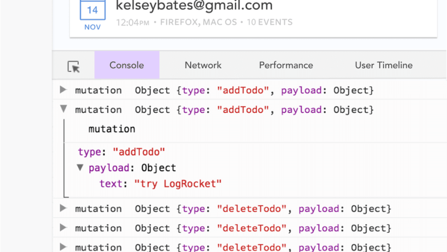
LogRocket is like a DVR for web apps, recording literally everything that happens in your Vue apps including network requests, JavaScript errors, performance problems, and much more. Instead of guessing why problems happen, you can aggregate and report on what state your application was in when an issue occurred.
The LogRocket Vuex plugin logs Vuex mutations to the LogRocket console, giving you context around what led to an error, and what state the application was in when an issue occurred.
Modernize how you debug your Vue apps - Start monitoring for free.
The post Charting with Vue: A comparison appeared first on LogRocket Blog.

Oldest comments (0)