
Written by Jeremy Kithome✏️
Introduction
Web accessibility (also known as a11y) refers to the design, coding, and creation of websites and web tools that can be used by everyone. Currently, there are many sites and tools that have accessibility barriers that pose challenges to some users. To build a more accessible web, it is important to put accessibility at the forefront of product development.
The Web Content Accessibility Guidelines(WCAG) provides shared standards for creating accessible sites and tools that meet the needs of individuals, organizations, and governments internationally.
You can find checklists from The A11Y Project, Wuhcag, and WebAim based on the WCAG that you can use as a reference point when building accessible products.
In this article, we will be building an accessible date picker component that leverages the accessibility guidelines. Here is a short demo showing what the finished component will look like:


Prerequisites
This article assumes that you are familiar with React. Before we begin building the date picker, ensure that you have Node, Yarn or npm installed on your machine. If not, you can find instructions on how to install them in the provided links. We will be using create-react-app to bootstrap our project. The create-react-app documentation recommends that previous versions installed globally via npm install -g create-react-app are uninstalled using npm uninstall -g create-react-app to ensure that npx (a package runner tool that comes with npm versions 5.2+) always uses the latest version.
Getting started
Let’s go ahead and look at how to create our project. You can use any of the three available options highlighted below to create your project.
npx:
$ npx create-react-app accessible-datepicker
npm (npm init <initializer> is available in npm 6+) :
$ npm init react-app accessible-datepicker
yarn (yarn create <starter-kit-package> is available in Yarn 0.25+) :
$ yarn create react-app my-app
Once you have finished creating the project folder you can open it and run it:
cd accessible-datepicker
npm start //or
yarn start
This will run the app in development mode and you can view it in the browser using the link http://localhost:3000/.
Installing additional dependencies
Since a lot of CSS frameworks have accessibility inbuilt in their components, we will avoid using them for now. This will enable us to understand how to build accessible components without the help of the framework. We will require a couple of libraries to help us build our date picker component. date-fns for manipulating dates, react-fontawesome for icons, lodash to manipulate some data and react-axe which tests your application for accessibility and reports findings directly to the console while developing and debugging.
To install them, run the following command:
$ yarn add date-fns lodash @fortawesome/fontawesome-svg-core @fortawesome/free-solid-svg-icons @fortawesome/react-fontawesome react-axe
Once the dependencies are installed, set up react -axe by adding the following code to src/index.js.
import axe from 'react-axe';

if (process.env.NODE_ENV !== 'production') {
  axe(React, ReactDOM, 1000);
}
Component setup
Our date picker application will have three constituent components namely:
- The app component which will be the main component of the application
- The date picker component which will display the current date when the application loads and prompt the user to select a date
- The calendar component which will display a calendar that the user can navigate and select a date
# Navigate to source directory
$ cd src/
#Create new files
$ touch calendar.js datepicker.js
Accessibility
In this article, we will be focusing on making the component accessible through the use of appropriate contrast, keyboard navigation, and Accessible Rich Internet Applications(ARIA). Color safe is a wonderful site that allows you to generate accessible text color for a given background color based on WCAG guidelines for contrast ratios.
ARIA semantics you will encounter within this article include:
- role e.g application, button, grid, grid cell
- aria-label
- aria-selected
A role defines a type of user interface element. The aria-label attribute is used to define a string that labels the current element and is used in cases where a text label is not visible on the screen. Aria-selected, on the other hand, indicates the current “selected” status of a widget.
Navigation around the calendar that we will work on later, can be managed using keys tied to certain actions.
| KEY | ACTION |
|---|---|
| Left | Moves focus one cell to the left (previous day) |
| Right | Moves focus one cell to the right (next day) |
| Up | Moves focus one cell up (Same day previous week) |
| Down | Moves focus one cell down (Same day next week) |
| Page Up | Moves focus to similar cell for previous table (Same day previous month) |
| Page Down | Moves focus to similar cell for next table (Same day next month) |
| Home | Moves focus to the first cell in the grid (First day of the month) |
| End | Moves focus to the last cell in the grid (Last day of the month) |
| Ctrl + Page Up | Moves focus to same day previous year |
| Ctrl + Page Down | Moves focus to same day next year |
| Enter/Space | Select cell in focus (day) |
| Esc | Close calendar |
The app component
This will render the date picker component and the calendar component conditionally based on boolean values in state. We will have two boolean values in state, showDatepicker and showCalendar to toggle the date picker and calendar visibility respectively. When the date picker is visible, the calendar will not be visible and vice-versa. We will also have a value date in state that we will initialize to the current date and can be changed when the user selects a different date on the calendar. Let’s see what this looks like to begin with. Add the following code to src/app.js:
import React, { useState } from 'react';
import { format } from 'date-fns';
import './App.css';

const App = () => {
  const [showDatepicker, setShowDatePicker] = useState(true);
  const [showCalendar, setShowCalendar] = useState(false);
  const [date, setDate] = useState(format(new Date(), "yyyy-MM-dd"));

  return (
    <div className="App" role="application">
      {showDatepicker && (
        <div>Datepicker</div>
      )}
      {showCalendar && (
        <div>Calendar</div>
      )}
    </div>
  );
}
export default App;
When a user clicks on the date picker, the date picker should be closed and the calendar shown instead. We will create a component method toggleCalendar to do this. We will add two more methods handleSelectDate to update the date selected by the user and closeCalendar to toggle from calendar to the date picker without changing the currently selected date. The code will look something like this:
const toggleCalendar = (e) => {
   setShowDatePicker(false);
   setShowCalendar(true);
 }
 const handleSelectDate = (date) => {
   setDate(date);
   setShowDatePicker(true);
   setShowCalendar(false);
 }
 const closeCalendar = () => {
   setShowDatePicker(true);
   setShowCalendar(false);
 }
We have now done the basic setup for the app component and can now start building out the children components.
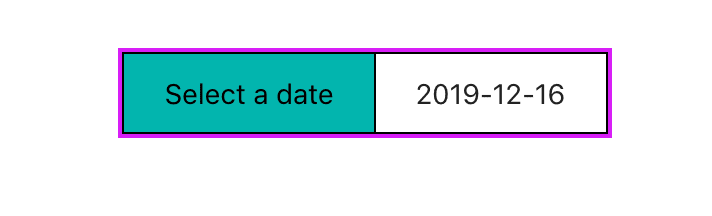
The date picker component
The date picker component will show text prompting the user to select a date and the currently selected date. It will receive date and handleSelect props to show the current date and to toggle calendar visibility respectively.
For styling purposes, I elected to use a div element as opposed to something more intuitive such as a button or input. To allow the user to engage the date picker using the tab key, we need to give the div a tabindex="0" attribute. The user should be able to engage the date picker to show the calendar by pressing the Enter or Space keyboard keys. We can facilitate this by using the OnKeyPress event listener to listen for key presses.
Once a key is pressed, we need to verify that it is the Enter key or Space key before proceeding. For visual users clicking on the date picker should toggle the calendar. Our src/datepicker.js file should look something like this:
import React from 'react';
import './App.css';
const Datepicker = ({ date, handleSelect }) => {
  const handleKeyPress = (e) => {
    const charCode = e.charCode
    if(charCode === 13 || charCode === 32) {
      handleSelect();
    }
  }
  return (
    <div
      className="datepicker"
      tabIndex="0"
      onClick={handleSelect}
      onKeyPress={handleKeyPress}
      role="button"
      aria-label="Date picker"
    >
      <div>
        Select a date
      </div>
      <div aria-label="Selected date">
        {date}
      </div>
    </div>
  );
}
export default Datepicker;
Let’s go ahead and import the date picker component in our src/app.js file and pass it the relevant props:
...
import Datepicker from "./datepicker";
const App = () => {
  ....
  return (
    <div className="App" role="application">
      {showDatepicker && (
        <Datepicker date={date} handleSelect={toggleCalendar}/>
      )}
      {showCalendar && (
        <div>Calendar</div>
      )}
    </div>
  );
}
export default App;
Let’s also add some style to src/App.css. You can style it as you desire as long as you follow contrast guidelines. You will notice that I have added a focus style for all elements:
.App {
  text-align: center;
  display: flex;
  justify-content: center;
  padding-top: 50px;
}
*:focus {
  outline: 2px solid #d71ef7;
}
.datepicker {
  display: flex;
  flex-direction: row;
  border: 1px solid black;
  cursor: pointer;
}
.datepicker > div {
  padding: 10px 20px;
}
.datepicker > div:nth-child(1) {
  border-right: 1px solid black;
  background-color: #00b5ad;
  color: #000000;
}
The following images show what our app will look like once reloaded:

The calendar component
When the calendar component is complete, it should display a grid that starts off displaying the month of the currently selected date and can be navigated to different dates. The first step is to build the calendar header which will contains icons to navigate to the previous month, previous year, next month, and next year.
It will also display the currently selected month and year. We will create a table that will only have the names of days of the week for now. Using date-fns we will be able to add methods that can add or subtract a month or year from the currently selected date. We will create a new date object using a date props passed from the app component and store it in state. This will be used to generate the calendar later. Our initial code for the calendar component should look something like this:
import React, { useState } from 'react';
import {
  format,
  startOfMonth,
  subMonths,
  addMonths,
  subYears,
  addYears,
  getDaysInMonth,
  getDay,
  endOfMonth,
  setDate,
  getDate,
  isEqual,
  subWeeks,
  addWeeks,
  subDays,
  addDays
} from 'date-fns';
import { chunk } from 'lodash';
import { FontAwesomeIcon } from '@fortawesome/react-fontawesome';
import { faAngleLeft, faAngleRight, faAngleDoubleLeft, faAngleDoubleRight } from '@fortawesome/free-solid-svg-icons'
import './App.css';
const Calendar = ({ date, handleSelectDate, closeCalendar }) => {
  const[selectedDate,setSelectedDate] = useState(new Date(date));
  const setPreviousMonth = () => {
    const previousMonth = subMonths(selectedDate, 1);
    setStartDate(startOfMonth(previousMonth));
  }
  const setNextMonth = () => {
    const nextMonth = addMonths(selectedDate, 1);
    setStartDate(startOfMonth(nextMonth));
  }
  const setPreviousYear = () => {
    const previousYear = subYears(selectedDate, 1);
    setStartDate(startOfMonth(previousYear));
  }
  const setNextYear = () => {
    const nextYear = addYears(selectedDate, 1);
    setStartDate(startOfMonth(nextYear));
  }
  const handleKeyPress = (e,cb) => {
    const charCode = e.charCode
    if(charCode === 13 || charCode === 32) {
      cb();
    }
  }

  return (
    <div className="calendar">
      <div className="title">
        <div className="icons">
          <div
            className="iconContainer"
            tabIndex="0"
            onClick={setPreviousYear}
            onKeyPress={(e) => handleKeyPress(e,setPreviousYear)}
            role="button"
            aria-label="Previous year"
          >
            <FontAwesomeIcon icon={ faAngleDoubleLeft } />
          </div>
          <div
            className="iconContainer"
            tabIndex="0"
            onClick={setPreviousMonth}
            onKeyPress={(e) => handleKeyPress(e,setPreviousMonth)}
            role="button"
            aria-label="Previous month"
          >
            <FontAwesomeIcon icon={ faAngleLeft } />
          </div>
        </div>
        <div className="month" role="heading">
          <b>
            {format(selectedDate, "MMMM yyyy")}
          </b>
        </div>
        <div className="icons">
          <div
            className="iconContainer"
            tabIndex="0"
            onClick={setNextMonth}
            onKeyPress={(e) => handleKeyPress(e,setNextMonth)}
            role="button"
            aria-label="Next year"
          >
            <FontAwesomeIcon icon={ faAngleRight } />
          </div>
          <div
            className="iconContainer"
            tabIndex="0"
            onClick={setNextYear}
            onKeyPress={(e) => handleKeyPress(e,setNextYear)}
            role="button"
            aria-label="Next year"
          >
            <FontAwesomeIcon icon={ faAngleDoubleRight } />
          </div>
        </div>
      </div>
      <table
        id="grid"
        tabIndex="0"
        role="grid"
        aria-label="Month"
      >
        <thead>
          <tr role="row">
            <th className="header" role="columnheader" aria-label="Sunday"><abbr title="Sunday">Su</abbr></th>
            <th className="header" role="columnheader" aria-label="Monday"><abbr title="Monday">Mo</abbr></th>
            <th className="header" role="columnheader" aria-label="Tuesday"><abbr title="Tuesday">Tu</abbr></th>
            <th className="header" role="columnheader" aria-label="Wednesday"><abbr title="Wednesday">We</abbr></th>
            <th className="header" role="columnheader" aria-label="Thursday"><abbr title="Thursday">Th</abbr></th>
            <th className="header" role="columnheader" aria-label="Friday"><abbr title="Friday">Fr</abbr></th>
            <th className="header" role="columnheader" aria-label="Saturday"><abbr title="Saturday">Sa</abbr></th>
          </tr>
        </thead>
        <tbody>
        </tbody>
      </table>
    </div>
  );
}
export default Calendar;
When a key is pressed while any of the icon buttons is focused, we will call the handleKeyPress with the event and a callback. It will check if the key that was pressed was either enter or space then execute the callback.
Once we import our calendar component and pass it the appropriate props, our App.js file will be complete.
import React, { useState } from 'react';
import { format } from 'date-fns';
import Datepicker from "./datepicker";
import Calendar from "./calendar";
import './App.css';
const App = () => {
  const [showDatepicker, setShowDatePicker] = useState(true);
  const [showCalendar, setShowCalendar] = useState(false);
  const [date, setDate] = useState(format(new Date(), "yyyy-MM-dd"));
  const toggleCalendar = (e) => {
    setShowDatePicker(false);
    setShowCalendar(true);
  }
  const handleSelectDate = (date) => {
    setDate(date);
    setShowDatePicker(true);
    setShowCalendar(false);
  }
  const closeCalendar = () => {
    setShowDatePicker(true);
    setShowCalendar(false);
  }
  return (
    <div className="App" role="application">
      {showDatepicker && (
        <Datepicker date={date} handleSelect={toggleCalendar}/>
      )}
      {showCalendar && (
        <Calendar date={date} handleSelectDate={handleSelectDate} closeCalendar={closeCalendar} />
      )}
    </div>
  );
}
export default App;
When you reload the app and click on the date picker, it will bring up a calendar that doesn’t have the dates populated yet.

Generate days of the month
Now that we have the calendar header and the days of the week, the next step is to generate the days of that month. The calendar will be generated using the date we initialized in state. We need to know how many days there are in the month and on what day the first and last days fall. If there are any days before the first day from the previous month or after the last day from the next month for that week, we will need to add empty values to fill out the week. This will give us an array whose length is a multiple of seven (number of days in a week). We can then use lodash’s chunk utility method to create an array of arrays where each array is a week in the month that has days of the week:
const generateMonth = () => {
    const daysInMonth = getDaysInMonth(selectedDate);
    const startWeekday = getDay(startOfMonth(selectedDate));
    const endWeekday = getDay(endOfMonth(selectedDate));
    const gridDays = chunk([
      ...Array.from({ length: startWeekday }).fill(null),
      ...Array.from({ length: daysInMonth }, (_,i) => setDate(selectedDate, i+1)),
      ...Array.from({ length: (6-endWeekday) }).fill(null)
    ], 7);
    return gridDays;
  }
Once we have the generated weeks and dates, we need to render the data. Each row will represent a week and each column a day of the week. Each cell will display the respective day of the month and for the empty days we filled out the weeks with, empty cells will be created. The currently selected date will be highlighted:
{generateMonth().map((week,i) => (
<tr className="week" key={`week-${i}`} role="row">
{week.map((day,i) => (
day
?
<td
className={`cell${isEqual(selectedDate, day) ? ' active' : ''}`}
key={`day-cell-${i}`}
onClick={() => handleDateSelection(day)}
role="gridcell"
aria-selected={isEqual(selectedDate, day)}
>
{getDate(day)}
</td>
:
<td className="empty" key={`day-cell-${i}`}> </td>
))}
</tr>
))}
After reloading the app, you will see that the days of the month are now populated:
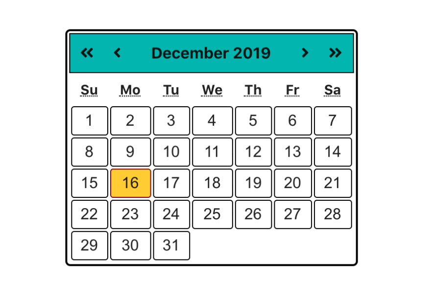
You probably noticed that our table element had a tabindex="0" attribute. This allows it to be focused and keyboard keys used to navigate days. In addition to the key/action table under the accessibility section, we need to define some additional rules for navigating the calendar using keyboard keys.
- When a user presses left and the current selected date is the first day of the month, they will be taken to the last day of the previous month
- When a user presses right and the current selected date is the last day of the month, they will be taken to the first day of the next month
- When a user presses up and the corresponding day of the week to the currently selected day is in the previous month, they will be taken to the corresponding day the previous month
- When a user presses down and the corresponding day of the week to the currently selected day is in the next month, they will be taken to the corresponding day the next month
- When the user presses Page Up and Page Down(to navigate to previous and next month respectively) or Ctrl + Page Up and Ctrl + Page Up(to navigate to similar day in previous year and next year respectively), if there is no corresponding date e.g for months with different days or leap years, they will be taken to the last day of the month.
Luckily for us, date-fns takes care of these edge cases and we don’t need to worry about them. An onKeyDown event listener will listen to key presses when the table is focused. It’s important to note that the combination of some keys e.g Control + Page Up on certain browsers are already used for browser shortcuts and might navigate away from the page. The user may need to disable the shortcuts. As an alternative, you can use the shift key instead of control. Let’s add the event handler to the table element:
<table
  id="grid"
  tabIndex="0"
  onKeyDown={handleTableKeyPress}
  role="grid"
  aria-label="Month"
>
  ...
</table>
The handleTableKeyPress method will handle the key presses and then call a function that executes the corresponding operations. Let’s add the component methods required to handle keyboard navigation:
const setPreviousDay = () => {
  const previousDay = subDays(selectedDate, 1);
  setSelectedDate(previousDay);
}
const setNextDay = () => {
  const nextDay = addDays(selectedDate, 1);
  setSelectedDate(nextDay);
}
const setPreviousWeek = () => {
  const previousWeek = subWeeks(selectedDate, 1);
  setSelectedDate(previousWeek);
}
const setNextWeek = () => {
  const nextWeek = addWeeks(selectedDate, 1);
  setSelectedDate(nextWeek);
}
const setDatePreviousMonth = () => {
  setSelectedDate(subMonths(selectedDate, 1));
}
const setDateNextMonth = () => {
  setSelectedDate(addMonths(selectedDate, 1));
}
const setDatePreviousYear = () => {
  setSelectedDate(subYears(selectedDate, 1));
}
const setDateNextYear = () => {
  setSelectedDate(addYears(selectedDate, 1));
}
const setMonthStart = () => {
  setSelectedDate(startOfMonth(selectedDate));
}
const setMonthEnd = () => {
  setSelectedDate(endOfMonth(selectedDate));
}
const handleTableKeyPress = (e) => {
  const keyCode = e.keyCode;
  // Check if control key was pressed
  // const control = e.ctrlKey;
  // Use shift key to prevent browser shortcut conflicts
  const control = e.shiftKey;
  switch(keyCode) {
    case 13: //Enter
      handleSelectDate(format(selectedDate, "yyyy-MM-dd"));
      return;
    case 27: //Esc
      closeCalendar();
      return;
    case 32: //Space
      handleSelectDate(format(selectedDate, "yyyy-MM-dd"));
      return;
    case 33: //Page Up
      control ? setDatePreviousYear() : setDatePreviousMonth();
      return;
    case 34: //Page Down
      control ? setDateNextYear() : setDateNextMonth();
      return;
    case 35: //End
      setMonthEnd();
      return;
    case 36: //Home
      setMonthStart();
      return;
    case 37: //Left
      setPreviousDay();
      return;
    case 38: //Up
      setPreviousWeek();
      return;
    case 39: //Right
      setNextDay();
      return;
    case 40: //Down
      setNextWeek();
      return;
    default:
      return;
  }
}
const handleDateSelection = (date) => {
  const dateString = format(date, "yyyy-MM-dd");
  handleSelectDate(dateString);
}
Finally, add the following styles to App.css:
.calendar {
  width: 300px;
  display: flex;
  flex-direction: column;
  border: 2px solid black;
  padding: 2px;
  border-radius: 5px;
}
.title {
  display: flex;
  flex-direction: row;
  justify-content: space-between;
  font-size: 16px;
  background-color: #00b5ad;
  padding: 10px 0;
  border: 1px solid black;
}
.icons {
  display: flex;
  flex-direction: row;
}
.iconContainer {
  padding: 0 10px;
  cursor: pointer;
}
.month {
  padding: 0 15px;
}
.header {
  height: 30px;
}
.cell {
  border: 1px solid black;
  border-radius: 3px;
  height: 30px;
  font-family: arial, helvetica, sans-serif;
  font-size: 16px;
}
.cell:hover {
  background-color: #fc3;
  border-color: #800;
}
.cell.active {
  background-color: #fc3;
  border-color: #800;
}
That’s it!! We have built an accessible date picker component in React.
Next steps
You may have noticed that we didn’t follow some best practices such as prop validation. You can add these yourself. The calendar component is quite massive and can be broken into smaller children components. You can also play around with different color combinations and different contrast ratios and see how that affects the application. You can find the code for this article on GitHub.
Conclusion
This was a look at how you can build an accessible date picker. The same principles can be followed when building other types of components in React. There are a lot more considerations that one can add that will make any tools that we build easy to use for everyone.
As developers, project managers, and entrepreneurs, it is our duty to ensure that we build an ecosystem that is welcoming to everyone. I hope that you and I will continue to make our projects, sites, and tools more accessible.
Full visibility into production React apps
Debugging React applications can be difficult, especially when users experience issues that are difficult to reproduce. If you’re interested in monitoring and tracking Redux state, automatically surfacing JavaScript errors, tracking slow network requests and component load time, try LogRocket.

LogRocket is like a DVR for web apps, recording literally everything that happens on your React app. Instead of guessing why problems happen, you can aggregate and report on what state your application was in when an issue occurred. LogRocket also monitors your app's performance, reporting metrics like client CPU load, client memory usage, and more.
The LogRocket Redux middleware package adds an extra layer of visibility into your user sessions. LogRocket logs all actions and state from your Redux stores.
Modernize how you debug your React apps — start monitoring for free.
The post How to build an accessible date picker component in React appeared first on LogRocket Blog.

Top comments (0)