
Animations can be a really powerful way to convey a message, clarify functions, or even simply add eye candy. They can also be annoying, and for some people, even trigger awful symptoms.
Operating systems have been supporting the option to reduce animations for years now, allowing their users to disable them when necessary.

The web platform has been lagging behind in this, though. Up until very recently, there was no way to ask users if they preferred to see animations or not. The best thing we could do was set it as an option in their account’s configuration, but that’s suboptimal since we’d probably lose those users before they even sign up — not to mention that it’s quite difficult to implement.
Prefers-reduced-motion is a media query that finally brings that functionality to the web by allowing us to query the OS on the user’s choice for animations and set different CSS rules depending on the choice.
It’s part of the Media Queries Level 5 CSS specification, which is at an Editor’s Draft stage, so it makes sense that the implementation was far from perfect until recently. Firefox and Safari had already shipped it quite some time ago, but with the biggest player out of the picture, this was something we couldn’t rely on. Chrome 74 finally joins the browsers supporting it, so the time has come to deploy it.
Why is this important?
The name of the query is pretty self-explanatory: we should respect our users’ preferences. Animations can be annoying when used wrong, and we all know that, so it’s fairly understandable that some people will choose to disable them.
But for others, this goes much further than simple preferences: their ability to use our websites at all or being otherwise left out depends on it. People with vestibular disorders such as vertigo can have severe episodes of dizziness and nausea triggered by animation. Users with dyslexia or attention disorders will be pulled out of focus with this unnecessary movement.
Also, devices with limited resources or screens with low refresh rates can be overloaded when we try to play animations on them.
These might seem like rare cases, but these issues are extremely common. Some people are permanently disabled, while the rest of us are only temporarily abled, and life can strike us with any of these things at any given moment.
I learned that lesson the hard way when a sudden episode of vertigo triggered by labyrinthitis left me unable to get anything done for a little over a month. Turns out, about 40 percent of people will experience vertigo at least once in their lifetime.
Providing our users with the choice to disable animations is about empathy. Is being a decent person. Is knowing that we could, and probably will, need the same sometime. If that doesn’t sell it for you, let me tell you it’s also about business logic: if users find our website annoying or unusable, they’ll just leave.
How to implement it
Progressive enhancement is probably the right answer for new projects. For each animation, we should provide a prefers-reduced-motion media query that instructs the browser on what to do when the user has asked the OS to cut animations
For instance, if we want an element to animate in from the top, we could do something like this:
.animatable{
  animation: animate 2s ease-out;
  transform: translateY(0); /* set the animation's finishing point as the default, so it still shows up when we set animation to none */
}
@keyframes animate{
  from{ transform: translateY(-100%)}
  to{ transform: translateY(0)}
}
@media screen and (prefers-reduced-motion: reduce){
  .animatable {animation: none;}
}
This stylelint plugin helps warn us when we forget to set a reduced motion alternative to an animation
Even better, we could set the non-animating version as the default and query for the no-preference choice, setting the animation there instead:
.animatable{
  transform: translateY(0);
  animation: none;
}
@keyframes animate{
  from{ transform: translateY(-100%)}
  to{ transform: translateY(0)}
}
@media screen and (prefers-reduced-motion: no-preference){
  .animatable {animation: animate 2s ease-out;}
}
This hides animations from users running browsers that don’t support this query (Edge) or media queries at all (IE) just in case some user is running them and has any issue with animations.
A great alternative recommended by Google is having a separate stylesheet for all our animations and loading them conditionally. Remember that we can set media queries in the HTML’s , so only browsers that support this feature will download that animation-related CSS, saving some bytes from the rest.
<link rel=”stylesheet” href=”animations.css” media=”(prefers-reduced-motion: no-preference)”>
The nuke approach
Implementing the query in a previously existing codebase can be quite difficult, so if you need a quick and dirty solution, consider using a rule that overwrites all animations when the user chooses to.
The simplest way, and probably the first that comes to mind, is literally disabling animation from all elements using something like this:
@media screen and (prefers-reduced-motion: reduce)
  * {
    animation: none !important;
  }
}
By placing that rule at the end of our last stylesheet, it should prevent any animation from playing. The issue there is that animations are commonly implemented in such way that the elements only appear/position at the right place by the end of them, so declaring no animation will render the elements useless and break our website’s flow.
So we need to make sure to fix this in a way that places the elements where they should. Eric Bailey recently published a better approach at CSS-Tricks:
@media screen and (prefers-reduced-motion: reduce){
  * {
    animation-duration: 0.001ms !important;
    animation-iteration-count: 1 !important;
  }
}
The code above will ask the browser if the user has requested the operating system to reduce motion and, in such cases, set a ridiculously short animation-duration in a universal selector to force all animations to their ending point instantly.
animation-iteration-count: 1 makes sure they only play once to prevent rules that might have animation-iteration-count: infinite from playing a gazillion times in quick succession.
Remember, this should be the very last CSS we include, so it takes precedence over all others, even if they have a rule set as !important.
Wrapping up
Chrome has finally joined the browsers supporting this extremely important accessibility media query, which will hopefully make the web experience easier for lots of people with different conditions.
It’s our responsibility (and should be our goal) to make the web a better place for everyone, so whether you choose to go with the “nuke approach” or take the time to consider implementing animations as progressive enhancement, we now have the tools to make it right.
Plug: LogRocket, a DVR for web apps
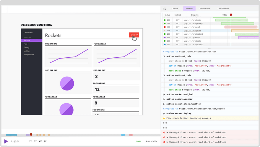
LogRocket is a frontend logging tool that lets you replay problems as if they happened in your own browser. Instead of guessing why errors happen, or asking users for screenshots and log dumps, LogRocket lets you replay the session to quickly understand what went wrong. It works perfectly with any app, regardless of framework, and has plugins to log additional context from Redux, Vuex, and @ngrx/store.
In addition to logging Redux actions and state, LogRocket records console logs, JavaScript errors, stacktraces, network requests/responses with headers + bodies, browser metadata, and custom logs. It also instruments the DOM to record the HTML and CSS on the page, recreating pixel-perfect videos of even the most complex single-page apps.
The post New in Chrome 74: Prefers-reduced-motion media query appeared first on LogRocket Blog.

Top comments (0)