The best react inline style libraries — comparing Radium, Aphrodite, & Emotion

In any non-trivial React app, CSS styles can become a problem if you don’t manage them correctly.
Global style definitions, !important rules everywhere, and low flexibility when reusing components are examples of these problems.
This has led to alternative approaches to the classical approach of using CSS files. For example, here’s a good post about three styling approaches.
This article is about inline styles. However, I’m not going to talk about what they are or whether you should use them or not.
I’m going to talk about libraries that will help you use inline styles in your React application — libraries that allow you to use features that are not directly supported otherwise (like media queries).
I’ll compare:
This list is the result of not considering libraries that:
- Don’t seem to be maintained anymore.
- Don’t seem to be popular.
- Don’t work as inline styles as object or string literals.
However, as with most articles of this type, you may not agree with this list so feel free to post a comment with your favorite library and what’s special about it.
Using each of those libraries, I’m going to style a div element with the following CSS rules:
https://medium.com/media/d80f9c88b8dc7b2d4d2e6188e8ba07c5/href
This will be the result:

At the end of this article, you’ll find a table summarizing the features of the libraries.
Let’s start with Radium.

Radium
Of the three libraries presented here, Radium is the most popular one in terms of GitHub stars, issues, and StackOverflow questions.
If you already have some inline styles as object literals, you don’t have to modify them to use Radium.
For example, here’s the style object that corresponds to the CSS rules shown earlier:
https://medium.com/media/a5ea948d859fd8538b9898d7b16a2a42/href
It looks like a regular inline style, except for the hover and media rules, which are not supported by common inline styles.
If you apply this style to a component:
https://medium.com/media/da75da0d4279f93b5137e54688bf9b53/href
And run the app, the div element will change its style but it will ignore the hover and media rules. Actually, this warning will be shown in the console:
Warning: Unsupported style property @media (max-width: 700px). Did you mean @media (maxWidth: 700px)?
To use Radium, you first have to install it:
npm install --save radium
And then import or require it:
import Radium from 'radium';

// Or const Radium = require('radium');
Radium is a high-order component (HOC).
It processes the style attribute of the components specified in the render method, adding handlers that update the state if interactive styles (like hover), applying vendor prefixes, and merging styles among other things.
You can use it this way:
class App extends Component {

// ...

}

export default Radium(App);

// Or App = Radium(App);
Or with ES7 decorators:
@Radium

class App extends Component {

// ...

}
Usually that will be enough, but if you’re using media queries, keyframes, or some Radium plugins, you also need to use the StyleRoot component to wrap the top-level component of your app:
ReactDOM.render(
    <StyleRoot><App /></StyleRoot>,
    document.getElementById('root')
);
Now if you run the application, and inspect the div element, you’ll see this:
https://medium.com/media/6f332ff8d77d409e82c9406427755680/href
Notice that for the media query, it created a new CSS class with a random name within a style element. According to the documentation, it does it this way so media queries work correctly with server-side rendering.
And what about the hover effect?
When you mouse over the element, its style attribute is updated to add the specified hover style:

You can also specify an array of styles in the style attribute. This comes in handy when you need to override some styles depending on the value of a property, for example:
https://medium.com/media/7903fd83695d8aa03b1f0cc6b61440fb/href
There’s also a Style component that renders a style element, which, for example, helps you add CSS rules to the body element or scope classes applied to other elements.
For instance, this:
https://medium.com/media/31654aebfca9eb622e1d01388c6fb710/href
Will render:
https://medium.com/media/6e633b9ffbdf5bc90e31b8f699b10171/href
On the other hand, one disadvantage of Radium is that only three states are supported: :hover, :foucs, and :active, and if you have more than one element in your component that uses one of these states, you need to provide a unique key prop.
There’s even a function that allows you to query these states, getState:
<div style={styles.panel}>

  React + Radium rocks!

  { Radium.getState(this.state, null, ':hover') ? (

      <span>Yeah!</span>
    )
    : null
  }

</div>
However, this means that you have to manually implement pseudo-selectors like :checked, :last, :before, or :after.
Another missing functionality is the support of @font-face. However, Radium implements almost all of its functionality as a plugin and you can also use the plugin API to implement custom functionality, like @font-faces.
A Radium plugin is a function that accepts a PluginConfig object and returns a PluginResult object and it is called once for every rendered element that has a style attribute.
Here you can take a look at the source code of the plugins include in Radium. An in this repository by Ian Obermiller, you can find another example of a plugin.
Here’s the basic example implemented with Radium:
https://medium.com/media/32d4cad9cf12f1c7a3fc4532d90e8890/href
Aphrodite
Aphrodite is another popular library for writing CSS in JavaScript, but it takes a slightly different approach than Radium.
First, install it with:
npm install --save aphrodite
Once again, you have an object with the styles of the application:
https://medium.com/media/21ee0c1d3ff6440ac8f2235594df8be3/href
But this time, you have to pass this object to the function StyleSheet.create:
https://medium.com/media/90613a64993571109e4fe5d993b42654/href
In turn, the styles from this object are passed to the css function, and the result is used in the className property of the component:
https://medium.com/media/bae8422263145d0e8576476f74750b70/href
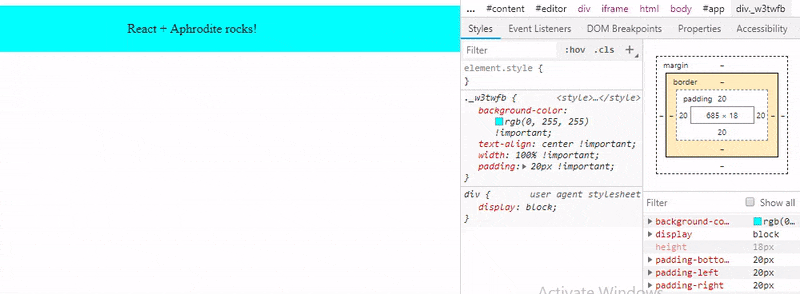
Notice that Aphrodite uses the className property, not the style property.
To understand this, if you print the result of css(styles.panel) you’ll get a class name. In my case I got panel_w3twfb.
If you take a look at the object returned by StyleSheet.create, you’ll see something like:
https://medium.com/media/20fb34c76b909463f3e828de93925baa/href
That function returned an object that wrapped the CSS rules and added a _name property, with the same value as the one returned by the css function.
Using the Inspector tool of your browser, you’ll see the definition of this panel_w3twfb class:
.panel\_w3twfb {

  background-color: rgb(0, 255, 255) !important;

  text-align: center !important;

  width: 100% !important;

  padding: 20px !important;

}
By default, Aphrodite appends !important to all the CSS rules. If you don’t want this, the only thing you need to do is import aphroidte/no-important instead of aphrodite:
import { StyleSheet, css } from 'aphrodite/no-important';
Also, when the flag NODE_ENV is set to production or if you call minify(true) before StyleSheet.create:
import { StyleSheet, css, minify } from 'aphrodite';

minify(true);

const styles = StyleSheet.create({

  //...

});
Aphrodite will only keep the hash in the name of the CSS class. In this case, w3twfb.
But where’s this class? It’s not defined next to the div element or anywhere else in the body of the document.
Aphrodite creates a style element inside the document’s
element to put its generated styles:<html lang="en">
<head>
...
<style type="text/css" data-aphrodite=""></style>
</head>
<body>
...
</body>
</html>
However, you can create a style element with the data-aphrodite attribute and Aphrodite will use it instead of creating one.
Aphrodite will buffer writes to the style to avoid many DOM modifications. If you calculate the element’s dimensions in componentDidMount or componentDidUpdate, the documentation recommends using setTimeout or flushToStyleTag to ensure all styles are injected correctly.
And what about the hover style and the media query?
They are also added:
.panel\_w3twfb:hover {

  color: rgb(255, 255, 255) !important;

  cursor: pointer !important;

}

@media (max-width: 700px) {

  .panel\_w3twfb {

    background-color: rgb(255, 0, 0) !important;

  }

}
In a similar way than Radium, you can combine more than one style:
https://medium.com/media/afc271d3ea25b83f3a01c2be507dd564/href
Also like Radium, it has limited support for nesting. For instance, this issue shows an example of a Saas-like class for an element that has both classes, jump-btn and disabled:
.jump-btn {

  width: 32px;

  height: 32px;

  background: url('jump\_btn.png') no-repeat 0 0;

  &.disabled {

    background-position: -32px 0;

  }

  ...

}
That has to be written in Aphrodite in the following way because only pseudo selectors and media queries can be nested:
https://medium.com/media/9b65f4812e0bed767fba2837ebca1c82/href
However, unlike Radium, Aphrodite support font faces:
https://medium.com/media/2298e96070ba6ba1d874d52d548e256b/href
After and before pseudo-elements natively (with the caveat that the content property requires double or single quotes inside the string value):
https://medium.com/media/d47ad4e03e91f45352a8454396fe7d01/href
On the other hand, Aphrodite doesn’t provide an API the way Radium does. Granted, it works in a different way, but it may be helpful for some situations (for example, see here and here).
It provides an extension mechanism, but currently, it only allows you to generate new selectors based on the specified styles (it’s used by the library to handle media queries and pseudo elements/classes).
Here you can see the basic example implemented with Aphrodite:
https://medium.com/media/005517b833a551d122141cc72c563e87/href
Emotion
Recently, Kent C. Dodds deprecated Glamorous (a library that otherwise would have made into this list) in favor of emotion. His reasons:
- Emotion can do everything Glamorous can do.
- Emotion can do more than Glamorous can do.
- Emotion is faster than Glamorous.
- Emotion is smaller than Glamorous.
That tells us something about this library, right?
First, install it with:
npm install --save emotion
One more time, starting with the object that contains the styles of the application:
https://medium.com/media/897bc45ba86039bd54e6e456932d1809/href
You only need to modify the format of the :hover pseudo class. From:
':hover': {

  ...

}
To:
'&:hover': {

  ...

}
Emotion is similar to Aphrodite. Both use the className property and a function called css:
https://medium.com/media/9ee6b2954541c30f1ab5d1dd6b33426a/href
The css function returns the name of the CSS class that is generated automatically. In my case, it returned css-4k75yl.
The rendered HTML looks like this:
<div class="css-4k75yl">

  React + Emotion rocks!

</div>
And you can find the definition of this class inside the document’s
element: https://medium.com/media/f36d723051f89d64a606a21a7a21d193/hrefOptionally, you can also add a label property to the style object to append a custom name to the generated CSS class.
For example, the following definition:
https://medium.com/media/86434a0c07324e75e7787acebe36f14b/hrefWill result in the class name css-4k75yl-my-name.
So in this way, Emotion is not that different from Aphrodite:

But something about this library is that it has way more features than Radium and Aphrodite.
For example, with Emotion you have two more ways to style components.
Instead of an object literal, you specify the style as a tagged template:
https://medium.com/media/175dd1ae66a8067db304c152b1880f08/hrefNotice that the syntax is completely different. It’s more like CSS:
- The names of the rules are not camel-cased.
- Quotes are not used.
- Rules are separated with a semicolon
On the other hand, you can also style elements or components with the styled function.
For this, first, you need to install react-emotion (or preact-emotion if you’re using Preact):
npm install --save react-emotion
Then, calling the function by first passing an HTML tag or React/Preact component and then either an object literal with the styles:
https://medium.com/media/4bcfc02095807c15da3cf981ae3bccd0/href
Or a template literal:
https://medium.com/media/b54b8908028a87046233f01fc2b7a0de/href
And use that new styled component like any other:
https://medium.com/media/d1a141ab604984128e217ebb11f1927e/href
Of course, props can be passed to this component and you can change its styles of based on the props:
https://medium.com/media/aa9c3dfbd4789cd8b66c6fc0fbd6b384/href
In the documentation page for styled components, you can check out more configuration options.
You can also combine styles:
https://medium.com/media/3d0afbddb35b5c874590d21c76d86320/href
And Emotion will merge them in the order they appear (notice the class name changes):
.css-17nr31q {

  background-color: #00ffff;

  text-align: center;

  width: 100%;

  padding: 20px;

  background-color: red;

}
However, unlike Aphrodite, when combining multiple class names, Emotion provides some advanced options.
Also unlike Aphrodite (but similar to Radium), Emotion allows you to specify global styles easily:
https://medium.com/media/58b2168f67e5d1c799b64efa41c17738/href
Emotion supports server-side rendering and keyframes like the other libraries, but it has better support for nested selectors and something unique is the support for themes, provided by the library emotion-theming.
For example, after installing emotion-theming with:
npm install --save emotion-theming
You can put the background color style in a theme to share it across other components:
https://medium.com/media/b14d33bb9aaa4ac63f67057b15864167/href
Here you can see the basic example implemented with Emotion using an object:
https://medium.com/media/e55cbf11a06e609ecafde1967049f060/href
And here you can see it implemented using a tagged template:
https://medium.com/media/98bdaf5979650e08ba3d0992b640b72b/href
Wrapping up
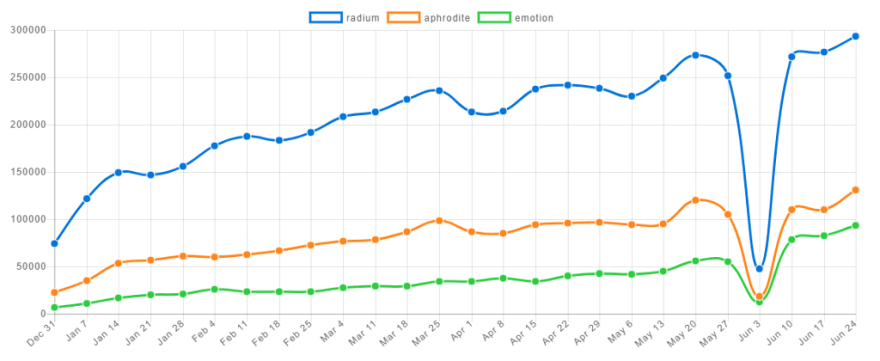
A good page to learn how popular are these libraries is npm trends. Here’s a snapshot of the statistics at the time of this writing (here you can find the most recent ones):
And here’s a summary of the features of these libraries:
https://medium.com/media/b88f8dfdadd91ae9fc1cd930774e81a3/href
If you ask me, all things being equal, I’d say my favorite library is Aphrodite.
I feel this library has the best balance. Radium lacks some features while Emotion, although it’s flexible and it has great documentation, it has so many features that it’s a bit complex to use sometimes.
But when deciding what library to use in your project, the most important thing is to take into account the aspects that are relevant for your project. Don’t choose the library with the most features or yeses in the table.
Finally, also check out this repository where Michele Bertoli compares a lot more libraries for React and implement an example with each of them.
Plug: LogRocket, a DVR for web apps
LogRocket is a frontend logging tool that lets you replay problems as if they happened in your own browser. Instead of guessing why errors happen, or asking users for screenshots and log dumps, LogRocket lets you replay the session to quickly understand what went wrong. It works perfectly with any app, regardless of framework, and has plugins to log additional context from Redux, Vuex, and @ngrx/store.
In addition to logging Redux actions and state, LogRocket records console logs, JavaScript errors, stacktraces, network requests/responses with headers + bodies, browser metadata, and custom logs. It also instruments the DOM to record the HTML and CSS on the page, recreating pixel-perfect videos of even the most complex single page apps.
Try it for free.

Top comments (0)