
Written by Ogundipe Samuel✏️
It’s 2020 and React is still one of the most loved frontend libraries around.
The React community is also growing rapidly as more React packages are created to simplify various aspects of development with React.
In this post, we’ll take a look at the fastest growing React libraries over the past year as well as some of of their use cases.
N/B: This post assumes you know or use React. If you want to learn more about React, check out the docs here.

Ant Design
Ant Design is a set of enterprise-class UI designed for web applications.
It provides over 50 customizable components that can be used to craft beautiful applications.
Ant Design recently beat material UI to become the most popular React UI library on GitHub with over 56k stars.
Every aspect of Ant Design is completely thought-out down to the smallest detail. It’s built based on a design system created by the makers.
It is specially created for internal desktop applications and is based on several principles and unitary specifications. It makes design and prototype more simple and accessible for all of a project’s members.
If you’d like to create applications that provide a native feel for your users, definitely check it out.
There’s also a mobile version of Ant Design. You can learn more about it here.
Material UI
MaterialUI is a set of components built based on the material design guidelines of Google.
Material UI consists of many accessible and configurable UI widgets.
The components are self-supporting and only inject the styles they need to display, which could lead to performance enhancements in your application.
MaterialUI has an active set of maintainers and a strong community behind it. It currently has over 54k stars on GitHub, making it one of the most popular component libraries out there.
It provides a simple, light, and user-friendly layout and design to make building beautiful applications a breeze.
Using it is borrowing from the Google design team’s wealth of knowledge of how consistent and easy-to-use interfaces should look.
If you’re looking to build a beautiful, consistent, and light interface quickly without sacrificing accessibility and performance, material design will help you achieve that.
You can get started here.
React Bootstrap
React Bootstrap is a UI kit based on the bootstrap library.
It simply replaces the JavaScript in the regular Bootstrap components with React code.
Using React bootstrap is often intuitive to use because of the number of available bootstrap themes.
It is arguably the fastest way to get started building interfaces using React and Bootstrap.
It has gained popularity over the years and now has over 17k stars on GitHub.
It also gathers over 500k downloads on npm weekly.
If you want to build React apps quickly, React Bootstrap can be very useful.
It’s world’s most popular front-end component library, and it has a lot of starter kit, resources, and themes readily available for use.
Blueprint UI
Blueprint is a React-based UI toolkit for the web.
It is optimized for building complex, data-dense web interfaces for desktop applications that run in modern browsers and IE11.
It is not a mobile-first UI toolkit.
From the component library, you can pick up bits of code for generating and displaying icons, interacting with dates and times, picking timezones, and more.
With over 15k stars on GitHub and a weekly download of over 100k on NPM, it is one of the fastest-growing UI libraries in the past year.
If you’re building something that needs to deal with a lot of data and a lot of flexibility, then consider taking a look at Blueprint.
To get an overview of how it works and the components it offers, you can check it out on CodeSandbox here.
Semantic UI React
Semantic UI React is the official React integration for Semantic UI.
Semantic UI is a jQuery-based library that adds extra functionality to your pipeline.
With Semantic UI React, all the extra functionality has been re-written to React code.
You’ll use JSX code to directly define the components and bind it with its React Component code.
It comes with a huge list of pre-built components designed specifically to make sense of and produce a semantically-friendly code.
It has over 10.6k stars on GitHub and is being downloaded over 100k times every week from NPM.
If you’re looking to build apps with React and want to ensure 100% semantic-friendly code, you should definitely check it out.
Rebass
Rebass is a tiny UI components library capable of creating a very powerful set of theme-able UI elements based on the Styled System library.
Rebass contains only eight foundational components in a super-small file, all built specifically for responsive web design.
The components use styled-system and serve as a great starting point for extending into custom UI components for your app using its inbuilt ThemeProvider.
If you don’t want to rely completely on component libraries and intend to extend an already existing one during development, you should definitely check out Rebass.
It’s rapidly gaining popularity. The project currently has over 6k stars on GitHub and gathers around 130k downloads per month from NPM.
Fabric React
Fabric React is another exciting UI library created by the Microsoft dev team.
Fabric React provides components with behaviors and graphics similar to office products.
The UI library offers compatibility with Desktop, Android, and iOS devices and is used by sites such as Office 365, OneNote, Azure DevOps, and other Microsoft products.
It is packed with a lot of prebuilt components that can be used to develop most parts of any application, and its design follows Microsoft’s Office Design Language.
If you’re creating a web app with office-like UI, consider taking a look at this.
It’s rapidly gaining popularity: the project currently has over 6.2k stars on GitHub, with around 77k downloads per week from NPM.
Evergreen UI
Evergreen is a React UI Framework for building ambitious products on the web. It was created by the developers at Segment.
One of the best things about Evergreen is their detailed explanation of their design decisions.
It provides a set of components for building essential features of a web application.
Evergreen’s design is light, simple, and intuitive. You can use it to get started building elegant user interfaces pretty quickly.
It’s also rapidly gaining popularity, and currently has over 9k stars on Github with over 100 contributors.
Chakra UI
Chakra UI is a simple, modular, and accessible component library that gives you all the building blocks you need to build React applications.
Chakra UI contains a set of layout components like Box and Stack that make it easy to style your components by passing props.
One thing I personally love about it is that most of the components are dark mode compatible.
It can get you started with building simple, composable components that cater to real-world UI design problems.
In just a few months, it has gained over 4k stars on GitHub and earned a lot of positive comments from top React developers.
You can get started by checking out the docs here.
Grommet
Grommet is a React-based framework that provides accessibility, modularity, responsiveness, and themes in a tidy package.
Grommet helps build responsive and accessible mobile-first projects for the web with an easy to use component library.
One of the best things about grommet is that you can easily integrate it with existing projects or when starting out with new ones.
Big names like Netflix and Boeing are among its users.
For small screen phones or for wider screen displays, Grommet will help you quickly design layouts.
It provides support for W3c’s WCAG 2.1 spec and provides accessibility via keyboard or screen reader.
Grommet is also growing with about 5k stars on GitHub.
To find out more click here.
Conclusion
In this tutorial, we looked at the 10 most popular and fastest-growing React component libraries available today. We also looked at the type of applications where they fit best.
Before diving into react projects, you should take time to review these frameworks as they can save you a ton of time during development.
Happy coding!
Full visibility into production React apps
Debugging React applications can be difficult, especially when users experience issues that are difficult to reproduce. If you’re interested in monitoring and tracking Redux state, automatically surfacing JavaScript errors, and tracking slow network requests and component load time, try LogRocket.
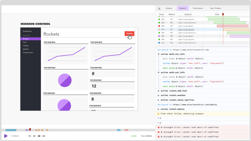
LogRocket is like a DVR for web apps, recording literally everything that happens on your React app. Instead of guessing why problems happen, you can aggregate and report on what state your application was in when an issue occurred. LogRocket also monitors your app's performance, reporting with metrics like client CPU load, client memory usage, and more.
The LogRocket Redux middleware package adds an extra layer of visibility into your user sessions. LogRocket logs all actions and state from your Redux stores.
Modernize how you debug your React apps — start monitoring for free.
The post Top 10 React Component Libraries for 2020 appeared first on LogRocket Blog.

Top comments (1)
Another good one is IBM carbon components for React