Introduction
Working on UIs and ensuring engaging and unique user experiences is harder than ever before in 2019. There are tons of frameworks, whitepapers, best practices, templates all preaching to have the best solution for your UIs. There are even server-side frameworks that enable you to fully build your UI completely server-side with Java, where the UI components are connected to the front-end counterparts (as GWT widgets) through RPC calls... Options are virtually endless.
And yet, we still see lots of websites, and apps, failing completely in delivering a good user experience, why?
The importance of business context
When working on the visual side of any application or website, the only things that matter, are:
Good design, UI and UX best practices;
Knowledge of the business you're writing code for;
Both of these aspects, when taken into consideration together, can greatly improve your designs and make it easier to cope with requirement changes while delivering improved designs fast.
There are probably more aspects that can weight in a lot in terms of a good design: you need to have good designers, people skilled with design tools and programs and, more importantly, designing a good UI takes time.
However, the two aspects highlighted above are the main ones that are more actionable by a single developer and as such, those will be the ones discussed here.
Adhere to good design practices
It may seem obvious that one must adhere to good practices when designing anything that will be client-facing, but, it turns out, that a large majority of websites can't seem to get it right, usually bloating their landing pages with tons of menus, sidebars, images, floating images, etc, which greatly deteriorates the UX and usability.
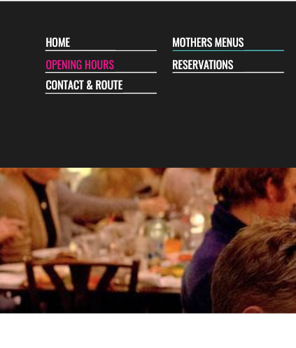
This is part of a top menu of a very popular restaurant with over 2K reviews on google maps. However, that doesn't really seem to make an impact or at least raise awareness to the fact that this is poor design, and might steer people away.
There is horizontal scrolling on the website as well, and making the colors change on hover, to extremely contrasting colors on top of a black background is really not providing a good user experience. Unfortunately, the website doesn't do well on mobile devices either, so if tourists would want to search for a good restaurant... this becomes tricky quickly.
It's too strong, too clunky, and misses the point of how/why people search for a restaurant: they just want to eat!
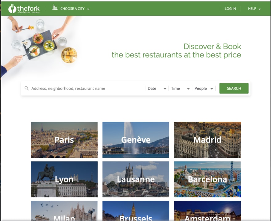
Consider now, the much cleaner and better UI from the popular website TheFork:
It's clear that this UI is much more appealing: cleaner, lighter colors, a responsive design that feels native on mobile, looks good across a range of devices and more importantly, it's clearly doing something that the previous one doesn't do:
It knows what people want from their app
The way it blends it within the UX is perfect, you have simply a field to input an address, you can conveniently use dropdowns and calendar widgets to select date, number of people and time of reservation, and hit search.
Additionally, the design is also "mobile-first", so, roughly, if we'd simply shrink the current UI to fit a mobile device, it all would "just work", apart from some layouting rules for sidebars or menus. It's easy to not notice it, because, it doesn't get in the way and those are the best UIs: the ones you 'don't see'. This leads to the second point regarding good UI design.
Know your business
The restaurant example is a perfect example of what it pays off to know the business and the customers that will ultimately end up using your products and how other competitors are placing themselves in the market. In other words, it's important to have context about the grand scheme of things that your UI/UX will make visible to the world.
That's what I call contextual design.
There will always be core concepts of your domain that will be key concepts. These are concepts that people immediately map to a certain business: food to restaurants, a ball to soccer, a pill to some medical domain application or a drug, etc, etc.
Combining these core concepts of your domain with clean design approaches, like using modern and flexible design languages like Material Design, preferring grid-based layouts, and develop with mobile devices in mind upfront, can pay off enormously when it comes to have a good feedback loop to iterate on the UI to reach the best possible outcome.
Additionally, if possible, a good design is only attractive if it matches people's expectations, so, involving some pilot users on testing the UI and collecting their feedback can be great to get to the design people will love and spread and use!
Conclusion
It's important to both know your design principles and how to apply them and at the same time, it's key to know the business you're developing for, the people who will likely benefit from it, use it and require changes to it.
If you put a focus on knowing the business well, it can be all you need in order to develop a great UI!
What are some UI designs, themes and frameworks you like and use?


Top comments (2)
This is a very good article and there's a lot of good things to think about.
I am still very green on UI, but I really like minkmalist design that does what it's supposed to do without bloating the interface. This is especially so when it comes to the colour palette. I'd rather have just a handful of colours that work well together than a different colour for each single little thing.
Thanks, I'm glad you liked! And yes, I also favor minimalist and efficient UIs as much as possible... I had previously worked with medical domain web apps and we were pioneers in the clean designs we introduced on our platforms, so that doctors, analysts and people doing the real work could be efficient.
Clean and minimal design that doesn't get in the way always wins!