What, how and why
For some time now I wanted to create my wife's website for her art. I'm still a junior developer, building projects with my self-taught knowledge. So far I've worked with nodeJS-EJS and React as frontend technologies, and mongoDB and Firebase as backend.
But I want to improve my React and DB knowledge (apart from SQL which I use everyday for work). So, as I made my personal website (www.alexbuaiscia.com) with just HTML/JS/EJS/MongoDB, and I used the other techs just for work-related projects, I wanted to give a try to building something personal with React and Firebase.
I was tempted to use Apollo-GraphQL, but then the technology is much newer and lesser used, so it'll go into my next project.
So anyway, the project will proceed one step at a time, and I decided to document the whole process, so that maybe somebody will benefit from it... and most of all myself, as there are many things that I'll learn along the way.
I'm documenting all this, also, for its creative process more than super-correct practices. So take it more for inspiration for your own creativity, more than real examples to follow line by line.
Ok, so on with the project.
Let's start
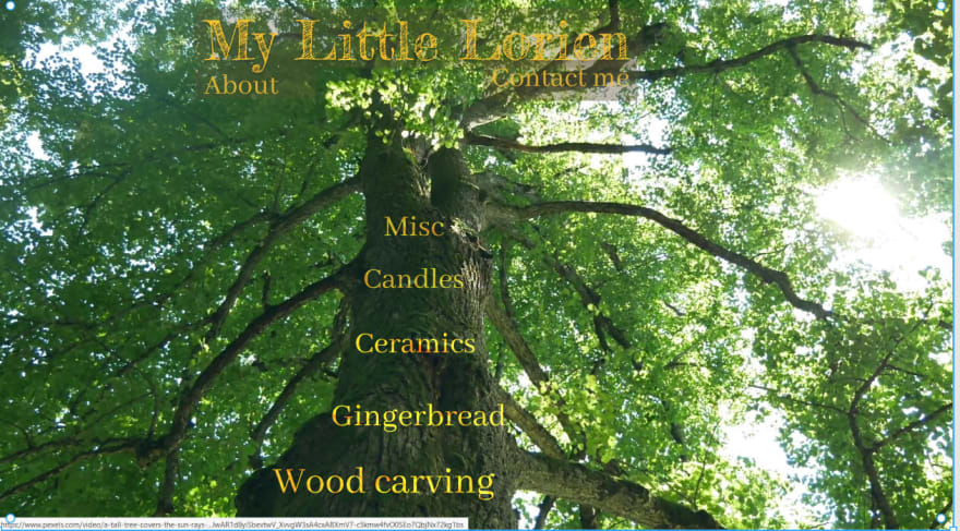
Phase1: designing it. My wife and I started to put down some ideas and used Figma to make a sketch of the categories and the landing page. It's far from finished and looks like this.
It's a website about art so something artistic must have been done. I know how to style the texts into the tree and Figma give some nice CSS...although with absolute references. So far I've an idea on how to make it on mobile, but not sure about sizes in the middle.
I'm not sure 100% about the colors that get a little lost with the tree, but there will be time to work it out.
We haven't designed the other pages yet, but will be more frontend-friendly (more normal grid ie.). The tree will stay opaque in the background.
Ah, important note: the image in the landing page is actually a placeholder. It will be a video ;)
I'm not a designer by profession so it's all an experiment.
And a super important point: feedbacks are most welcomed! Send me a message (Twitter DM or other contact)
Thank you for reading and see you in the next one!
Original post here on my blog.
Alex


Top comments (1)
Great tutorial.
You can also try Desech Studio to import the figma design file and then make minor adjustments. This will create clean html structure with css grids.
Then you can integrate it with react by using this plugin. Check this github repo for more details.