
Here we are going to learn how to plot maps in jupyter notebook (or any other coding interface you prefer). This is very useful for doing some geospatial analysis. This is by no means an exhaustive work on geospatial analysis. But this article promises to be fun, super practical... and interactive. Okay, I already said interactive in the title. Plus you will learn other cool things you can do with your map.
For this article we will learn how to:
1) Get a location coordinate.
2) View a location on a map
3) Add markers to a map.
4) Add MarkerCluster to a map.
5) Add Circle to a map.
6) Add choropleth to a map.
7) Measure distances between points on a map.
8) Create buffers on a map.
Worthy of note;
1) There are many different geospatial file formats such as shapefile, GeoJSON, KML, and GPKG.
2) Geopandas is a library for reading geolocation data such as mentioned in 1 in python programming language. Install geopandas or use google colab to replicate what we are doing.
3) Shapefile is the most common file type used.
4) All of these file types can be quickly loaded with the gpd.read_file() function. Here you will have a geoDataFrame
5) You require the longitude and latitude values as different columns.
6) You also require a column that combines both latitude and longitude into a geometry. When you plot, this geometry can either be a
point![]() , linestring
, linestring  or polygon
 ![]()
7) Every GeoDataFrame contains a special "geometry" (comprising of the cordinates) column. It contains all of the geometric objects that are displayed when we call the plot() method.
8) All the datasets used in this article is obtained from Kaggle.
First we import our dependencies
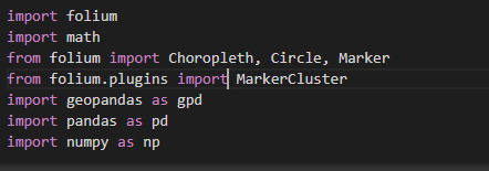
Note that Folium is a powerful Python library that helps you create several types of Leaflet maps. The fact that the Folium results are interactive makes this library very useful for dashboard building.
1) Get a location coordinate
First off, you need a coordinate of any location before you can visualize it on a map. This means you need two values, one for the latitude and the other for the longitude of the location. Don’t fret. That’s easy to obtain using the code snippet below.
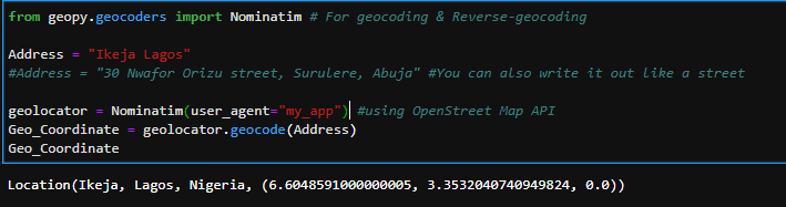
Image 1
Image 1, we used OpenStreetMap API to extract the coordinates. Other APIs are available and the list and code syntax can be found here.
2) View a location on a map
Now that we have our coordinates and our dependencies are imported, let us proceed to plotting our map.
Plotting your first map is as simple as running this one line of code
world_map = folium.Map()
World_map
Let us use the coordinates of Canada to view Canada and also add some arguments to the basic
Canada = folium.Map(location = [56.130,106.35],
tiles='openstreetmap',
zoom_start = 4)
Canada
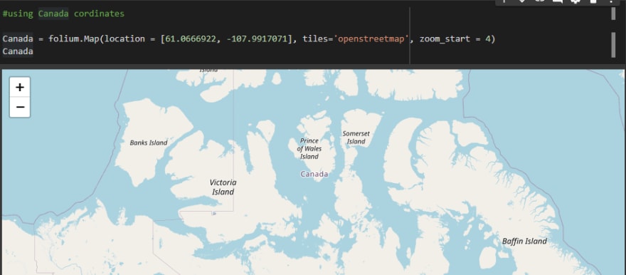
Image 2
Location sets the initial center of the map. We use the latitude (56.130° N) and longitude (106.35° E) for the country of Canada.
Tiles changes the styling of the map. Here we used the OpenStreetMap style. Find other tile styles here. Just copy the name of each folder and insert in the tiles parameter. You can play around with different tiles. Below images are a few others.
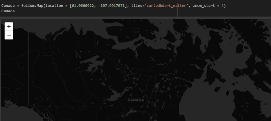
Image 2a
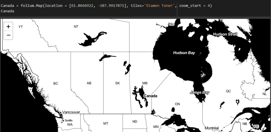
Image 2b
Zoom_start sets the initial level of zoom of the map, where higher values zoom in closer to the map. You can play with different values.
3) Add markers to a map
Markers are used to denote exact locations on a map. Next we load our dataset which has a geometry column for coordinates. We will use this column to see the points on the map. We will achieve this by adding what is called marker to our map.
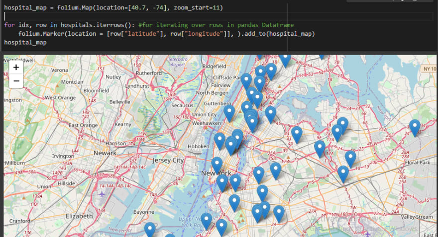
Image 3
Sometimes we may have a marker-packed map like the image below
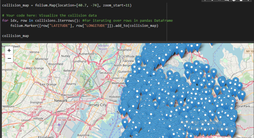
Image 3a
To make maps like this more appealing, this will lead us to MarkerClusters
4) Adding MarkerCluster to a map
If we have a lot of markers to add, MarkerCluster can help to declutter the map. Each marker is added to a MarkerCluster object and each cluster displays the number of markers in it. When you click on each cluster, it expands and shows the markers in the cluster.
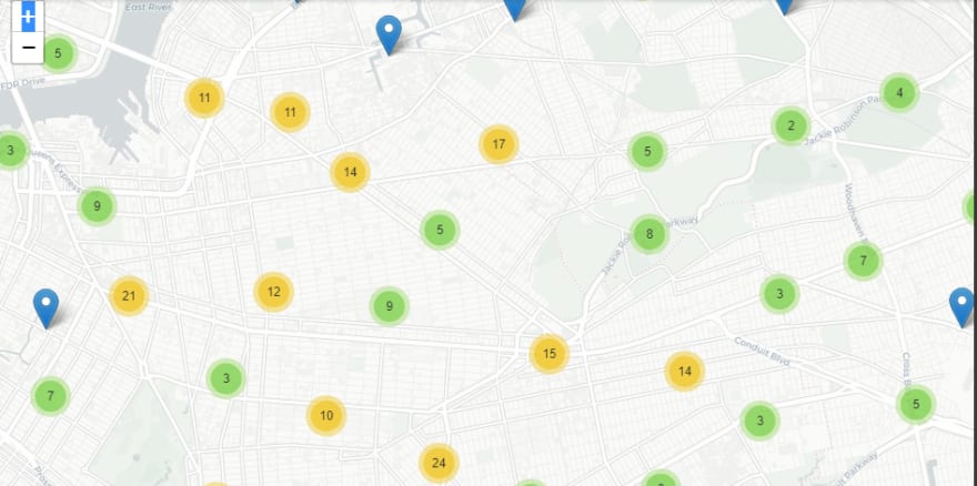
Image 4
5) Adding circles to a map
Here we use circles instead of markers. By varying the size and color of each circle, we can also show the relationship between location and any other variable.
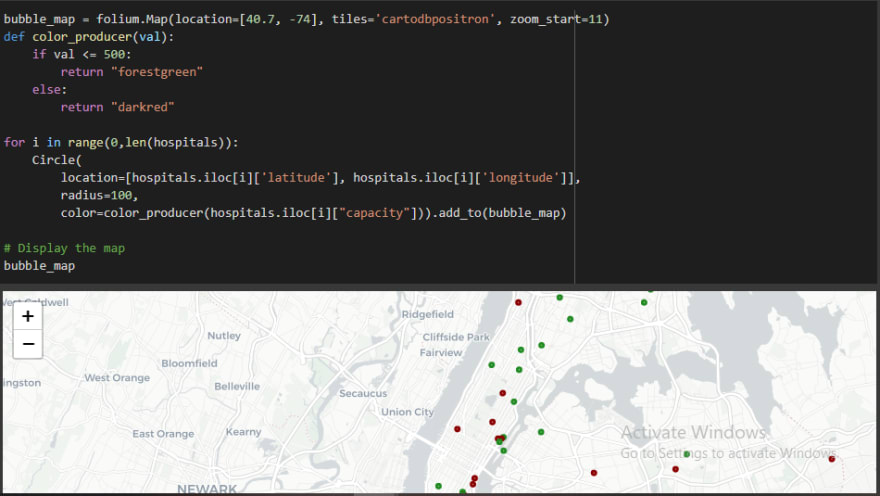
Image 5
6) Visualizing a Choropleth
Choropleth is a type of thematic map in which areas are shaded or patterned in proportion to a statistical variable that represents an aggregate summary of a geographic characteristic within each area, such as population density or per-capita income. This means that regions with higher numbers (of your chosen variable) take a darker shade and gets lighter as the number decreases.
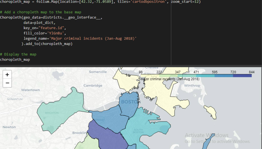
Image 6
7) Measuring distance on a map
To measure distances between points from two different GeoDataFrames, we first have to make sure that they use the same coordinate reference system (CRS).
Check CRS: print(df.crs)
Convert from one CRS to another (also called reprojecting): df.to_crs(espg : 2272)
Also check the unit of the CRS. Insert the CRS in the search column.
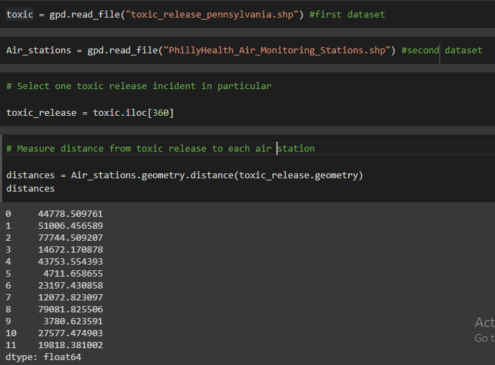
Image 7
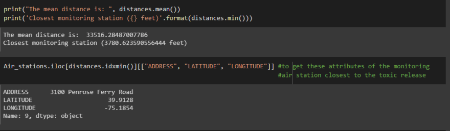
Image 7a
8) Creating a buffer in a map
Buffer is used for getting all points within a specified distance away from a point of interest (POI).
Firstly, we create a buffer around all the monitoring air stations (POI). The code cell below creates a GeoSeries two_mile_buffer containing 12 different Polygon objects. Each polygon is a buffer of 2 miles (or, 2*5280 feet) around a different air monitoring station.
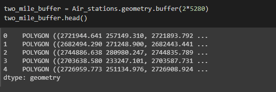
Image 8
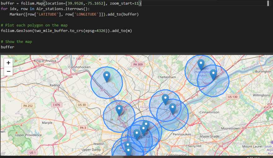
Image 8a
To test if a toxic release occurred within 2 miles of any monitoring air station, we will first collapse all of the polygons into a MultiPolygon object. We do this with the unary_union attribute.
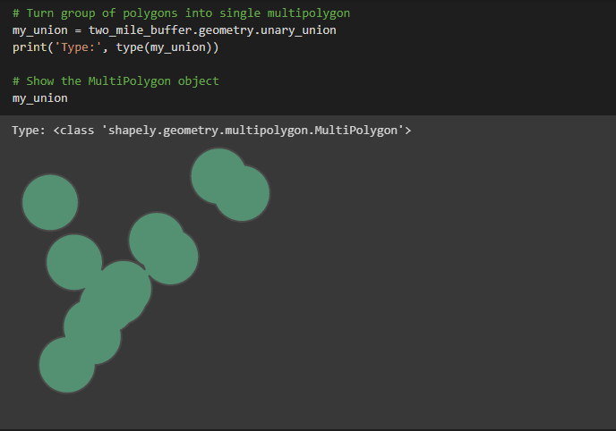
Image 8b
We use the contains() method to check if the multipolygon contains a toxic release point. We will use the toxic release incident from earlier, which we know is roughly 3781 feet to the closest monitoring station. We will also check other random toxic release points
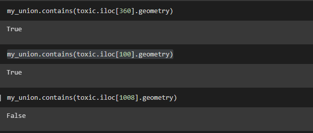
Image 8c
I hope you enjoyed this article. I'm still learning and will appreciate your critique.
Find me online
Twitter: @rKyrian
LinkedIn: Chinazo Anebelundu
Instagram: @chinazo-anebel
Facebook: Chinazo Anebelundu
Find the notebook and datasets here

Top comments (1)
I suggest maybe you could do a follow up article and work on visualizing any particular data distribution(population, employment rate, mortality rate and so on) on any of the map types.