In the past two days, I came across a very interesting CSS property — box-decoration-break. Let’s take a look.
How can we understand box-decoration-break?:
- box — box, which can be understood as an element box model, like a div tag
- decoration — understood as element style
- break — line break, reference word-break, understood as the performance of line break
Then, this property can be first understood as the expression of the element’s style when a line break occurs.
MDN: The box-decoration-break CSS property specifies how an element’s fragments should be rendered when broken across multiple lines, columns, or pages. The general idea is that the box-decoration-break property specifies how an element fragment should be rendered when a line wrap/break occurs.
Only two values can be selected:
{
    box-decoration-break: slice;   // default
    box-decoration-break: clone;
}
Example
This attribute usually works on inline elements. Suppose we have the following structure and add a border to it:
<span>ABCDEFGHIJKLMN</span>
span {
    border: 2px solid #999;
}
Well, the effect is as follows, it's a very normal effect:

Well, the next step is break, we break the text of the above line, and the style remains unchanged:
<span>ABCD <br/>EFG <br/> HI<br/> JKLMN</span>
Got the following result:

you can see that when the text wraps, the border also changes. The first and last lines have three borders, and the middle two lines have only the upper and lower borders. If the 4 lines are combined, they can be assembled into Figure 1, which is a normal display effect.
Next, we add the protagonist of this article box-decoration-break: clone:
span {
    border: 2px solid #999;
+   box-decoration-break: clone;
}
After it takes effect, we will get this result:

box-decoration-break: clone
Seeing this, we can already roughly understand the role of this property:
box-decoration-break: cloneInline elements that use, if there is line wrapping, each line will have all the full styling of the original single line.
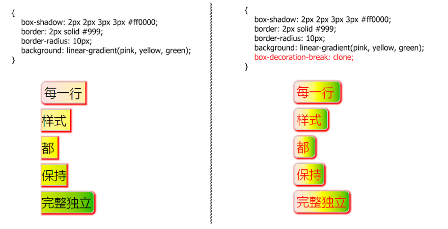
Let's look at another example to deepen our understanding. There is the following structure, which uses the two effects box-decoration-break: clone before:
<span >每一行 <br/>样式 <br/> 都 <br/> 保持<br/> 完整独立</span>
CodePen Demo -- box-decoration-break
box-decoration-break: clone Effective Range
Of course, elements that box-decoration-break: clone use are not available for every style, but only for the following styles:
- background
- border
- border-image
- box-shadow
- clip-path
- margin
- padding
- Syntax
box-decoration-break: clone in action
Next, let's see if there are any reliable practical application scenarios.
box-decoration-break: clone to achieve text selection effect
There will be scenarios where we want to highlight a specific paragraph of text in a multi-line text. In this case, we can nest the SPAN with P to show the SPAN wrapped text in some specific way.
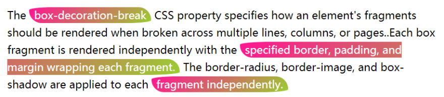
For example, we have this text:
<p>
The <span>box-decoration-break</span> CSS property specifies how an element's fragments should be rendered when broken across multiple lines, columns, or pages..Each box fragment is rendered independently with the <span>specified border, padding, and margin wrapping each fragment.</span> The border-radius, border-image, and box-shadow are applied to each <span>fragment independently.</span>
</p>
Among them, we wrap the content that needs to be emphasized by <span> tags , give a specific style and add box-decoration-break: clone it, so that no matter whether the emphasized text wraps or not, the emphasized background of each place is the same:
p {
    font-size: 22px;
    line-height: 36px;
}

span {
    background-image: linear-gradient(135deg, deeppink, yellowgreen);
    color: #fff;
    padding: 2px 10px;
    border-radius: 50% 3em 50% 3em;
    box-decoration-break: clone;
}
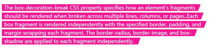
Get the following effect:

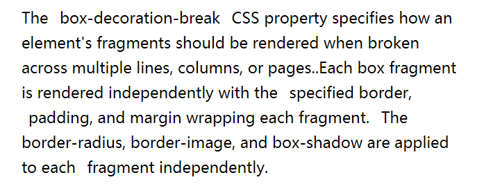
What if you don't add box-decoration-break: clone? Then if there is a newline, the effect will be greatly reduced:
CodePen Demo -- text-decoration-break demo
box-decoration-break with a specific border for each line of text
There will be such a scenario, we want each line of copy to have a specific border style, like this:
How to achieve it? Maybe one per line <p>, with the above styles <p> set. But what if the text content is indeterminate and the container's width is indeterminate?
This scenario box-decoration-break is also use. Of course, there is a little trick here. Normally, it box-decoration-break: clone only works on the inline element , if our copy is wrapped in a <p> tag like this:
<p>
The box-decoration-break CSS property specifies how an element's fragments should be rendered when broken across multiple lines, columns, or pages..Each box fragment is rendered independently with the specified border, padding, and margin wrapping each fragment. The border-radius, border-image, and box-shadow are applied to each fragment independently.
</p>
box-decoration-break: clone To <p> take effect on, it can be achieved <p> by display: inline. In this way, to achieve the above effect, we only need:
p {
    display: inline;
    box-decoration-break: clone;
    background:linear-gradient(110deg, deeppink 0%, deeppink 98%, transparent 98%, transparent 100%);
}
Fits perfectly no matter how the text content or container width changes:

CodePen Demo -- box-decoration-break Each line of text with a specific border
box-decoration-break combined with transition animation
Combining the above, we can also consider combining box-decoration-break with transition effects or animation effects.
For example, we hope that when we hover the text content, some text paragraphs that need to be displayed can be highlighted, which may be like this:
CodePen Demo -- box-decoration-break with transition animation
Or:

CodePen Demo -- box-decoration-break with transition animation
You can try to click into Demo, and then remove box-decoration-break: clone it, you will find that the effect is greatly reduced.
Compatibility(2022–07–19)
Well, according to the usual compatibility, it should not be very good. And MDN also gives this hint:
This is an experimental technology. Check the Browser compatibility table carefully before using this in production.
Take a look at Can I Use, it's actually good:

Finally
More wonderful CSS technical articles are summarized in my Github -- iCSS.
And maybe you will love my CodePen, which has a large number of amazing CSS effects.
Well, that's all for this article, I hope it helps you. :)

Top comments (10)
Balloon Town*brings the magic of colorful creations right to your doorstep with their convenient delivery service. Whether it's for a birthday, party, or special event, you can now have stunning balloon arrangements delivered to make any occasion unforgettable. Let Balloon Town brighten your celebration with their vibrant designs, delivered with care and creativity.
If anyone needs locksmith in orlando, check out All American Locksmith. They offer everything from key duplication to smart lock installation and work all around Orlando. I saved their number — 407-272-6040 — because they’re the only ones I’ll call now.
Explore the full Whataburger meal with classic burgers, chicken sandwiches, breakfast items, and more. Fresh, flavorful fast food made your way.
Some comments may only be visible to logged-in visitors. Sign in to view all comments.