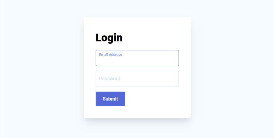
Recently I stumbled upon this beautiful login form made with Tailwind CSS. It has some Javascript code beside CSS to achieve the desired animation.
The code looks like this.
<style>
    .input {
        transition: border 0.2s ease-in-out;
        min-width: 280px
    }

    .input:focus+.label,
    .input:active+.label,
    .input.filled+.label {
        font-size: .75rem;
        transition: all 0.2s ease-out;
        top: -0.1rem;
        color: #667eea;
    }

    .label {
        transition: all 0.2s ease-out;
        top: 0.4rem;
        left: 0;
    }
</style>

<script>
    var toggleInputContainer = function (input) {
        if (input.value != "") {
            input.classList.add('filled');
        } else {
            input.classList.remove('filled');
        }
    }

    var labels = document.querySelectorAll('.label');
    for (var i = 0; i < labels.length; i++) {
        labels[i].addEventListener('click', function () {
            this.previousElementSibling.focus();
        });
    }

    window.addEventListener("load", function () {
        var inputs = document.getElementsByClassName("input");
        for (var i = 0; i < inputs.length; i++) {
            console.log('looped');
            inputs[i].addEventListener('keyup', function () {
                toggleInputContainer(this);
            });
            toggleInputContainer(inputs[i]);
        }
    });
</script>

<div class="shadow-xl p-10 bg-white max-w-xl rounded">
    <h1 class="text-4xl font-black mb-4">Login</h1>
    <div class="mb-4 relative">
        <input class="removed-for-readability" id="email" type="text">
        <label for="email" class="removed-for-readability">Email Address</label>
    </div>
    <div class="mb-4 relative">
        <input class="removed-for-readability" id="password" type="password">
        <label for="password" class="removed-for-readability">Password</label>
    </div>
    <button class="removed-for-readability">Submit</button>
</div>
I didn't like the fact that you had to reach out to pure DOM functions to achieve this functionality. Turns out that Svelte's use directive is a perfect fit for the job and also a good example of showing one of the things you can use it for. Let's refactor the code a bit.
<style>
  .input {
    transition: border 0.2s ease-in-out;
  }

  .input:focus + .label,
  .input:active + .label,
  .input.filled + .label {
    font-size: 0.75rem;
    transition: all 0.2s ease-out;
    top: -0.1rem;
    color: #667eea;
  }

  .label {
    transition: all 0.2s ease-out;
    top: 0.4rem;
    left: 0;
  }
</style>

<script>
  const labelToggle = node => {
    const handleKey = event => {
      if (event.target.value) {
        event.target.classList.add('filled');
      } else {
        event.target.classList.remove('filled');
      }
    };
    node.addEventListener('keyup', handleKey);

    return {
      destroy() {
        node.removeEventListener('keyup', handleKey);
      }
    };
  };

  const labelClick = node => {
    const click = event => {
      event.target.previousElementSibling.focus();
    };
    node.addEventListener('click', click);

    return {
      destroy() {
        node.removeEventListener('click', click);
      }
    };
  };
</script>

<div class="max-w-lg p-10 bg-white rounded shadow-md">
  <h1 class="mb-4 text-3xl font-black">Login</h1>
  <form>
    <div class="relative mb-4">
      <input use:labelToggle class="removed-for-readability" id="email" type="text" />
      <label use:labelClick for="email" class="removed-for-readability">Email</label>
    </div>
    <div class="relative mb-4">
      <input use:labelToggle class="removed-for-readability" />
      <label use:labelClick for="password" class="removed-for-readability">Password</label>
    </div>
    <div class="text-center">
      <button class="removed-for-readability">Continue</button>
    </div>
  </form>
</div>
Do you notice that our text inputs now have use:labelToggle directives and our labels have use:labelClick? Basically, we have defined the two "use" handlers, or actions as they are called in Svelte, in the script section of the file and then attached them to the appropriate html nodes. But how does it work?
The use directive explained aka Svelte action
The actions are custom code that will be run when the element is mounted on the DOM and will pass the element to that action as a raw DOM node. If the function returns an object with destroy function on it, Svelte will run that function when the element is unmounted from the DOM. Very simple, but also incredibly powerful in case you want to do something outside of Svelte and use the full power of DOM.
Below is an annotated example of the toggle handler attached to our text inputs.
// Svelte passes in raw html DOM element when element is mounted on the DOM
const labelToggle = node => {
    // Define a custom event handler for the text input element
    const handleKey = event => {
      // if element's value is not empty add class "filled"
      if (event.target.value) {
        event.target.classList.add('filled');
      } else {
        event.target.classList.remove('filled');
      }
    };
    // bind custom event handler to element's keyup event
    node.addEventListener('keyup', handleKey);

    // when element is unmounted from the DOM remove the event listener
    return {
      destroy() {
        node.removeEventListener('keyup', handleKey);
      }
    };
  };
You can also pass in parameters to actions and run custom code if parameters change, but I wanted to keep the example simple here. Read the docs if you want to learn more.
Svelte's actions have many use cases,like drag-and-drop, tooltips, etc. Only your imagination is the limit.

Top comments (2)
I don't think this is a good use-case (heh) for
use. It would be less code to add an event listener instead:This way, Svelte takes care of the event listener lifecycle for you. Scenarios where you're only adding a single event listener don't need actions. If you're listening to a lot of events, then it could make sense to move the handlers into an action and dispatch a single custom event that has what you need, like in the Svelte tutorial.
Agree. Example was mostly for demonstration purpose and is overkill, even though it's a nice one! Thanks for teaching me and others :)