
🎯 Introduction
When working on a React project, organizing your files and folders effectively is crucial for scalability, maintainability, and team collaboration. A well-structured project helps developers navigate the codebase efficiently, reduces complexity, and promotes best practices. 🏗️
In this article, we will explore a scalable folder structure for React applications using TypeScript, styled-components, Redux, and Context API, considering modularisation, separation of concerns, and best coding practices. 📝
📂 Basic Folder Structure
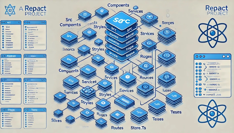
A modern React project using TypeScript, styled-components, Redux, and Context API follows this structure:
my-app/
├── node_modules/
├── public/
├── src/
│   ├── App.tsx
│   ├── index.tsx
│   ├── components/
│   ├── assets/
│   ├── styles/
│   ├── services/
│   ├── hooks/
│   ├── context/
│   ├── pages/
│   ├── utils/
│   ├── routes/
│   ├── store/
│   │   ├── slices/
│   │   ├── store.ts
│   ├── config/
│   ├── theme/
│   ├── tests/
├── .gitignore
├── package.json
├── tsconfig.json
├── README.md
📦 Detailed Folder Structure and Best Practices
🔄 1. Store – Redux State Management
This folder contains Redux store configuration and slices for state management.
store/
├── slices/
│   ├── authSlice.ts
│   ├── userSlice.ts
│   ├── themeSlice.ts
├── store.ts
Example Redux Slice:
import { createSlice, PayloadAction } from "@reduxjs/toolkit";

interface ThemeState {
  mode: "light" | "dark";
}

const initialState: ThemeState = {
  mode: "light",
};

const themeSlice = createSlice({
  name: "theme",
  initialState,
  reducers: {
    toggleTheme: (state) => {
      state.mode = state.mode === "light" ? "dark" : "light";
    },
  },
});

export const { toggleTheme } = themeSlice.actions;
export default themeSlice.reducer;
🌍 2. Context – Context API for Global State
Stores context providers for managing app-wide state without prop drilling.
context/
├── AuthContext.tsx
├── ThemeContext.tsx
├── SidebarContext.tsx
Example Sidebar Context API:
import React, { createContext, useState, ReactNode, useContext } from 'react';

type SidebarContextType = {
  isOpen: boolean;
  toggleSidebar: () => void;
};

const SidebarContext = createContext<SidebarContextType | undefined>(undefined);

export const SidebarProvider: React.FC<{ children: ReactNode }> = ({ children }) => {
  const [isOpen, setIsOpen] = useState(false);

  const toggleSidebar = () => setIsOpen(!isOpen);

  return (
    <SidebarContext.Provider value={{ isOpen, toggleSidebar }}>
      {children}
    </SidebarContext.Provider>
  );
};

export const useSidebar = () => {
  const context = useContext(SidebarContext);
  if (!context) throw new Error('useSidebar must be used within a SidebarProvider');
  return context;
};
💅 3. Theme – Global Theme & Styled-Components
Stores the global theme configuration and styled-components for consistent UI styling.
Theme Configuration:
export const theme = {
  colors: {
    primary: "#007bff",
    secondary: "#6c757d",
    backgroundLight: "#ffffff",
    backgroundDark: "#121212",
  },
  spacing: {
    small: "8px",
    medium: "16px",
    large: "24px",
  },
};
Example Styled Component:
import styled from "styled-components";

export const Button = styled.button`
  background-color: ${(props) => props.theme.colors.primary};
  color: white;
  padding: ${(props) => props.theme.spacing.medium};
  border-radius: 5px;
  cursor: pointer;
`;
🛠️ 4. Hooks – Custom Hooks for Reusability
- A place for storing reusable custom hooks.
- Keeps logic modular and reusable.
hooks/
├── useFetch.ts
├── useDebounce.ts
├── useTheme.ts
Example Custom Hook:
import { useState, useEffect } from "react";

export function useDebounce(value: string, delay: number = 500) {
  const [debouncedValue, setDebouncedValue] = useState(value);

  useEffect(() => {
    const handler = setTimeout(() => {
      setDebouncedValue(value);
    }, delay);

    return () => clearTimeout(handler);
  }, [value, delay]);

  return debouncedValue;
}
🧪 5. Testing Best Practices
- Stores unit tests and integration tests.
- Uses Jest and React Testing Library.
tests/
├── components/
│   ├── Button.test.tsx
├── hooks/
│   ├── useDebounce.test.ts
Example Test Case:
import { render, screen } from "@testing-library/react";
import { Button } from "../../src/components/Button";

test("renders button correctly", () => {
  render(<Button>Click Me</Button>);
  expect(screen.getByText(/click me/i)).toBeInTheDocument();
});
✅ Conclusion
A scalable React project using TypeScript, styled-components, Redux, and Context API ensures:
- 🔹 Type safety with TypeScript.
- 🔹 Modular styling with styled-components.
- 🔹 Separation of concerns through hooks, services, and context.
- 🔹 Efficient state management via Redux Toolkit & Context API.
- 🔹 Reusability & Scalability with custom hooks & optimized folder structure.
🤔 How do you structure your React projects? Let’s discuss in the comments! 🚀

Top comments (0)