
In part 3, we will finish building out the project by adding the CSS to it.
Start the local server, by clicking on the blue Go Live button in the bottom right hand corner of the page of Visual Studio Code.

In our styles.css file, we will first add a basic CSS reset. This is used to reset the default browser styles for the HTML.
* {
  margin: 0;
  padding: 0;
  box-sizing: border-box;
}
We are then going to choose the background color and center the text.
body {
  background-color: #5a4fcf;
  text-align: center;
  font-family: "Open Sans", sans-serif;
}
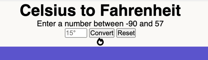
You should see this result in the browser.

We are then going to target the title and card classes to change the background color and round out the border.
.title,
.card {
  border-radius: 15px;
  background-color: #faf9f6;
}
The next step is to use a Google font.
Go to https://fonts.google.com/, and search for the Limelight font.

Click on the Google font, and choose Select this style.

A tab on the right hand side will slide open, and you should see the option to copy the code for the link tag.

Add that link tag, inside the head for our HTML file.
  <!--Google font-->
  <link rel="preconnect" href="https://fonts.googleapis.com">
  <link rel="preconnect" href="https://fonts.gstatic.com" crossorigin>
  <link href="https://fonts.googleapis.com/css2?family=Limelight&display=swap" rel="stylesheet">
</head>
In the CSS file, add the Limelight font to the title class along with these margin and padding styles.
.title {
  padding: 20px 0;
  margin: 40px auto 30px;
  max-width: 40%;
  font-family: "Limelight", cursive;
}

Next, add these margin styles for the #message.
#message {
  margin: 20px 0 30px;
}
Next, set the dimensions for the card class.
.card {
  max-width: 300px;
  height: 250px;
  padding: 15px;
  margin: auto;
}

For the .input-container, we will use flex to add some space between the input and buttons.
.input-container {
  margin-bottom: 40px;
  display: flex;
  justify-content: space-around;
}

We will then set the width for the number input.
input[type="number"] {
  width: 20%;
}
Next, set the margins for the .result-div and .result-text.
.result-div {
  margin: 10px 0;
}

.result-text {
  margin: 10px;
}
We will then set the colors and font sizes for the Font Awesome icons.
.fas,
.far {
  margin-left: 5px;
  font-size: 1.3rem;
}

.fa-fire,
.fa-burn {
  color: #ff0000;
}

.fa-fire {
  font-size: 3rem;
}

.fa-sun {
  color: #ffbf00;
}

.fa-icicles {
  color: #00d0ff;
}
Then we want to add the button styles.
.btn {
  color: white;
  padding: 5px;
  margin: 0 10px;
  background-color: #0818a8;
  cursor: pointer;
  border: none;
  border-radius: 10%;
}

Lastly, we will add two media queries to target smaller mobile devices.
@media (max-width: 500px) {
  .title {
    max-width: 300px;
    font-size: 1.3rem;
  }
}

@media (max-width: 300px) {
  .title {
    max-width: 200px;
    font-size: 1rem;
  }
}
This is what the entire CSS file should look like.
* {
    margin: 0;
    padding: 0;
    box-sizing: border-box;
}

body {
    background-color: #5a4fcf;
    text-align: center;
    font-family: "Open Sans", sans-serif;
}

.title,
.card {
  border-radius: 15px;
  background-color: #faf9f6;
}

.title {
    padding: 20px 0;
    margin: 40px auto 30px;
    max-width: 40%;
    font-family: "Limelight", cursive;
}

#message {
    margin: 20px 0 30px;
}

.card {
    max-width: 300px;
    height: 250px;
    padding: 15px;
    margin: auto;
}

.input-container {
    margin-bottom: 40px;
    display: flex;
    justify-content: space-around;
}

input[type="number"] {
    width: 20%;
}

.result-div {
    margin: 10px 0;
}

.result-text {
    margin: 10px;
}

.fas,
.far {
  margin-left: 5px;
  font-size: 1.3rem;
}

.fa-fire,
.fa-burn {
  color: #ff0000;
}

.fa-fire {
  font-size: 3rem;
}

.fa-sun {
  color: #ffbf00;
}

.fa-icicles {
  color: #00d0ff;
}

.btn {
    color: white;
    padding: 5px;
    margin: 0 10px;
    background-color: #0818a8;
    cursor: pointer;
    border: none;
    border-radius: 10%;
}

@media (max-width: 500px) {
    .title {
      max-width: 300px;
      font-size: 1.3rem;
    }
}

@media (max-width: 300px) {
    .title {
        max-width: 200px;
        font-size: 1rem;
    }
}
In part 4, we will setup a GitHub repository and deploy our project to GitHub Pages.

Top comments (0)