The article was originally published on Codica blog.
If you are not satisfied with the number of visitors and transactions on your e-commerce website, maybe you should think about improving your UX design. Pretty often these enhancements can fix particular marketplace issues.
Moreover, efficient and appealing design helps earn the loyalty of your customers by making their interaction with your platform seamless and convenient.
Below you can see the most widespread issues that the owners of e-commerce platforms face and suggestions on how they could be solved with user-friendly UX design.
UX and its role in marketplace design
It can be a tough call to create and launch an online marketplace. Therefore, it comes as no surprise that sooner or later its owners face specific challenges. Luckily, they can be easily solved with the help of user experience design (UX).
The main goal of UX design is to improve customers’ satisfaction and loyalty through usability and usefulness offered in the interaction with a product. This general term encompasses multiple factors such as aesthetics, usability, marketing, and accessibility.
So, what makes UX important for marketplace performance and conversions?
With the help of UX, you can create the user journey on the website. In such a way you ensure the seamless experience and increase customer satisfaction.
Innovative web design should not be your primary concern. In reality, useful data and easy navigation are the most important things for your customers. Take Amazon, for example. The Internet giant had not changed its design for many years. This tactic successfully adopted by the world’s biggest online marketplace proves that basic UX principles work.
When users interact with the e-commerce website in a simple manner, the chances are they return for repeat purchases. Therefore, proper organization and easy navigation become must-have features for your online marketplace. Allow users to find and purchase the desired item in no time.
To sum it up, the key goals of a marketplace UX are as follows:
- Boost conversion rate.
- Make user flow on the platform as simple as possible.
- Improve the security and reliability of your e-commerce website.
When you achieve these goals, you will be able to gain new buyers and sellers and make your platform more profitable.
Problem: Low user engagement
Eye-catching and trendy UI design does not make your platform profitable. The number of transactions completed there does. If you have very few purchases, it pays to analyse your platform and find a way to improve it.
Below we prepared possible solutions to this issue.
Solution: Make your marketplace idea clear
To begin with, make it clear to customers what goods and services are available on your platform. Highlight its main differences from similar e-commerce websites. Provide users with a clear marketplace idea and benefits from the very first seconds they spend on the website.
Always think about your users. Make sure they know what to do on each step of their customer journey. Display special product offerings, encouraging users to start shopping immediately.
Make sure your e-commerce platform is fast, simple, and smooth.
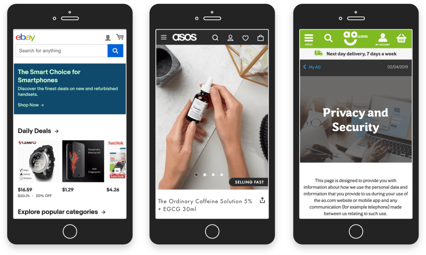
Avoid overloading the home page with extra information. Focus on high-quality product photos rather than ads. Always stick to the point, as Amazon and eBay do.
If you visit Newegg website, you will definitely know what to find there. All elements on the webpage are arranged perfectly, so you can easily reach the required information.
Solution: Think of the user's journey on the site
Make sure that the customer journey through your online marketplace is effective. You should be able to match users’ expectations and satisfy their demands at each stage of the purchase process.
It would be a good idea to create a Customer Journey Map for offering a seamless user experience. It will make it easier for you to understand your target audience, learn about the issues they face and the products they wish to buy.
Take the effort of studying the demographics of your target audience. Learn as much as you can about their gender, age, geographical location, and education level.
Try to understand users’ goals and motives that have the biggest impact on their purchase decision. Evoke positive feelings and emotions by giving consumers what they want and they will reward you with repeat purchases.
Though Starbucks is not a marketplace, it is a perfect example of a brand making proper use of a Customer Journey Map.
Also, don’t forget about visual hierarchy and arrange content on a page naturally.
Points to consider:
- Remember that the size of each object matters. For example, big elements seem more attractive.
- Visual elements should be applied efficiently. Use bright and contrast colours to catch the users’ eye.
- F and Z patterns also show great results. They can be helpful in understanding how a consumer moves around the site and what they pay attention to.
Problem: Small amount of mobile transactions
Is mobile traffic so important?
Let’s see what numbers can tell us. Statista predicts that sales from smartphones will rise up to 49.2% of all US sales in 2020.
We cannot underestimate the convenience of mobile commerce. Otherwise, a huge amount of website visitors will leave the platform.
First of all, it is definitely more comfortable in comparison with the desktop. Users get advanced portability that is impossible when we deal with computers. Besides, purchases via social networks, e.g. Instagram have become more common these days.
Solution: Make mobile optimisation a priority
More and more people are looking for goods and services on mobile phones and tablets. Therefore, many factors deserve your special attention when developing the marketplace with a focus on mobile buyers.
Create user-friendly mobile designs, so that customers can buy products from their smartphone, thus making the purchase process extremely smooth and fast.
Points to consider:
- Make sure your platform is easy-to-navigate from all mobile devices regardless of the screen size or resolution.
- Allow customers to use digital wallets, including ApplePay, AndroidPay, and others.
- Break a checkout process into several steps to make it easier.
- If you already have a website, create an adaptive version to please customers with the convenient purchasing process.
Problem: Lack of trust
Your marketplace should engage customers and make them believe you offer a reliable platform for selling and buying different goods and services. They want to have confidence in you before clicking the “Buy Now” button.
Solution: Trustworthy photos of products
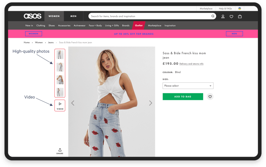
It all starts with high-quality images of selling items. So, it is a must-have. Give your customers photos of products with more details visible.
When you visit a traditional, brick-and-mortar store, you are viewing goods from all sides. The same happens in an online marketplace. It would not hurt to be more progressive and user-oriented. Give vendors the chance to implement videos for demonstrating the product in a real environment: a microwave oven in the kitchen, a dress on a girl, etc.
On Asos website, you can find both high-quality photos and videos. They help visitors to move through the designed customer journey towards a purchase.
Solution: Full product description
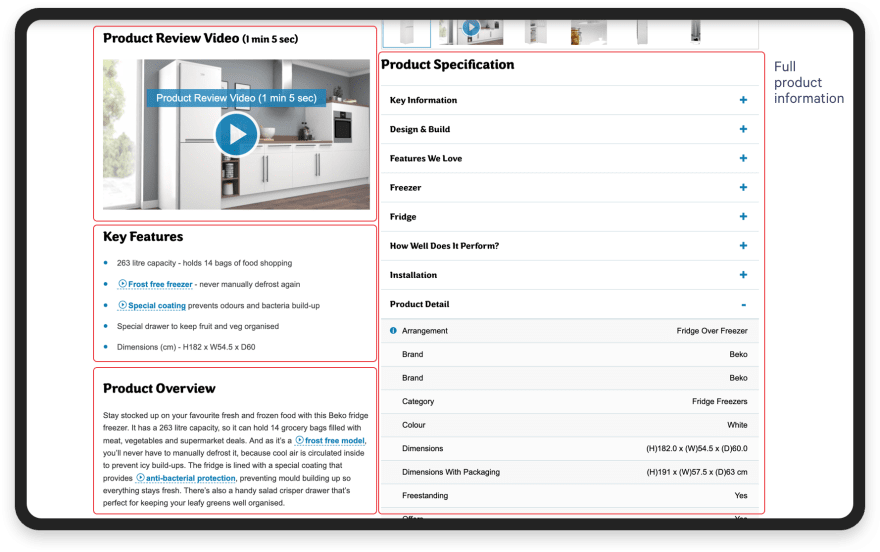
Give sellers the possibility to write the detailed product description: from “where it is made” to “how eco-friendly it is.'' Let them arrange the key information next to the main photo and place a secondary description below the picture. It helps customers understand whether this item meets their expectations or not.
AO pays special attention to product descriptions and their place on the site. They help the customers to make informed decisions when purchasing an item.
Solution: System of ratings and reviews
It goes without saying that ratings and reviews are one of the key features to build trust in your online marketplace. They help understand the quality of a product and answer questions. If customers leave positive comments about a purchased item, new users think they should try it too. Everyone reads the reviews before buying, so this section is a must on an e-commerce website. Do not forget about a seller rating system as well.
Etsy provides their customers with the best possible experience. You can view both seller and product ratings before making a decision and buying the desired handcrafted item.
Solution: Secure purchase and refund policy
Consumers should have the possibility of giving the purchased item back if it did not meet their expectations or simply did not suit them. Otherwise, they will not risk buying any goods from you.
Besides, it would be a sensible idea to add a one-click-to-buy button to make purchasing smoother.
Amazon is a customer-oriented online marketplace, and they make shopping secure and risk-free, by introducing a strong return & refund policy.
Final Thoughts
UX design is not about creating beautiful interfaces. This term supposes the right choice of visual elements, convenience, gaining a new audience, encouraging users to buy the desired products, thus boosting sales. By showing a caring attitude to the customers through brilliant UX, you can earn their trust and loyalty and stand out from the competitors.
What is the bottom line? Value your customers, design the e-commerce platform with your users in mind, and never underestimate the power of good UX.
The article was originally published on Codica blog.


Top comments (0)