Greetings fellow developer, how are you? 👋🏼
Hope you all are doing great 🙂
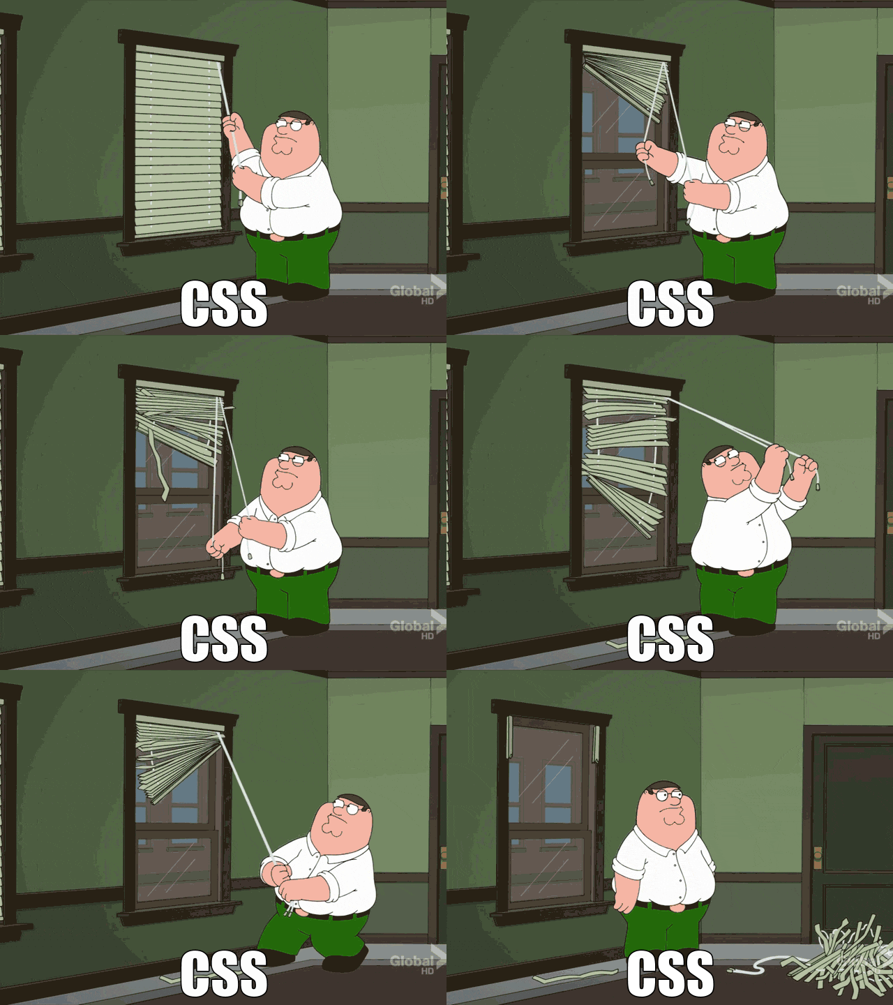
Today, I'm gonna talk about CSS! Almighty CSS, every developer's worst nightmare. OK, maybe not the worst but let's admit it, CSS is wearisome if you are a beginner who does not have much experience writing CSS.
So I just had a wonderful session with the CSS Wizard, Kuhagra Gour. For those of you who don't know him, he's the creator of CSS Battle, Web Maker and more. The session was a part of NeoG Camp's guest lecture series where we get the chance to interact, learn and clear our doubts directly with the industry experts.
We covered a lot of topics and discussed tons of problems that students face while writing CSS.
Now as we covered a lot of ground it's not possible for me to write each and everything that we discussed but I can provide you with some tips which may be very useful to you if you struggle while writing CSS or if you are just a beginner in front-end development.
Let's Start,
When developing applications, always try to do a mobile-first approach. And then, later on, optimize it for desktop.
Try not to nest classes while writing CSS inside the stylesheet, writing CSS for one class only will help.
  /* BAD */
  .conainer .paragraph .hightlight {
    background-color: gray;
  }

  /* GOOD */
  .highlight {
    background-color: gray;
  }
- Keep the Magic Numbers & Values inside CSS variables (such as colors, margin, padding, font-size, etc)
 :root {
   /* COLORS */
   --primary-color: #0B5ED7;
   --secondary-color: #5C636A;
   --dark-color: #1C1F23 ;
   --info-color: #0EA5E9;
   --link-color: #1D4ED8;
   /* SPACING */
   --padding-one: 1rem;
   --padding-two: 2rem;
   --padding-three: 3rem;
 }
The above point will also help you in creating themes based on your current CSS, just change the variable values and VOILA! there you have yourself a new theme.
Always keep spacing consistent.
Use Vanilla CSS as much as possible.
Try not to use "px" for spacing and sizing, instead use "rem" and "em" for responsiveness ("rem" is more preferred).
  /* Avoid */
 .container {
  padding: 48px;
 }
  /* Use */
 .container {
  padding: 3rem;
 }
Use a consistent naming convention for your classes (for better DX).
While writing an app keep in mind to give equal importance to both UX and DX.
-
While approaching a complex design, first take your time and identify your components
- Components that are not going to be in normal flow i.e., components having
position: absoluteandposition: fixed; - Container components which are uni-directional will use
display: flex; - Container components which are bi-directional will use
display: grid;
- Components that are not going to be in normal flow i.e., components having
And then plan your approach accordingly.
That's all for now!
I hope this helps somebody.
Thank You ✌🏼
Happy Coding 🧡


Top comments (3)
HI. Can you please clarify the statement "Use Vanilla CSS as much as possible"?
Vanilla CSS means pure CSS, this is for people who tend to use a CSS preprocessor over pure CSS.
Some good tips here I agree rem and em are much preferred these days.