When I started to learn CSS, my first challenge was understanding why there were so many different ways to position elements and what are the main differences between them.
Let's start with the very basic concepts. The browser interprets the HTML flow from left to right and from top to bottom. Whenever we add HTML elements to our website, we will see that there are 2 different kind of elements which already have a default position:
→ Inline Elements get positioned in a row next to each other: span, a, img, strong, em, button, input, label, select, textarea, etc.
🔲 Block Elements always start on a new line: div, header, nav, section, article, aside, main, footer, audio, video, figure, figcaption, form, table, ul, ol, li, p, hr, headings (h1-h6), etc.
See some examples here.
Easy. Now when we talk about CSS position properties, there are a bunch of them: position, display, z-index, float, clear, flex-box and grid. Why do we need so many and what are the differences between them? One of the things that helped me to understand them was creating a technical documentation project, which summarises all concepts in an easy way with visual and practical examples. Check them out here!
But let's go deeper into the newest and most used and efficient position properties: flex-box and grid.
- FlexBox vs Grid
- FlexBox Properties & Grid Properties
- Practise, practise, practise
FlexBox vs Grid
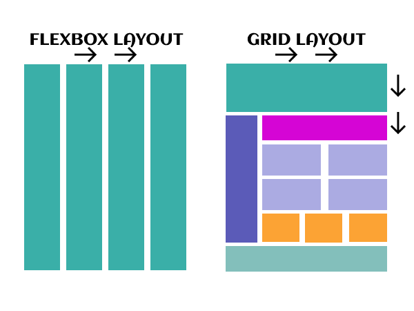
One of the main differences between both properties is that flex-box organises multiple elements in 1 dimension (rows or columns), while grid organises multiple elements in 2 dimensions (rows and columns)
The flexbox layout offers the possibility to make items adapt (width, height and order) more easily to the available space depending on the device screen size. It is very useful on app/web components or small layouts, while the Grid layout is recommended for larger projects. Have a look at both examples:
On the one hand, the Flexible Box Layout organises multiple elements (flex items or children) within a container (flex container or parent element) It has an inline position by default. On the other hand, Grid also positions multiple elements within a container but their default position is a block or column.
The above example is very simple but not very elegant. In order to start playing with the elements position and make our website's layout a bit more professional, we need to explore the Flexbox and Grid properties.
Flexbox & Grid Properties
You can find an in-deep-tutorial about Flexbox and Grid properties here.
Practise, practise, practise
It is said that “practice makes the master” and after so much theory it is time to build something from scratch, sweat, fail, learn and have fun! 🚀
"In theory there is no difference between theory and practice - in practice there is"
✨ Yogi Berra ✨
Below you can find some great and fun games to practise CSS positioning. I especially love Frontend Mentor, where you can find a lot of different projects for different levels and a great community that will support you and give you feedback along your way. Good luck!
- Position static, relative, absolute, fixed: CSS Sundae
- Flexbox: FlexBox Froggy
- Flexbox: FlexBox Zombies
- Grid: Grid Garden
- Components & Websites challenges: Frontend Mentor


Top comments (2)
My question is: do one learn CSS's positioning, or just improvise along the way until they get a new junior dev to delegate those tasks onto?
Wait for a junior Dev to hand off to. You'll learn positioning during code review 😉