This article was originally published here. Original author: Richard Všianský
Design system is a very powerful buzzword of today's application development. Each tech company is trying to achieve consistency and simple developer experience by incorporating one of them into all their applications.
Additionally, many of them are open-sourced and publicly available. To illustrate it we can mention IBM's Carbon, Google's Material, or Red Hat's PatternFly. These libraries are customizable and easy to use with many predefined components, so even small projects can use them to make their own development easier, cheaper, and faster without sacrificing a custom identity.
However, choosing the right one is particularly hard when there are so many of them. Because of that, it's a great idea to start with a simple prototype but doing it shouldn't take so much time. One tool helping with that is Data Driven Forms (DDF), a React library for rendering and managing forms using a data driven approach. This approach takes JSON data and changes them into fully functional forms. Complex forms can be 'coded' in minutes without any actual code knowledge.
Use case --- creating a form schema
Let's imagine a simple case to implement: a registration form. According to our fictional product management, the form consists of several elements users have to enter:
- Nickname
- Password
- Confirm Password
- Terms confirmation
We can start directly with defining a Data Driven Forms schema according to its definition.
const schema = {
  fields: []
}
The schema is an object containing one required attribute: fields. An array of form fields. Each of these are defined by objects having just two required attributes: name and component.
const field = {
  name: ...,
  component: ...,
  ...additionalAttributes
}
Both of them are string values defining what their names exactly suggests. Component depends on a used set of components, but in libraries provided by Data Driven Forms we can find all basic form components under keys such as text-field, select, checkbox, radio, textarea, .... These components then implement their custom attributes, most of them are shared: label, helperText, options, ... . In React, attributes correspond to component props.
So, let's transform our elements to fields definitions:
- Nickname
{
  name: 'nickname',
  component: 'text-field'
}
However, this is clearly not enough to satisfy (also fictional) UX requirements. There is no label and validation --- with a configuration like this, it's just a single HTML input element. Luckily, in Data Driven Forms fixing that is really simple:
{
  name: 'nickname',
  component: 'text-field'
  label: 'Nick name',
  validate: [{type: 'required'}]
}
There are introduced two new attributes: label and validate. Validate is an array of validators --- objects or functions. Data Driven Forms provide basic validation covering most cases (length, patterns), but it can be also customized by providing a function (async functions are also supported!) or using validatorMapper to define custom types. These custom types can be then used in string-based objects.
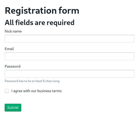
required validator is one of the implemented validators by the library, so we can use it immediately. (We could add another attribute to the field: isRequired, a boolean value that appends a required mark to the field. However, all inputs are required in our form, so it's better to put a single note to the beginning of the form. We will do it later.)
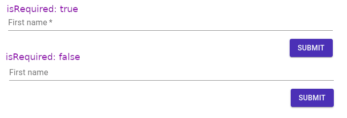
The difference between isRequired. (Material UI design)
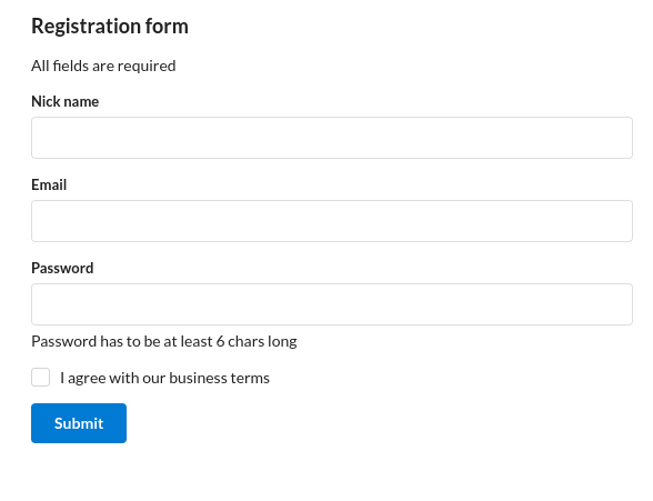
We can use the knowledge obtained in the previous paragraph to write the same object for the email, but the email has an additional format limitation. We will use pattern validation type to enforce it.
{
  name: 'email',
  component: 'text-field',
  label: 'Email',
  validate: [{
    type: 'required'
  } ,{
    type: 'pattern',
    pattern: '[a-z0-9._%+-]+@[a-z0-9.-]+.[a-z]{2,}$',
    message: 'Not valid email'
  }],
}

Validation triggered on the email field. (Semantic UI design)
- Password
{
  name: 'password',
  component: 'text-field',
  label: 'Password',
  validate: [{
    type: 'required'
   }, {
    type: 'min-length',
    threshold: 6,
   }],
  type: 'password',
  helperText: 'Password has to be at least 6 chars long'
}
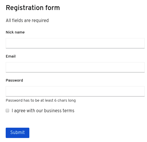
A new validator type is used: min-length makes sure that the value will have a length of 6 or more. type: 'password' is a standard HTML input element type, that shows the value as dots. helperText renders additional information to the field, its position and look depends on the used design library.

The password field with helperText and password type. (BlueprintJS design)
- Confirm Password
Let's do a twist here: there is a requirement that the password confirmation field will appear only if users enter some password to the field above. From the UX viewpoint, it does not make much sense, but it will nicely show another feature of Data Driven Forms: conditional fields.
{
  name: 'confirm-password',
  component: 'text-field',
  type: 'password',
  validate: [{type: 'required'}],
  label: 'Confirm your password',
  condition: {when: 'password', isNotEmpty: true}
}
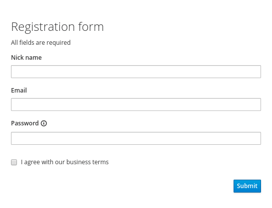
Data Driven Forms provides several types of conditions --- one of them is isNotEmpty. Using this type we can make sure that users have to enter the password first. DDF also allows to nest conditions (AND, OR, NOT), so all combinations are possible.
However, we are still missing to check if the confirmation is the same as the password. As said earlier, we can do it via providing a function in the validate array or adding a custom type to in validatorMapper. We will use the second option, because we need to access all values:
const validatorMapper = {
   'same-password': () => (value, allValues) => value !== allValues.password ? 'Password do not match' : undefined
}
Notice that the validator is a function returning a function (high-order function.) This construct allow to cache results or pass additional arguments from the schema. We will use this object as a prop later. Now, we can use this type in the validate array:
...
validate: [{type: 'same-password'}]
...
Notice that we can remove the required validator as it's already checked in the initial password field.

Cross-field validation and conditional field. (PatternFly 4 design)
- Terms confirmation
{
  name: 'terms',
  component: 'checkbox',
  label: 'I agree with our business terms',
  validate: [{type: 'required'}]
}
Changing the component is simple --- just replace the component string. Everything else works still the same.

Checkbox component. (PatternFly 3 design)
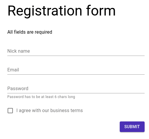
Final schema
Now, we can put all the fields together in the final schema with adding a title and description:
const schema = {
 title: 'Registration form',
    description: 'All fields are required',
    fields: [{
            name: 'nickname',
            component: 'text-field',
            label: 'Nick name',
            validate: [{
                type: 'required'
            }]
        },
        {
            name: 'email',
            component: 'text-field',
            label: 'Email',
            validate: [{
                    type: 'required'
                },
                {
                    type: 'pattern',
                    pattern: '[a-z0-9._%+-]+@[a-z0-9.-]+.[a-z]{2,}$',
                    message: 'Not valid email'
                }
            ]
        },
        {
            name: 'password',
            component: 'text-field',
            label: 'Password',
            validate: [{
                    type: 'required'
                },
                {
                    type: 'min-length',
                    threshold: 6
                }
            ],
            type: 'password',
            helperText: 'Password has to be at least 6 chars long'
        },
        {
            name: 'confirm-password',
            component: 'text-field',
            type: 'password',
            validate: [{type: 'same-password'}],
            label: 'Confirm your password',
            condition: {
                when: 'password',
                isNotEmpty: true
            }
        },
        {
            name: 'terms',
            component: 'checkbox',
            label: 'I agree with our business terms',
            validate: [{
                type: 'required'
            }]
        }
    ]
};
In just few minutes, we have written a fully functional and human readable form with many advanced features.
Now, let's make it work in our React project.
Using of Data Driven Forms
The first thing we have to do is to install react-form-renderer:
npm install --save @data-driven-forms/react-form-renderer
or
yarn add @data-driven-forms/react-form-renderer
This is the core of the Data Driven Forms library. The renderer is the component responsible for converting the schema into React components and it provides all the features we mentioned in this article.
After we install it, we can import it into our project:
import React from 'react';
import FormRenderer from '@data-driven-forms/react-form-renderer';
// if you want to treeshake the component
// import FormRenderer from '@data-driven-forms/react-form-renderer/dist/cjs/form-renderer';
const schema = { ... }; // defined earlier
const validatorMapper = { ... }; // defined earlier, not required

const App = () => {
 return(
 <FormRenderer
      schema={schema}
      onSubmit={(values, formApi) => console.log(values)}
      FormTemplate={FormTemplate}
      componentMapper={componentMapper}
      validatorMapper={validatorMapper} *// not required*
   />
 )
};
onSubmit is a submit function. Typically it would be a function making a request to API endpoint. schema is the object we created in the previous chapter. However, two props are still missing: FormTemplate and componentMapper. This is the point of this article: these two props define components the form uses. componentMapper includes components we are using in the schema: text-field, checkbox, etc. FormTemplate wraps the form, renders buttons, show a title.
We can implement our own components and templates, but Data Driven Forms offers multiple prepared libraries:
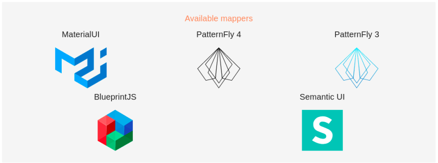
Available Data Driven Forms mappers libraries.
We call these libraries 'mappers' because they map Data Driven Forms attributes and features to libraries' props. For example, label attribute from the schema is mapped to FormLabel Material UI component.
Using of these mappers is as simple as it can be. Install them, import them and use them in the renderer component.
import React from 'react';
import FormRenderer from '@data-driven-forms/react-form-renderer';
import { FormTemplate, componentMapper } from '@data-driven-forms/mui-component-mapper';
// you can also treeshake whatever component you need
// import FormTemplate from '@data-driven-forms/mui-component-mapper/dist/cjs/form-template';
// import TextField from '@data-driven-forms/mui-component-mapper/dist/cjs/text-field';
// import Checkbox from '@data-driven-forms/mui-component-mapper/dist/cjs/checkbox';
// const componentMapper = { 'text-field': TextField, checkbox: Checkbox }

const schema = { ... }; // defined earlier
const validatorMapper = { ... }; // defined earlier

const App = () => {
 return(
    <FormRenderer
      schema={schema}
      onSubmit={(values, formApi) => console.log(values)}
      FormTemplate={FormTemplate}
      componentMapper={componentMapper}
      validatorMapper={validatorMapper}
    />
 )
};
Because all mappers' APIs are the same, we can quickly switch between them and choose the one we like the most.
However, we have to still install components libraries and their styles separately. The Data Driven Forms documentation page provides links leading to each library's installation guide or you can use examples below as starter points. Be aware that some libraries overwrites global styles, so be sure that you include only one of them at one time.
Material UI form
BlueprintJS form
Semantic UI form
PatternFly 4 form
PatternFly 3 form
Conclusion
Using Data Driven Forms we wrote common code defining the schema of form and everything else is provided by the library. We can run all these projects and take a look at how the libraries differ from each other. All these forms are fully functional, so during prototyping, we can code the whole form and switch the design library anytime we need to.
Also, it's simple to customize each part of the form --- if you don't like the headers or buttons, just switch them in FormTemplate. Or you can replace the whole components, add your custom ones, and much more.
In addition, there are more complex components like Wizard or Select --- writing them from scratch can take hours, using them in Data Driven Forms is just as simple as using text-field.
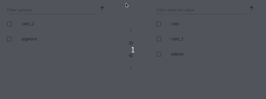
A dual list select component provided by Data Driven Forms. (Material UI design)
If you want to use different or custom components/design library, Data Driven Forms provides a simple command line that generates the structure of the whole package, it can even add TypeScript definitions. Just runyarn generate-template inside a root folder of DDF repository and interactive CLI will guide you. Next time, we will take look at this command and making a custom mapper.
The Data Driven Forms project is fully open-sourced on GitHub. If you find this project interesting, please join our community. We are opened to all contributions and we deeply appreciate each star we get. There is also an official twitter account @DataDrivenForms you can follow to get all the latest news.

Top comments (0)