Over on Medium I've written a series of five articles outlining the approach I use to creating or rewriting site templates. The process I advocate for comes at design -- ACTUAL DESIGN -- from the exact opposite end that most of the artists under the DELUSION they know what design is do.
I am an accessibility and efficiency consultant by trade, typically called in to fix accessibility issues for those in court or worried about legal action, or who are simply having their web presence turn into a money pit due to difficulties with sustainability, efficiency, speed, and hosting costs.
In other words, fixing technical debt.
This is why I'm so vehemently against the bloated inefficient disasters known as "frameworks" where they sucker people into writing two to ten times the code needed, but also in the case of HTML and CSS more often than not vomit up broken, bloated, inaccessible disasters of how NOT to use web technologies. Bootcrap, Failwind, etc. etc. flip the bird at what HTML is for, why CSS exists, and reeks of the worst of mid '90's browser-wars era garbage. All they do is slop classes all over the place to recreate everything that was wrong with HTML 3.2 and the vendor specific garbage that veered HTML way off course from its original intent. The very course that HTML 4 Strict was trying to steer us back to!
The same goes for dicking around in a paint program or WYSIWYG worrying about what things look like before you even have semantic markup of content -- or at least a facsimile of what future content might be. Photoshop, Illustrator, Gimp, even Figma are NOT DESIGN PROGRAMS. This is because design -- ACTUAL DESIGN -- is engineering that incorporates art as one of its many facets. It is not art unto and of itself. Thus wasting time drawing pretty pictures is not design.
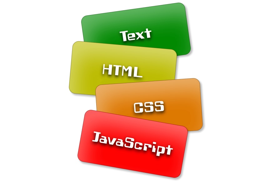
Progressive enhancement is actually a fairly simple concept based on the idea that content dictates markup, content + markup + device and user limitations dictates layout, and then you sprinkle the pretty on top like decorating a cake. Thus if any of your fancy tech stack goes missing -- JS, CSS, images, even HTML itself -- you still have a page that's useful and accessible, even if it is a "degraded" experience. Thus the term "graceful degradation". Something wasting your time pushing pixels around on a graphics tablet will never give you.
Likewise JavaScript should -- if you need to worry about accessibility in the slightest -- enhance an already working page, or at most apply bugfixes for specific buggy UA's when you've expended all other options. See the steaming dung-heap that is browser behaviors on iOS. Not that anyone with accessibility needs would/should be using crApple products in the first place.
Anyhow, here's a link to the first part of the series. The next part is linked at the bottom of each article.


Top comments (0)