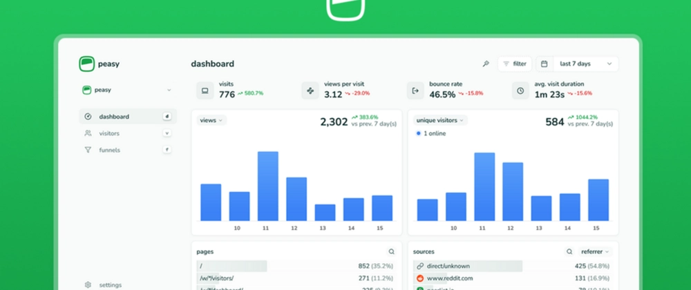
over the short time peasy has been live, we've consistently received love for its minimalistic and easy-to-use design. it has gotten us great referrals from users and even some attention from notable people in the community like the founder of Peerlist. here are some of my core principles and steps for designing great products.
learn your design principles
one of the most important things you can do is learn core design principles — things like hierarchy, color theory, spacing, and typography. these are not just buzzwords to ignore; they're the foundational elements that dictate how users perceive and interact with your creation. i’ve seen too many sites ignore these fundamentals, and more often than not, it results in ugly, cluttered, or hard-to-use products.
The principles of design is a great guide to foundational design principles, perfect for anyone starting their design journey. another valuable resource is Laws of UX, which goes into key psychological principles that shape effective design. mastering and applying these principles is half the battle, as they enable you to create designs that feel intuitive and visually appealing to users.
although these are 'rules' of design, they are not set in stone. some great designs break these rules, but they do so intentionally and with a deep understanding of why the rules exist in the first place.
dont be afraid to experiment
experimentation is key to great design. bold colors, gradients, unique visual elements, and even fonts (beyond the typical Inter or Geist) can add personality and make your product stand out—when used intentionally. too often, people default to the typical grey/black Vercel-ish design style, which, while sleek in 2023, now feels overused and uninspired.
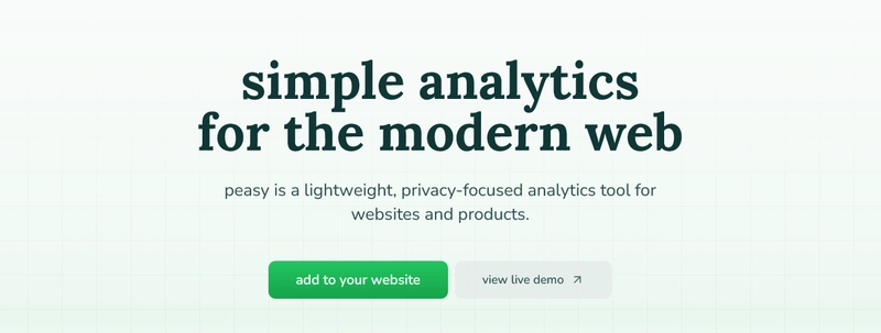
for peasy, we focused on subtle yet effective design choices, such as the gradient on primary buttons and the layered grid effect in the hero section of our landing page. these elements add depth and polish without overwhelming the user. These small details make the design feel refined and thoughtfully crafted.

good design isn’t just about playing it safe — it’s about pushing boundaries while maintaining clarity, usability, and a cohesive visual language. so don’t be afraid to break away from trends and find a style that truly fits your product.
be an ‘inspiration sponge’
great design also often starts with a ‘wealth of inspiration’. keep an eye on platforms like Dribbble and other design directories. hang out on these sites and just absorb what other designers are doing — this has been one of the biggest things that’s helped me improve my design skills.
why does this work? exposing yourself to a variety of design styles helps you develop a deeper understanding of design trends and visual problem-solving techniques. the more you see, the better you become at recognizing what works, what doesn’t, and why. this is critical for evolving your design intuition and expanding your creative toolkit.
checking out what your competitors are doing is also a great way to improve your own design. starting with a well-proven base and tweaking it until it fits your needs is always a smart approach. it saves time, helps you avoid reinventing the wheel, and gives you a solid foundation to build on. just make sure you don’t copy their mistakes — learn from them.
technology
its no secret that technologies like Tailwind and Shadcn have clearly won, and for good reason — they are great technologies. don’t be afraid to use them. they come with great defaults and look amazing when taken to the next level. leveraging these frameworks also brings the advantage of uniform designs that are easy to maintain and scale.
one common argument against these frameworks is that they can result in similar-looking designs, but this argument is misguided. the truth is, these frameworks provide a strong starting point, but the real challenge lies in how designers build on top of them. if you're using Tailwind or Shadcn without customizing it, then yes, your design might end up looking similar to others — but this isn’t the fault of the frameworks. it's about the level of creativity and effort you put into pushing them beyond their defaults. i’ve seen more plain CSS sites done poorly than Tailwind-based ones. Tailwind, in particular, offers immense flexibility — it's not the framework that's the problem, it's how you use it. when used thoughtfully and creatively, these technologies give you the freedom to craft something truly unique while maintaining a solid design foundation.
care, polish and optimization
lately, there’s been a huge push for getting projects done as quickly as possible, especially with the rise of AI and “vibe coding”. the general idea is to ship as fast as you can, but great design doesn’t come from rushing through it — it comes from an iterative process. it’s about experimenting, seeing what works, and refining what doesn’t. this takes time.
at peasy, it took us around 7 months to release the MVP (with 4 of those months spent with a group of beta testers). a lot of that time was dedicated to iterating on what we had and perfecting the design. could we have pushed out a quicker version? absolutely. but the reality is, we care deeply about the product we’re building. we don’t just want to build something fast — we want to build something we can be proud of. that’s the mindset that led us to take the time we needed to get things right.
don’t build in a bubble
finally, one of the biggest mistakes you can make during the design process is building in a bubble. as someone with deep domain knowledge about your product, you’ll naturally have a bias towards how intuitive it feels. you’ll understand every little detail, the reasoning behind every decision, and the nuances that make the product work. this familiarity can make you believe that everything is clear and logical, but that’s not always the case for outsiders — the people who will actually use your product.
it’s crucial to get feedback from people who don’t have the same level of understanding or context as you do. they’ll be able to tell you if something is confusing, unclear, or just doesn’t make sense. sometimes, what feels intuitive to you may not be so obvious to someone coming in fresh. testing your design with real users, especially those who are not familiar with your product, will help identify pain points you might have missed.
the goal is to validate your design choices with people who don’t know the product inside and out. this feedback is invaluable because it helps you see your product from a new perspective. don’t rely solely on your own understanding of the product — get outside input to ensure your design truly works for everyone.
and that's it. can't believe you made it this far, but if you did, good luck on your design journey!


Top comments (0)