Tutorial on how to create a toggle button inside “open” & “close” texts.

HTML
For HTML we’ll need a container with 5 elements inside, which we’ll position using grid.
You can visualise it like so:
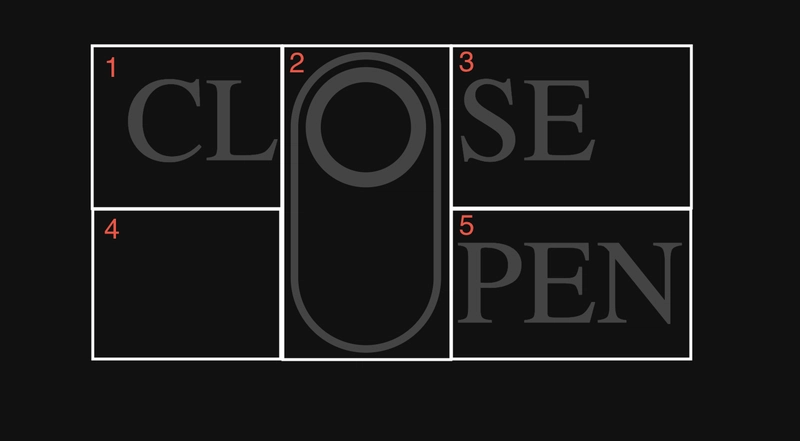
The second element (the toggle button) will take 2 spaces.
Inside of a second element, we’ll need an element for a circle.
And that’s it for the HTML.
<div class="container">
    <div>CL</div>
    <div class="toggle">
    <div class="circle"></div>
    </div>
    <div>SE</div>
    <div></div>
    <div class="open">PEN</div>
</div>
CSS
For CSS, first we’ll style the container.
As we mentioned earlier, we’ll set display to grid, with template columns and rows to 20px.
This means that one cell is 20x20 pixels.
Since the second element will use 2 cells, it will be 20x40 pixels.
Now we’ll add a little gap on x axis and set color to dark gray.
.container {
    display: grid;
    grid-template-columns: 20px 20px 20px;
    grid-template-rows: 20px 20px 20px;
    gap: 0 2px;
    color: #444;
}
Now we’ll style the toggle button.
We’ll set position to relative and height to 40px.
By setting grid-column property to number 2, this element will take 2 columns.
With 1/3 value for the grid-row, this element will be the same width as other 2.
Now we’ll set border to the same dark gray we used for container color and add a little radius.
Lastly, we’ll set box-sizing to border-box<, cursor to pointer and a little transition.
.toggle {
    position: relative;
    height: 40px;
    grid-column: 2;
    grid-row: 1 / 3;
    border: 1px solid #444;
    border-radius: 20px;
    box-sizing: border-box;
    cursor: pointer;
    transition: .2s;
}
Now we’ll style the circle inside of our toggle button.
Using absolute position, we’ll set top to 0, width and height to 16 px and add 1 px margin.
We’ll set border to 2 px with radius of 100% to create a circle and set it’s color to the same dark gray we used before.
By setting box sizing to border box, width and height of 16px will include the width and height of an element as well as the border.
By setting this, we’ll achieve to have the circle in the center of toggle button’s border.
Lastly, we’ll add a little transition.
.circle {
    position: absolute;
    top: 0;
    width: 16px;
    height: 16px;
    margin: 1px;
    border-radius: 100%;
    border: 2px solid #444;
    box-sizing: border-box;
    transition: .2s;
}
Now we’ll style he circle when the toggle button is active.
We’ll move it down by 20px, by setting top to 20px.
With a little transition, this movement will be nice and smooth.
We’ll change border color and set it to white, and add a light blue shadow inside as well as outside, to achieve neon effect.
.toggle:hover .circle {
    top: 20px;
    transition: .2s;
    border-color: #fff;
    box-shadow: 0 0 10px #5271ff,
          inset 0 0 10px #5271ff;
}
Now we’ll style the toggle button when it’s active.Same as for the circle, we’ll set the border color to white, add a little transition and add 2 light blue shadows, inside and outside.
.toggle:hover {
    border-color: #fff;
    transition: .2s;
    box-shadow: 0 0 10px #5271ff,
          inset 0 0 10px #5271ff;
}
Now we’ll style the “PEN” text.
We’ll add a little transition, because this element will be changing color on toggle.
Using flexbox, we’ll position the text at the end of the element.
.open {
    transition: .2s;
    display: flex;
    align-items: flex-end;
}
And lastly, we’ll style the “PEN” text when toggle is active.
Same as for toggle and circle, we’ll set color to white, add light blue text shadow and a little transition.
.toggle:hover ~ .open {
    color: #fff;
    text-shadow: 0 0 8px #5271ff,
    0 0 8px #5271ff;
    transition: .2s;
}
Video tutorial
You can find the video with step-by-step guide here.
Thank you for reading ❤️

Top comments (1)
Thank you plz more