
When we build SignUp/SignIn form, it will be cool to implement functionality for the user, can see current values that his enter. It's really easy do this using React, lets dive in too it.
npm i react-hook-form
We will install react-hook-form just for some basic validation. And use fontawesome icons for some fancy eye icon.
npm i --save @fortawesome/fontawesome-svg-core
npm i --save @fortawesome/free-solid-svg-icons
npm i --save @fortawesome/react-fontawesome
Now lets create component, just a basic form with two inputs and submit button
import React from "react";
import { useForm } from "react-hook-form";
import "./styles.css";

import { FontAwesomeIcon } from "@fortawesome/react-fontawesome";
import { faEye } from "@fortawesome/free-solid-svg-icons";
const eye = <FontAwesomeIcon icon={faEye} />;

export default function App() {
  const { register, handleSubmit } = useForm();
  const onSubmit = data => {
    console.log(data);
  };

  return (
    <div className="App">
      <input
        name="username"
        type="text"
        placeholder="Username"
        ref={register({ required: "This is required." })}
      />
      <div className="pass-wrapper">
        <input
          placeholder="Password"
          name="password"
          type="password"
          ref={register({ required: "This is required." })}
        />
        <i>{eye}</i>
      </div>
      <button type="submit" onClick={handleSubmit(onSubmit)}>
        Submit
      </button>
    </div>
  );
}
and add some CSS, for more pretty looks
.App {
  display: flex;
  flex-direction: column;
  text-align: center;
  justify-items: center;
  font-size: 22px;
  max-width: 500px;
  min-height: 672px;
  margin: 0 auto;
  border-radius: 25px;
  color: white;
  background-color: rgba(0, 0, 0, 0.5);
}

.App > input {
  margin-top: 200px;
}

input {
  margin: 0 auto;
  background-color: black;
  opacity: 50%;
  color: white;
  margin-top: 10px;
  width: 300px;
  height: 59px;
  font-size: 22px;
  margin-bottom: 14px;
  max-width: 527px;
  padding: 0 10%;
}

.pass-wrapper {
  position: relative;
  display: flex;
  margin-bottom: 14px;
}

i {
  position: absolute;
  top: 38%;
  right: 16%;
}
i:hover {
  color: #00fcb6;
  cursor: pointer;
}

button {
  width: 300px;
  height: 50px;
  margin: 0 auto;
}
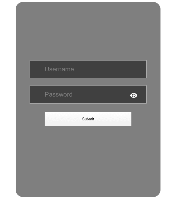
Component now looks like this
Now lets add some state with boolean values to track current password field view
const [passwordShown, setPasswordShown] = useState(false);
and function to toggle values
  const togglePasswordVisiblity = () => {
    setPasswordShown(passwordShown ? false : true);
  };
let adding onClick handler to our eye icon, by the way you can use any other icon or button to implement this on your project
<i onClick={togglePasswordVisiblity}>{eye}</i>
finally we will change input type, depence what current state of the app
 <input
             ...
              type={passwordShown ? "text" : "password"}
             ...
            />
That's done, now we can change the current password placeholder visual just to click on your eye icon. If you want see all code, please check this CodeSandbox link Show/Hide Password on toggle
Please give a like, if this tutorial was useful for you))

Top comments (7)
Can I also change the icon when clicked? So it'll show a strikethrough icon of an eye instead?
Thanks
Later edit: actually that was pretty simple, I've managed to do it like this:
just use a ternary on your src (if you are using an img element for the icon)
src={passwordShown ? notVisible : visible}(visible and notVisible being image imports defined in the beginning) or use the same ternary to change the className (if you are using an i tag from fontawesome for eg.)
className={`login-box${passwordShown ? "__notVisible" : "__visible"}`}what if it is in a button? how with will make the icon change
This will work even if img tag is inside the button.
you should have something like:
< button >
< img src={passwordShown ? notVisible : visible} />
< span >Submit< /span >
< /button >
Cool Thanks
nice
thank you
I added the eyeSlash option!
`import { FontAwesomeIcon } from "@fortawesome/react-fontawesome";
import { faEye , faEyeSlash } from "@fortawesome/free-solid-svg-icons";
const eye = < FontAwesomeIcon icon={faEye} display={false} />;
const eyeSlash = < FontAwesomeIcon icon={faEyeSlash} />;
< input type={passwordShown?"text":"password"} name="password" />
< i onClick={()=>setPasswordShown(!passwordShown)}>{passwordShown?eye:eyeSlash}`
Thankyou , very helpful!