
Hello everyone! In this tutorial lets build a responsive navbar and hamburger menu using html,css and a little bit of javascript.
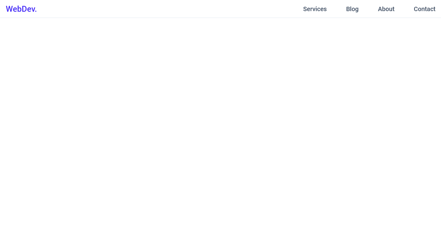
This is how it will look,

Github link :
So let's start with the HTML,
 HTML
<header class="header">
        <nav class="navbar">
            <a href="#" class="nav-logo">WebDev.</a>
            <ul class="nav-menu">
                <li class="nav-item">
                    <a href="#" class="nav-link">Services</a>
                </li>
                <li class="nav-item">
                    <a href="#" class="nav-link">Blog</a>
                </li>
                <li class="nav-item">
                    <a href="#" class="nav-link">About</a>
                </li>
                <li class="nav-item">
                    <a href="#" class="nav-link">Contact</a>
                </li>
            </ul>
            <div class="hamburger">
                <span class="bar"></span>
                <span class="bar"></span>
                <span class="bar"></span>
            </div>
        </nav>
</header>
Here, we have
-
headerwith the class ofheaderwhich work as a container of our navbar -
navwith the class ofnavbar - a link with the class of
nav-logo -
ulwith the class ofnav-menu - inside the
ulwe have 4lis with the class ofnav-item - inside each
nav-itemwe have a link with the class ofnav-link - for our hamburger I have added a
divwith the class ofhamburgerand inside which we have 3spans with the class ofbar
So this is the HTML that we need.
Now let's add the CSS reset
(Here we will import the font we need and add some basic CSS to reset all the default styles.
 CSS
@import url('https://fonts.googleapis.com/css2?family=Roboto:ital,wght@0,500;1,400&display=swap');

* {
    margin: 0;
    padding: 0;
    box-sizing: border-box;
}

html {
    font-size: 62.5%;
    font-family: 'Roboto', sans-serif;
}

li {
    list-style: none;
}

a {
    text-decoration: none;
}
Now let's add styles to the elements one by one,
-
headerandnavbar
 CSS
.header{
    border-bottom: 1px solid #E2E8F0;
}

.navbar {
    display: flex;
    justify-content: space-between;
    align-items: center;
    padding: 1rem 1.5rem;
}
-
hamburgerstyles
 CSS
.hamburger {
    display: none;
}

.bar {
    display: block;
    width: 25px;
    height: 3px;
    margin: 5px auto;
    -webkit-transition: all 0.3s ease-in-out;
    transition: all 0.3s ease-in-out;
    background-color: #101010;
}
- basic styles for our other elements ``` CSS .nav-menu { display: flex; justify-content: space-between; align-items: center; }
.nav-item {
margin-left: 5rem;
}
.nav-link{
font-size: 1.6rem;
font-weight: 400;
color: #475569;
}
.nav-link:hover{
color: #482ff7;
}
.nav-logo {
font-size: 2.1rem;
font-weight: 500;
color: #482ff7;
}
### After this, It should look like this,
# But It's not responsive yet, so let's add the media queries.
CSS
@media only screen and (max-width: 768px) {
.nav-menu {
position: fixed;
left: -100%;
top: 5rem;
flex-direction: column;
background-color: #fff;
width: 100%;
border-radius: 10px;
text-align: center;
transition: 0.3s;
box-shadow:
0 10px 27px rgba(0, 0, 0, 0.05);
}
.nav-menu.active {
    left: 0;
}

.nav-item {
    margin: 2.5rem 0;
}

.hamburger {
    display: block;
    cursor: pointer;
}
}
What this media query does is, hides our `nav-menu` by setting `position: fixed;`  `left: -100%;` on it.
Also, we set our `hamburger` to `display: block;` so it's visible now.
We have also added an extra class that is `.nav-menu.active` which sets `left: 0;` on the `nav-menu`. Now we will have to add the javascript which will add this `active` class on the nav-menu when we click our hamburger.

# Let's add the javascript.
Javascript
const hamburger = document.querySelector(".hamburger");
const navMenu = document.querySelector(".nav-menu");
hamburger.addEventListener("click", mobileMenu);
function mobileMenu() {
hamburger.classList.toggle("active");
navMenu.classList.toggle("active");
}
Here the function `mobileMenu()` also adds an `active` class on our `hamburger` and our `nav-menu` which makes our mobile menu open. we can use the active class on the hamburger to create that X animation when we click on the `hamburger`. so let's do that now.
CSS
// Inside the Media Query.
.hamburger.active .bar:nth-child(2) {
    opacity: 0;
}

.hamburger.active .bar:nth-child(1) {
    transform: translateY(8px) rotate(45deg);
}

.hamburger.active .bar:nth-child(3) {
    transform: translateY(-8px) rotate(-45deg);
}
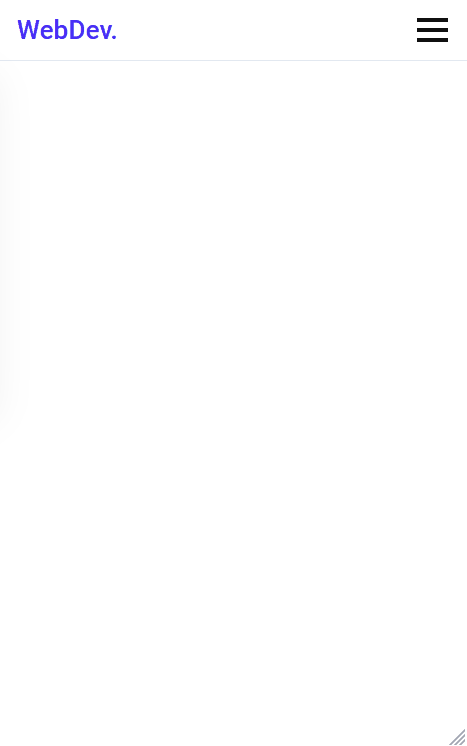
### It should look like this now,
## But there is a catch, the hamburger menu doesn't close when we click a link. So let's add that now,
Javascript
const navLink = document.querySelectorAll(".nav-link");
navLink.forEach(n => n.addEventListener("click", closeMenu));
function closeMenu() {
hamburger.classList.remove("active");
navMenu.classList.remove("active");
}
The `closeMenu()` function removes the `active` class from both the `nav-menu` and the `hamburger` which makes our mobile menu close.
So that's it guys we built a responsive navbar and hamburger menu with HTML CSS and javascript. Hope u liked it. Share this article. Thank you 😀

Top comments (66)
This is a great start, but does not resolve anything about the accessibility of this menu. Two immediate things to fix would be to make the hamburger menu itself a
buttonelement (which would make it clear that it's interactive) and to add some text that labels the button in some way (which would make it meaningful to a screen reader user). 👍🏻See these examples for more detail and other fixes:
Thank u so much for the feedback and suggestions! Appreciate it. And i will surely fix it and implement your suggestions 😊
Thank you for sharing!
There's a way to do it without using JavaScript, handling the menu visibility with CSS.
If you add a
<div>containing only the hamburger button and the menu, you can use the:focus-withinCSS pseudo-selector.:focus-withinapplies to an element if it has the focus, but also if one of its children is focused.For example, if you write the HTML for the menu like this:
You can use the
:focus-withinselector like this:Now, the
<nav class="navbar">will initially remain hidden, but it will appear when any child of<div class="menu-container">is focused. For example, when you click on the hamburger button or some of the menu items.This is a cool solution i just tried out in my own code! Thanks for sharing! The only downside is once the menu is open, you have to click outside the hamburger to close it which from a user experience perspective could confuse a user for a second/ make them think your site has a bug. Unless you also have a work around to this that i am missing.
why not this about leaving it go home :) :
=== CSS ===
.show {
display: block; /* Show navbar when class 'show' is added */
}
=== JS ===
you toggle it first with showNavbar(), then :
function hideNavbar() {
const navbar = document.getElementById('navbar');
navbar.classList.remove('show');
}
const navbar = document.getElementById('navbar');
navbar.addEventListener('mouseleave', hideNavbar);
Hey thank u so much for sharing this man! Will try this
This works great in codepen, I am trying to get the js to work and I am getting:
Uncaught TypeError: Cannot read properties of null (reading 'addEventListener')
at site.js:165
from:
hamburger.addEventListener("click", mobileMenu);
Do you know how to resolve this property null in the javascript file?
Appreciate your help in advance
Hey Ryan, I had this exact same issue, so Im gonna go ahead and guess you are using Chrome. Chrome has issues when using JS in localhost environment. To fix this, just move your js script tag to your footer, instead of your header. This fixed it for me, strange but hey...
Another solution is to add the 'defer' attribute to the script element.
Great explanation was helpful ! 👍🏽
Thank u !
Nice, thanks.
Thank u!
Great explanation! Helped a lot!
It was really helpful. The javascript code was easy to understand. As a beginner in javascript, I was really able to understand it without any help. I was even able to tweak it and modify it according to my wish.
Wow!
Awesome! 👏✌️
Thank u !
Thank you sharing. This is what I'm looking for
Thank u!❤