
Hello everyone! In this tutorial lets build a responsive navbar and hamburger menu using html,css and a little bit of javascript.
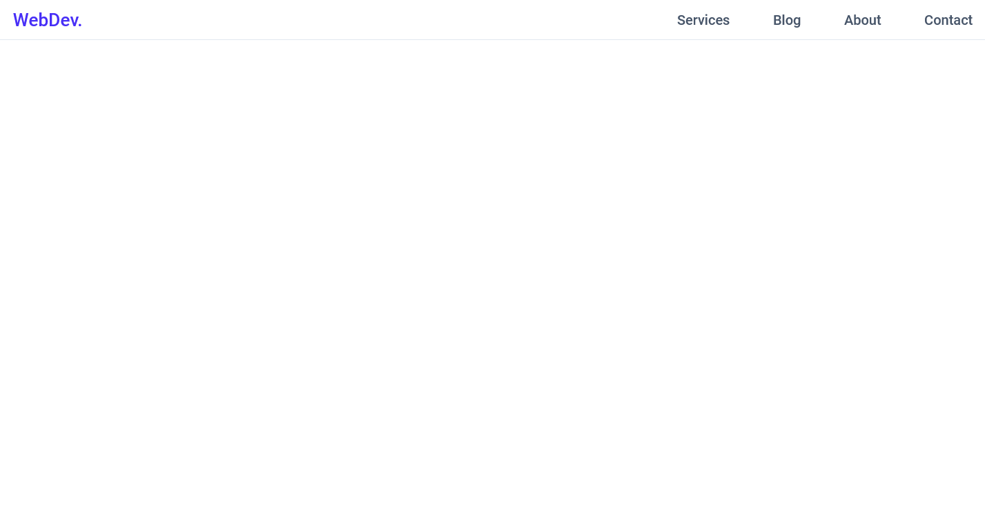
This is how it will look,

Github link :
So let's start with the HTML,
 HTML
<header class="header">
        <nav class="navbar">
            <a href="#" class="nav-logo">WebDev.</a>
            <ul class="nav-menu">
                <li class="nav-item">
                    <a href="#" class="nav-link">Services</a>
                </li>
                <li class="nav-item">
                    <a href="#" class="nav-link">Blog</a>
                </li>
                <li class="nav-item">
                    <a href="#" class="nav-link">About</a>
                </li>
                <li class="nav-item">
                    <a href="#" class="nav-link">Contact</a>
                </li>
            </ul>
            <div class="hamburger">
                <span class="bar"></span>
                <span class="bar"></span>
                <span class="bar"></span>
            </div>
        </nav>
</header>
Here, we have
-
headerwith the class ofheaderwhich work as a container of our navbar -
navwith the class ofnavbar - a link with the class of
nav-logo -
ulwith the class ofnav-menu - inside the
ulwe have 4lis with the class ofnav-item - inside each
nav-itemwe have a link with the class ofnav-link - for our hamburger I have added a
divwith the class ofhamburgerand inside which we have 3spans with the class ofbar
So this is the HTML that we need.
Now let's add the CSS reset
(Here we will import the font we need and add some basic CSS to reset all the default styles.
 CSS
@import url('https://fonts.googleapis.com/css2?family=Roboto:ital,wght@0,500;1,400&display=swap');

* {
    margin: 0;
    padding: 0;
    box-sizing: border-box;
}

html {
    font-size: 62.5%;
    font-family: 'Roboto', sans-serif;
}

li {
    list-style: none;
}

a {
    text-decoration: none;
}
Now let's add styles to the elements one by one,
-
headerandnavbar
 CSS
.header{
    border-bottom: 1px solid #E2E8F0;
}

.navbar {
    display: flex;
    justify-content: space-between;
    align-items: center;
    padding: 1rem 1.5rem;
}
-
hamburgerstyles
 CSS
.hamburger {
    display: none;
}

.bar {
    display: block;
    width: 25px;
    height: 3px;
    margin: 5px auto;
    -webkit-transition: all 0.3s ease-in-out;
    transition: all 0.3s ease-in-out;
    background-color: #101010;
}
- basic styles for our other elements ``` CSS .nav-menu { display: flex; justify-content: space-between; align-items: center; }
.nav-item {
margin-left: 5rem;
}
.nav-link{
font-size: 1.6rem;
font-weight: 400;
color: #475569;
}
.nav-link:hover{
color: #482ff7;
}
.nav-logo {
font-size: 2.1rem;
font-weight: 500;
color: #482ff7;
}
### After this, It should look like this,
# But It's not responsive yet, so let's add the media queries.
CSS
@media only screen and (max-width: 768px) {
.nav-menu {
position: fixed;
left: -100%;
top: 5rem;
flex-direction: column;
background-color: #fff;
width: 100%;
border-radius: 10px;
text-align: center;
transition: 0.3s;
box-shadow:
0 10px 27px rgba(0, 0, 0, 0.05);
}
.nav-menu.active {
    left: 0;
}

.nav-item {
    margin: 2.5rem 0;
}

.hamburger {
    display: block;
    cursor: pointer;
}
}
What this media query does is, hides our `nav-menu` by setting `position: fixed;`  `left: -100%;` on it.
Also, we set our `hamburger` to `display: block;` so it's visible now.
We have also added an extra class that is `.nav-menu.active` which sets `left: 0;` on the `nav-menu`. Now we will have to add the javascript which will add this `active` class on the nav-menu when we click our hamburger.

# Let's add the javascript.
Javascript
const hamburger = document.querySelector(".hamburger");
const navMenu = document.querySelector(".nav-menu");
hamburger.addEventListener("click", mobileMenu);
function mobileMenu() {
hamburger.classList.toggle("active");
navMenu.classList.toggle("active");
}
Here the function `mobileMenu()` also adds an `active` class on our `hamburger` and our `nav-menu` which makes our mobile menu open. we can use the active class on the hamburger to create that X animation when we click on the `hamburger`. so let's do that now.
CSS
// Inside the Media Query.
.hamburger.active .bar:nth-child(2) {
    opacity: 0;
}

.hamburger.active .bar:nth-child(1) {
    transform: translateY(8px) rotate(45deg);
}

.hamburger.active .bar:nth-child(3) {
    transform: translateY(-8px) rotate(-45deg);
}
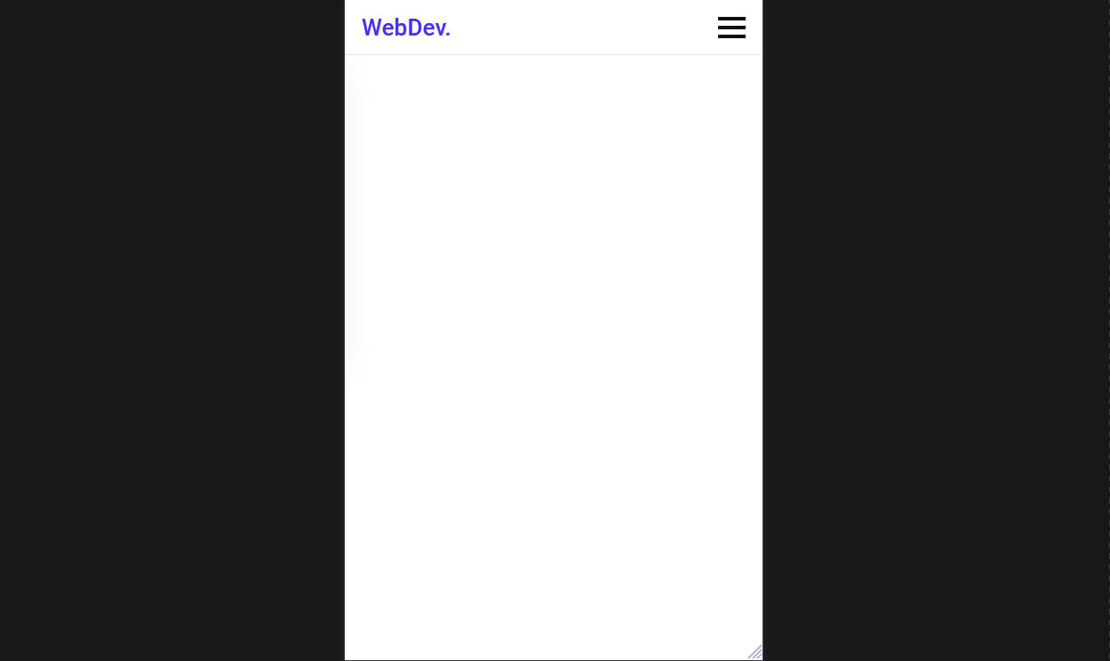
### It should look like this now,
## But there is a catch, the hamburger menu doesn't close when we click a link. So let's add that now,
Javascript
const navLink = document.querySelectorAll(".nav-link");
navLink.forEach(n => n.addEventListener("click", closeMenu));
function closeMenu() {
hamburger.classList.remove("active");
navMenu.classList.remove("active");
}
The `closeMenu()` function removes the `active` class from both the `nav-menu` and the `hamburger` which makes our mobile menu close.

So that's it guys we built a responsive navbar and hamburger menu with HTML CSS and javascript. Hope u liked it. Share this article. Thank you 😀

Oldest comments (66)
nice
Thanks.
Thank you sharing. This is what I'm looking for
Thank u!❤
wow! Thanks a lot for sharing. I have practiced the same by going through this post. Well structured and few lines of codes.
Thank you so much!❤
Amazingly simple, Thanks
Thank u!
Nice, thanks.
Thank u!
It was so easy to understand. Thank you for this. Bookmarked 😁
Thank u so much!
Yes, this is a very nice tutorial. Thank you for posting it.
Thank u!
thank you so much. You made it easy
Thank u for the feedback man!
Very Nice. Thanks
Thank u!
Loved it!
Thank u!