Theming Made Easy Using The ChangeNotifier Class
As a Frontend, Fullstack or even Backend developer I’m sure you must have googled “how to theme…” at least once. With app theming being so common nowadays but still being a bit complicated on most frameworks it’s not a surprise that “how to theme a * app” is commonly searched on google by Frontend to Backend developers alike.
In this article I will be sharing how I go about theming my Flutter apps, whether that be a side project or otherwise, using the ChangeNotifier class.
Prerequisites:
- Basic Flutter and Dart knowledge
- Flutter SDK fully installed on your development machine
- A device or emulator to test your app
- Basic knowledge on the ChangeNotifier class (Simple app state management | Flutter)
Let’s Begin
I will be starting out by creating the theme.dart file. It can be kept in any directory depending on your file structure. I keep it in its own separate folder that contains files like colors.dart and any other theming/styling variables.
Initial Setup
First things first, let’s change the root of our app into a stateful widget. We need to do this in order for the widget tree to re-render when the theme is changed. Some of you might think that is going to be very tasking process for the app especially if it’s a huge app like Instagram for instance, well you will be surprised to know that Flutter handles this quite well and if you do run into any bottlenecks or janky frames you can always make use of the AnimatedBuilder widget which takes in a Listenable as an argument and changes the children widgets or the widget tree that it wraps based on changes happening within the Listenable .
import 'package:flutter/material.dart'; | |
import 'package:widgettest/services/theme.dart'; // We will be making use of this later in the article | |
import 'package:widgettest/widgets/placeholder_widget.dart'; //We will be making use of this later in the article | |
void main() { | |
runApp(MyApp()); | |
} | |
class MyApp extends StatefulWidget { //👈 Changed to stateful widget from stateless widget | |
const MyApp({Key? key}) : super(key: key); | |
@override | |
State<MyApp> createState() => _MyAppState(); | |
} | |
class _MyAppState extends State<MyApp> { | |
// This widget is the root of your application | |
@override | |
Widget build(BuildContext context) { | |
return MaterialApp( | |
title: 'Flutter Demo', | |
theme: ThemeData(primarySwatch:Colors.blue), | |
home: const MyHomePage(), | |
); | |
} | |
} | |
class MyHomePage extends StatefulWidget { | |
const MyHomePage({Key? key}) : super(key: key); | |
@override | |
State<MyHomePage> createState() => _MyHomePageState(); | |
} | |
class _MyHomePageState extends State<MyHomePage> { | |
@override | |
Widget build(BuildContext context) { | |
return const Scaffold( | |
appBar: AppBar( | |
Title:'My App' | |
), | |
body: PlaceholderWidget() // 👈 this is where your widget will be, whether it be the counter or otherwise | |
); | |
} | |
} |
As I usually do in articles like this I explain the code within the code snippet. Take note of the comments.
Creating Theme.dart
We can leave the main.dart file as is for now and move on to creating the Theme.dart file.
In this file we will be declaring our themes whether that be light, dark, sunrise, noon, or whatever you want to call them. We do this by making use of the ThemeData class in Flutter
import 'package:flutter/material.dart'; | |
ThemeData lightTheme = ThemeData( | |
primarySwatch: Colors.blue, //👈 this is the primary color that stuff like the AppBar and FloatingActionButton Widget will default to | |
backgroundColor: Colors.white, | |
buttonTheme: const ButtonThemeData(buttonColor: Colors.blue), | |
textTheme: const TextTheme( | |
bodyMedium: TextStyle(color: Colors.black, fontSize: 30), //👈 we will be able to access these in our widgets later | |
headlineMedium: TextStyle(color: Colors.white, fontSize: 25))); | |
ThemeData darkTheme = ThemeData( | |
primarySwatch: Colors.red, | |
backgroundColor: Colors.blueGrey[900], | |
buttonTheme: const ButtonThemeData(buttonColor: Colors.red), | |
textTheme: TextTheme( | |
bodyMedium: const TextStyle(color: Colors.white, fontSize: 30), | |
headlineMedium: TextStyle(color: Colors.blueGrey[900], fontSize: 25))); |
You can change the colors, text styles and more to whatever your app theme might be. Be careful while using some parameters though, for some reason some won’t work when combined with other parameters. For instance, the bodyMedium and bodyText1 parameters in the TextTheme class can not be used at the same time, this will cause an error that will break the app and show the below error
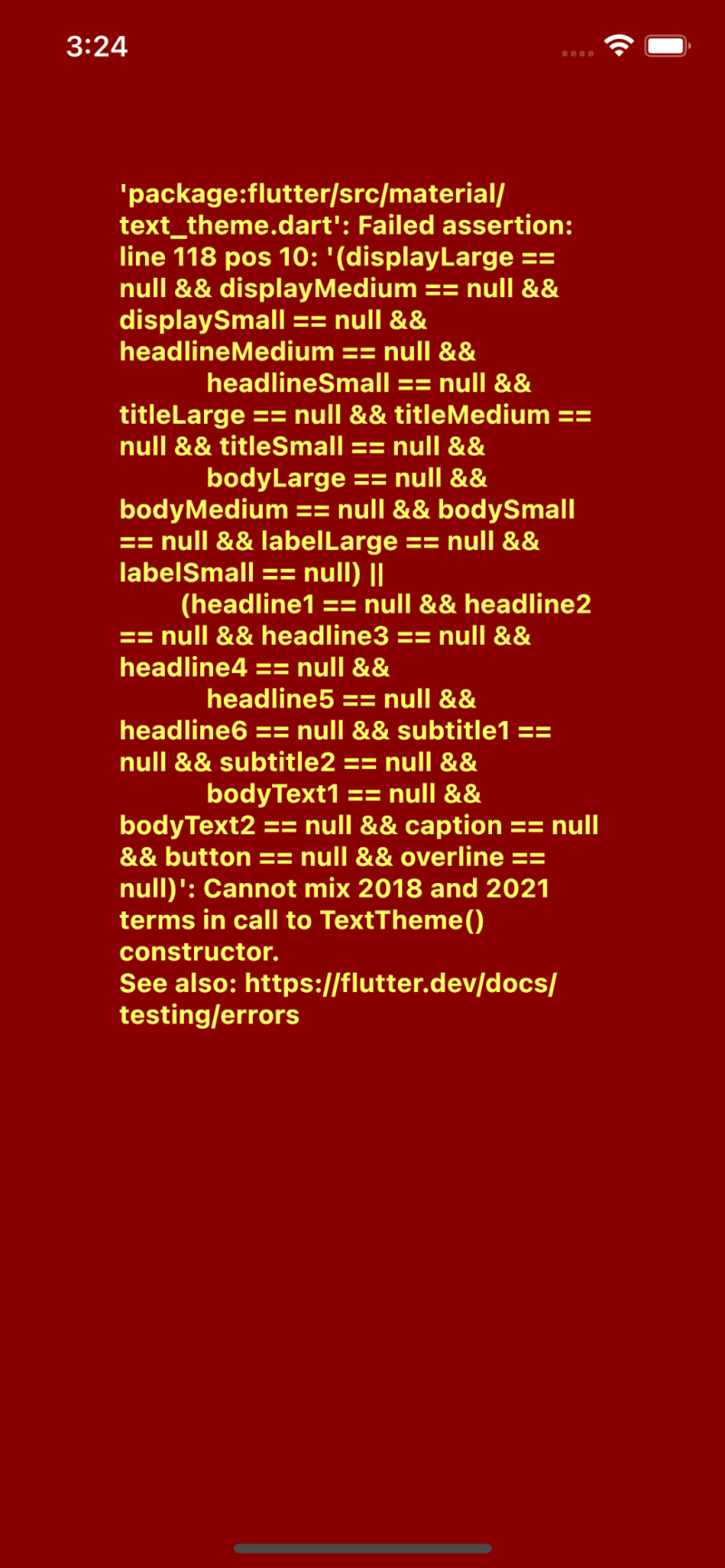
I don’t know why this is allowed to happen 🤷♂️. They should just deprecate the 2018 terms
Creating The AppTheme Class
We will be making a class called AppTheme that makes use of the ChangeNotifier class. This will house our theme state and the callback that will handle toggling of the theme.
import 'package:flutter/material.dart'; | |
ThemeData lightTheme = ThemeData( | |
primarySwatch: Colors.blue, //👈 this is the primary color that stuff like the AppBar and FloatingActionButton Widget will default to | |
backgroundColor: Colors.white, | |
buttonTheme: const ButtonThemeData(buttonColor: Colors.blue), | |
textTheme: const TextTheme( | |
bodyMedium: TextStyle(color: Colors.black, fontSize: 30), //👈 we will be able to access these in our widgets later | |
headlineMedium: TextStyle(color: Colors.white, fontSize: 25))); | |
ThemeData darkTheme = ThemeData( | |
primarySwatch: Colors.red, | |
backgroundColor: Colors.blueGrey[900], | |
buttonTheme: const ButtonThemeData(buttonColor: Colors.red), | |
textTheme: TextTheme( | |
bodyMedium: const TextStyle(color: Colors.white, fontSize: 30), | |
headlineMedium: TextStyle(color: Colors.blueGrey[900], fontSize: 25))); | |
//👇 I decided to add it to the theme.dart file since its just a few lines of code and still falls under the same context | |
class AppTheme with ChangeNotifier { | |
bool isDarkTheme = false; // 👈 in order to persist this make use of a storage library to store its value. I suggest get_storage | |
ThemeMode get themeMode => isDarkTheme ? ThemeMode.dark : ThemeMode.light; | |
void toggleTheme() { | |
isDarkTheme = !isDarkTheme; //👈 this will change the value of isDarkTheme leading to themeMode being changed | |
notifyListeners(); //👈 this will notify all listeners and carry out any function that is in the addListener() method that we will add soon | |
} | |
} | |
AppTheme appTheme = AppTheme(); | |
In the above code snippet I added the AppTheme class into the theme.dart file. I did this because the class is only a few lines of code. Notice that I created an instance of it on the 30th line, I did this because it would be easier to understand if another person were to take a look at your code and look for the root instance of AppTheme.
I made themeMode a getter since it is ill advised to mutate state directly, since mutating state directly leads to unexpected bugs some times.
Implementing appTheme
Once you’ve created all that you can go back to your main.dart file and implement it in the MaterialApp widget at the root of your application, like so:
import 'package:flutter/material.dart'; | |
import 'package:widgettest/services/theme.dart'; | |
import 'package:widgettest/widgets/placeholder_widget.dart'; | |
void main() { | |
runApp(MyApp()); | |
} | |
class MyApp extends StatefulWidget { | |
const MyApp({Key? key}) : super(key: key); | |
@override | |
State<MyApp> createState() => _MyAppState(); | |
} | |
class _MyAppState extends State<MyApp> { | |
// This widget is the root of your application | |
@override | |
void initState(){ | |
super.initState(); | |
appTheme.addListener((){ //👈 this is to notify the app that the theme has changed | |
setState(() {}); //👈 this is to force a rerender so that the changes are carried out | |
}) | |
} | |
@override | |
Widget build(BuildContext context) { | |
return MaterialApp( | |
title: 'Flutter Demo', | |
themeMode: appTheme.themeMode, //👈 this is the themeMode defined in the AppTheme class | |
darkTheme: darkTheme, //👈 this is the darkTheme that we defined in the theme.dart file | |
theme: lightTheme, //👈 and this is the lightTheme | |
home: const MyHomePage(), | |
); | |
} | |
} | |
class MyHomePage extends StatefulWidget { | |
const MyHomePage({Key? key}) : super(key: key); | |
@override | |
State<MyHomePage> createState() => _MyHomePageState(); | |
} | |
class _MyHomePageState extends State<MyHomePage> { | |
@override | |
Widget build(BuildContext context) { | |
return const Scaffold( | |
appBar: AppBar( | |
Title:'My App' | |
), | |
body: PlaceholderWidget() // 👈 this is where your widget will be, whether it be the counter or otherwise | |
); | |
} | |
} |
And with this you’re done. In order to make use of the themed values all you need to do is use Theme.of(context).* with (*) being the parameters you set in the ThemeData variables earlier e.g(Theme.of(context).textTheme.headlineMedium)
Let me show you the PlaceholderWidget code as an example
import 'package:flutter/material.dart'; | |
import 'package:widgettest/services/theme.dart'; | |
class PlaceholderWidget extends StatefulWidget { | |
const PlaceholderWidget({super.key}); | |
@override | |
State<PlaceholderWidget> createState() => _PlaceholderWidgetState(); | |
} | |
class _PlaceholderWidgetState extends State<PlaceholderWidget> { | |
int count = 0; | |
@override | |
Widget build(BuildContext context) { | |
return Scaffold( | |
backgroundColor: Theme.of(context).backgroundColor,//👈 theme usage | |
appBar: AppBar( | |
title: Text('Placeholder Screen', style: Theme.of(context).textTheme.headlineMedium,), //👈 theme usage | |
), | |
body: Center( | |
child: Column( | |
mainAxisAlignment: MainAxisAlignment.center, | |
children: [ | |
Text( | |
'Button clicked $count times', | |
style: const TextStyle(fontSize: 30), | |
), | |
Row( | |
mainAxisAlignment: MainAxisAlignment.center, | |
children: [ | |
const Text('light'), | |
Switch( | |
value: appTheme.isDarkTheme, | |
onChanged: ((value) { | |
appTheme.toggleTheme(); //👈 toggling app theme | |
})), | |
const Text('dark') | |
], | |
) | |
], | |
)), | |
floatingActionButton: FloatingActionButton( | |
onPressed: () => setState(() { | |
count++; | |
}), | |
child: Icon(Icons.plus_one, color: Theme.of(context).backgroundColor,), //👈 another theme use case | |
), | |
); | |
} | |
} |
Conclusion
Let me show you what your app might look like if you followed this article to the letter:
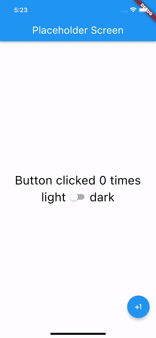
Yup! It does that fading animation on it own, no extra code.
And voila! You’re all done theming your Flutter app. With less than 30 lines of code and a few changes to already existing code you’ve added theming to your Flutter app.
If this article helped you in any way, please feel free to share, leave a comment or applause 👏. If you think that I could improve the article in any way, please leave a comment, I would be happy to chat and rub minds.
If you really liked this article feel free to check out my other posts on similar topics. And don’t forget to tune in next week for an inside look into a little side project I’m working on.
Top comments (0)