
Explore the full setup and code on GitHub: https://github.com/alias404/nx-workspace-tutorial
Modern web development demands efficient project structuring and component reusability. Nx provides a robust monorepo solution. Combining it with Next.js, a React component library leveraging Shadcn UI, and Tailwind CSS v4 can significantly streamline your workflow.
This guide provides a detailed walkthrough for setting up an Nx monorepo incorporating Next.js, a React component library with Shadcn UI, and Tailwind CSS v4. The steps outlined here have been created and tested with the following specific versions of frameworks and libraries:
Node.js: v22.14.0
Yarn: v4.7.0
Nx: v20.6.0
Tailwind CSS: v4.0.14
Please note that steps might slightly differ for different versions of these frameworks and libraries. Ensure you are using the specified versions or adapt the instructions accordingly.
Step 1: Initialize the Nx Workspace
Start by creating a new Nx workspace:
npx create-nx-workspace@latest --pm yarn

✔ Where would you like to create your workspace? · my-workspace
✔ Which stack do you want to use? · none
✔ Would you like to use Prettier for code formatting? · No
✔ Which CI provider would you like to use? · skip
✔ Would you like remote caching to make your build faster? · skip
In this guide, I have chosen yarn as my package manager. However, you can choose any package manager of your choice (npm, pnpm).
cd my-workspace

# Optional
# Update Yarn to the stable version and install dependencies:

yarn set version stable
yarn install
Clean up the initial workspace structure by removing the default packages directory and its reference in package.json.
Step 2: Generate Projects
Install necessary Nx plugins:
npx nx add @nx/next
npx nx add @nx/react
npx nx add @nx/js
Generate the Next.js application:
npx nx g @nx/next:app apps/website

✔ What unit test runner should be used? · none
✔ Which E2E test runner would you like to use? · none
✔ Would you like to use the App Router (recommended)? (Y/n) · false
✔ Would you like to use `src/` directory? (Y/n) · true
Generate the React component library:
npx nx g @nx/react:library libs/ui

✔ Which stylesheet format would you like to use? · none
✔ Which bundler would you like to use to build the library? Choose 'none' to skip build setup. · vite
✔ Which linter would you like to use? · none
✔ What unit test runner should be used? · none
Generate the TypeScript utility library:
npx nx g @nx/js:lib libs/utils --preset=ts

✔ Which bundler would you like to use to build the library? Choose 'none' to skip build setup. · none
✔ Which linter would you like to use? · none
✔ What unit test runner should be used? · none
Clean up any boilerplate code generated.
Step 3: Configure Tailwind CSS v4 for the Next.js App (apps/website)
This step focuses on configuring Tailwind CSS v4 specifically for the apps/website application, which is our Next.js project.
Upgrade Tailwind CSS to v4 and remove autoprefixer within the apps/website project:
yarn remove autoprefixer
yarn add tailwindcss@latest @tailwindcss/postcss@latest
Update postcss.config.js within the apps/website directory:
--- postcss.config.js (old)
+++ postcss.config.js (new)
@@ -1,11 +1,7 @@
-const { join } = require('path');
-
 module.exports = {
   plugins: {
-    tailwindcss: {
-      config: join(__dirname, 'tailwind.config.js'),
-    },
-    autoprefixer: {},
+    '@tailwindcss/postcss': {}
   },
 }
Delete tailwind.config.js within the apps/website directory. Clear the content of apps/website/src/pages/styles.css. This ensures that we are starting with a clean slate for our Next.js application's styling.
Step 4: Set Up Shadcn UI (CLI Support for Latest Configurations)
This step focuses on setting up Shadcn UI within our React component library (libs/ui). We're prioritizing CLI support to ensure we have access to the latest component configurations and styles, as the manual approach in Shadcn's documentation can sometimes lag behind the most recent updates.
To initialize Shadcn in a folder, the CLI expects a framework setup to be present. Since we are initializing it at the workspace root, which doesn't directly correspond to a framework, we create a temporary vite.config.js to simulate this environment. This allows the Shadcn CLI to detect a valid setup and proceed with initialization.
Create libs/ui/src/globals.css with the following content:
@import "tailwindcss";
Temporarily create vite.config.js in the workspace root. Update the root tsconfig.json with aliases:
--- tsconfig.json (old)
+++ tsconfig.json (new)
@@ -7,3 +7,10 @@
       "path": "./libs/utils"
     }
   ],
+  "compilerOptions": {
+    "baseUrl": ".",
+    "paths": {
+      "@/*": ["./*"]
+    }
+  }
 }
Run Shadcn initialization:
npx shadcn@latest init
This step will generate the components.json file and, importantly, automatically update the libs/ui/src/globals.css file to include the latest Tailwind CSS theme, CSS variables, and other necessary configurations based on the options you selected during the initialization process. This ensures your component library starts with the most up-to-date styles.
Delete the temporary vite.config.js. Update components.json with correct aliases:
--- components.json (old)
+++ components.json (new)
@@ -4,22 +4,16 @@
   "tsx": true,
   "tailwind": {
     "config": "",
-    "css": "src/styles/globals.css",
+    "css": "libs/ui/src/globals.css",
     "baseColor": "neutral",
     "cssVariables": true,
     "prefix": ""
   },
   "aliases": {
-    "components": "@/components",
-    "utils": "@/lib/utils",
-    "ui": "@/components/ui",
-    "lib": "@/lib",
-    "hooks": "@/hooks"
+    "components": "@/libs/ui/src/components",
+    "hooks": "@/libs/ui/src/hooks",
+    "utils": "@my-workspace/utils"
   },
   "iconLibrary": "lucide"
 }
Add a Shadcn component:
npx shadcn@latest add button
Move and export the Button component from libs/ui/src/components/ui/button.tsx to libs/ui/src/components/Button/Button.tsx. Update libs/ui/src/index.ts to export it.
Move lib/utils.ts to libs/utils/src/dom/cn.ts and export it from libs/utils/src/index.ts.
Update libs/utils/tsconfig.lib.json:
--- libs/utils/tsconfig.lib.json (old)
+++ libs/utils/tsconfig.lib.json (new)
@@ -8,7 +8,9 @@
     "tsBuildInfoFile": "dist/tsconfig.lib.tsbuildinfo",
     "emitDeclarationOnly": true,
     "forceConsistentCasingInFileNames": true,
-    "types": ["node"]
+    "types": ["node"],
+    "module": "ESNext",
+    "moduleResolution": "node"
   },
   "include": ["src/**/*.ts"],
   "references": []
Update libs/ui/package.json's main property to ./src/index.ts.
Step 5: Integrate Styles and Components
Update apps/website/src/pages/styles.css:
@import "../../../../libs/ui/src/globals.css";
@source "../../src/**/*.{ts,tsx,js,jsx}";
@source "../../../../libs/ui/src/**/*.{ts,tsx,js,jsx}"
Update apps/website/tsconfig.json with aliases and references:
--- apps/website/tsconfig.json (old)
+++ apps/website/tsconfig.json (new)
@@ -21,9 +21,13 @@
       {
         "name": "next"
       }
     ],
     "paths": {
       "@/*": [
         "./src/*"
+      ],
+      "@my-workspace/ui": [
+        "../../libs/ui"
       ]
     },
     "outDir": "dist",
@@ -47,7 +51,10 @@
     "src/**/*.spec.ts",
     "src/**/*.test.ts",
     ".next"
-  ]
+  ],
+  "references": [
+    { "path": "../../libs/ui" }
+  ]
 }
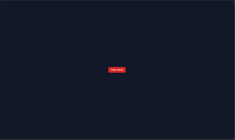
Import and use the Button component in apps/website/src/pages/index.tsx:
import { cn } from "@my-workspace/utils";
import { Button } from "@my-workspace/ui";

export default function () {
  return (
    <div className={cn(["flex flex-row", "items-center justify-center", "h-screen w-screen", "bg-gray-900"])}>
      <Button variant={"destructive"}>Hello World</Button>
    </div>
  );
}
Step 6: Set Up Storybook
Add the Storybook plugin:
npx nx add @nx/storybook
Initialize Storybook in libs/ui:
npx nx g @nx/react:storybook-configuration @my-workspace/ui

✔ Do you want to set up Storybook interaction tests? (Y/n) · false
✔ Automatically generate *.stories.ts files for components declared in this project? (Y/n) · true
✔ Configure a static file server for the storybook instance? (Y/n) · true
Install @tailwindcss/vite:
yarn add @tailwindcss/vite
Update libs/ui/vite.config.js:
--- libs/ui/vite.config.js (old)
+++ libs/ui/vite.config.js (new)
@@ -3,6 +3,7 @@
 import react from "@vitejs/plugin-react";
 import dts from "vite-plugin-dts";
 import * as path from "path";
+import tailwindcss from "@tailwindcss/vite";

 export default defineConfig(() => ({
   root: __dirname,
@@ -12,7 +13,8 @@
     dts({
       entryRoot: "src",
       tsconfigPath: path.join(__dirname, "tsconfig.lib.json"),
-    })
+    }),
+    tailwindcss(),
   ],
   // Uncomment this if you are using workers.
   // worker: {
Update libs/ui/.storybook/main.ts:
--- libs/ui/.storybook/main.ts (old)
+++ libs/ui/.storybook/main.ts (new)
@@ -1,7 +1,7 @@
 import type { StorybookConfig } from "@storybook/react-vite";

 const config: StorybookConfig = {
-  stories: ["../src/lib/**/*.@(mdx|stories.@(js|jsx|ts|tsx))"],
+  stories: ["../src/**/*.@(mdx|stories.@(js|jsx|ts|tsx))"],
   addons: ["@storybook/addon-essentials"],
   framework: {
     name: "@storybook/react-vite",
Create libs/ui/.storybook/styles.css:
@import "../src/globals.css";
@source "../src/**/*.stories.tsx";
Import libs/ui/.storybook/styles.css in libs/ui/.storybook/preview.ts.
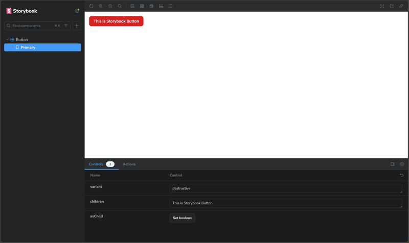
Create a story in libs/ui/src/components/Button/Button.stories.tsx.
Ensure everything is working as expected by running these commands:
# Launch Storybook for component development
npx nx storybook ui

# Start the Next.js development server
npx nx dev website
Output:
Next.js Application
Storybook
Conclusion
By following these steps, you've successfully set up an Nx workspace with a Next.js application, a reusable React component library powered by Shadcn UI and Tailwind CSS v4, and a utility library. This robust setup provides a solid foundation for building scalable and maintainable applications.
The combination of Nx's monorepo capabilities, Next.js's server-side rendering, Shadcn UI's accessible components, and Tailwind CSS v4's utility-first approach allows for rapid development and consistent styling across your projects. Remember to adapt these configurations to your specific project needs and continue exploring the powerful features these tools offer.
Happy coding!

Top comments (8)
nice guide... looking forward to more stuff in the future
There are some steps I'm not convinced about,:
button.tsxtoButton.tsx, I assume that part is personal preference rather than a requirement? (I know you also changed the folder but that's because the ShadCN CLI automatically usesuias a suffix folder for components).styles.cssfile, I get theglobals.cssimport from the library, but why thesourceto the JS/TS/JSX/TSX files? also if the library is supposed to be built, I expected alias paths here.Why pages router?
You're right that the App Router is the latest standard. I used the Pages Router here because it's still very common, and I wanted to keep the example simple and focused on the core topic: setting up a shared component library with Tailwind CSS v4. The setup steps work with both routing systems.
The React library generator has Tailwind as an option, why not use that?
That's a great observation. At the time I wrote the blog, the Nx generator's built-in Tailwind option wasn't configured to use Tailwind CSS v4. Since setting up v4 was the main point of the post, I had to configure it manually to show the specific steps needed for that version.
Is the library supposed to be built or just imported?
The library is definitely meant to be built. In an Nx monorepo, a key benefit is that libraries are built and their build cache is shared across all applications that use them. This is what speeds up your development and build times.
I don't understand the styles.css file.
Excellent question! This highlights a major change in Tailwind CSS v4. In older versions, you'd specify your source files in tailwind.config.js. With v4, you use the @source directive directly in the CSS file to tell the engine which files to scan for classes.
You're also right that the code doesn't use alias paths. This is because Tailwind CSS v4 does not currently support TypeScript path aliases, so we have to use relative paths for now. This is a known limitation that the community is hoping to see added in a future update.
Thanks for the detailed answer, here's my feedback:
styles.css, maybe it's because I have only used Tailwind v4 (with ShadCN) in single repo projects, so I don't need to configure the source files, or maybe it's looking at the whole repo in my case, but I don't need to tell it which files to scan.Yes, I’ll do my best to keep this blog updated as new features are released that may impact the topics discussed here.
You're absolutely right about the scanning process—TailwindCSS does handle scanning on its own, which is likely why it’s working as expected for you.
That said, I understand that omitting sources in this example might cause some confusion, so I’ve made an effort to be as specific and clear as possible wherever it made sense to do so. TailwindCSS - Which files are scanned
Hi, I'm trying to setup *Nx + Nextjs + shadcn * library (libs/design-system) but not able to do it, i have followed the documentation but while installing with shadcn command I'm getting error can anyone here to setup
`npx shadcn@latest add button
✔ Checking registry.
⠼ Installing dependencies.
Something went wrong. Please check the error below for more details.
If the problem persists, please open an issue on GitHub.
Command failed with exit code 1: yarn add @radix-ui/react-slot
error Running this command will add the dependency to the workspace root rather than the workspace itself, which might not be what you want - if you really meant it, make it explicit by running this command again with the -W flag (or --ignore-workspace-root-check).
yarn add v1.22.22
info Visit yarnpkg.com/en/docs/cli/add for documentation about this command.
`
github.com/Bipul-Dubey/prep_interv...
Hello, how would you go about each app having there own global.css file?
How would you go about each app having its own globals.css file?
The styles.css file inside each app can act as that app's global stylesheet.
Here's the key trade-off:
If you use a CLI tool like the Shadcn CLI to add a component, it will automatically update the default
globals.cssfile in your library. If you have created a separateglobals.cssfile yourself, the CLI won't update it, and you'll have to manually maintain it.That said, there's no real benefit to having multiple global CSS files within the shared library itself. It's best to have one main
globals.cssfor shared styles and then manage app-specific styles within each app's own stylesheet.