
One of the things that get the most bad rep in web development is form validation. It is something that seems so trivial and a part of almost every app, yet almost always, as your feature gets more complex, your validations seem to grow in mess and complexity as well.

Vest is a fairly new framework that aims to fix that bad parts in form validations by getting inspired by unit testing framework such as Mocha and Jest. It is framework agnostic, which means that you can use it with any UI framework you currently use.
In this tutorial you will learn how to use the basics of Vest to easily validate forms written in React.
What we'll be making today?
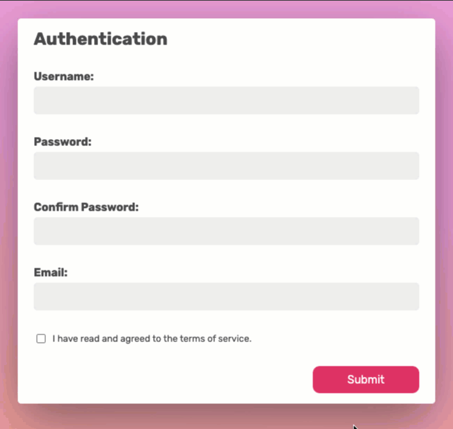
We'll start with a basic registration form, already implemented in React.
In this tutorial, although not React heavy, I am assuming you are comfortable with React, and have some familiarity with React's useState hook.
The concepts you'll be learning here though, are NOT react specific, and can be applied to any framework.
At any point during this tutorial when you feel that you want to go off-script, feel free to head to the Vest documentation site to learn about other cool features.
In this form we will add the following validations:
✅ Username required
✅ Username is too short
✅ Password is too short
✅ TOS agreement -> Validation without an error
✅ Passwords do not match -> Cross field validation
✅ Only validating the field that's being changed by the user
✅ Email is invalid
✅ Password is weak -> Warning validation
✅ Disabling the submit button if there are any errors
Take a look at our finished product:

Let's start
You can start by forking the starter sandbox. It contains a simple React form without any validations at all. All the form does at the moment is update the form state upon input change.
To make things simpler, it also contains an <Input/> component that's already designed to show our errors validation errors when we run them later on.
Begin with the basics
The main concept in Vest is that your validation sits separately from your feature. This allows you to easily refactor your feature without touching your validations.
So head over to the src/validate.js file. That's where we'll be spending most our time.
The first step is to import vest from 'vest';
Next we'll create a new vest suite with our form name and immediately export it.
import vest from 'vest';

export default vest.create(() => {

});
This export returns a function, that when we run it - it runs our validation.
Now, this function needs to somehow get our form data. We pass it over using our callback function, so let's add a data argument to our callback function.
import vest from "vest";

export default vest.create((data = {}) => {

});
This is the initial structure that's true to every Vest suite.
The anatomy of a test
As noted before, Vest is inspired by the syntax of unit-testing frameworks, so we write tests in a similar fashion.
A structure of a jest test is roughly
test('message', () => {
    expect(value).toBe(anotherValue)
});
And the structure of a Vest test is (in this example, eqauls is one of many possible assertions).
test('field_name', 'message', () => {
    enforce(value).equals(anotherValue)
})
- test - A function that runs a single validation test
- 'field_name' - The field being validated
- 'message' - The error that is presented to the user
- enforce - Vest's assertion library (docs link)
Writing your first test
Our first test is "Username is required", we will check that it is not empty using .isNotEmpty().
First, add to your import statement the named imports of enforce and test.
import vest, { test, enforce } from "vest";
and in your suite, add the following test:
  test("username", "Username is required", () => {
    enforce(data.username).isNotEmpty();
  });
validate.js is now supposed to look like this:
import vest, { test, enforce } from "vest";

export default vest.create((data = {}) => {
  test("username", "Username is required", () => {
    enforce(data.username).isNotEmpty();
  });
});
Connecting Vest to our form
Obviously, this should not work yet. We have done nothing to make our form work with Vest.
Head back to src/Form.js.
First, let's import our validation suite into our Form module:
// src/Form.js
import suite from './validate';
And now, we need to make our form "aware" of our returned validation results, with suite.get(). Whenever we we run our validations, suite.get will contain the most up-to-date validation result.
// src/Form.js
// ...
export default function Form() {
  const [formState, setFormState] = useState({});

  const result = suite.get();
  // ...
}
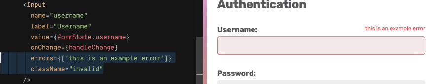
To display the errors on the username field, find it and add it the errors property: errors={result.getErrors('username')}
      <Input
        name="username"
        label="Username"
        value={formState.username}
        onChange={handleChange}
        errors={result.getErrors('username')}
      />
Vest is now connected to your form, and whenever an error is present - your form will show it. But we did not yet make our form run our validations.
Create a new function called runValidate (the name doesn't matter) in the body of your React component:
This function takes the name of the changed field,
and its value. It then runs our validation agains the full state.
  const runValidate = (name, value) => {
    const res = validate({
      ...formState,
      ...{ [name]: value }
    });
  };
Call runValidate from the handleChange handler:
  const handleChange = (name, value) => {
    setFormState({ ...formState, [name]: value });
    runValidate(name, value);
  };
Our component is supposed to begin like this:
export default function Form() {
  const [formState, setFormState] = useState({});

  const result = suite.get();

  const runValidate = (name, value) => {
    const res = validate({
      ...formState,
      ...{ [name]: value }
    });
  };

  const handleChange = (name, value) => {
    const nextFormState = { ...formState, [name]: value };
    setFormState(nextFormState);
    runValidate(name, value);
  };

// ...
Try typing something into the username field and then remove it. You're supposed to see our error message:

That was easy.
One cool thing about Vest's validation being test-driven, is that you can have multiple tests for the same field, meaning that you can easily display different errors depending on different criteria. For example, if you only want to allow usernames longer than 3 characters, simply add the following test after the first one in src/validate.js:
  test("username", "Username is too short", () => {
    enforce(data.username).longerThanOrEquals(3);
  });
Now, without any changes to our form our username field should be able to display both messages.

Adding a few more validation tests should be easy. Paste the following into your validation suite in src/validate.js. Here are some for our password and confirm_password inputs.
  test("password", "Password is required", () => {
    enforce(data.password).isNotEmpty();
  });

  test("password", "Password must be at least 6 chars long", () => {
    enforce(data.password).longerThanOrEquals(6);
  });

  test("confirm_password", "Passwords do not match", () => {
    enforce(data.confirm_password).equals(data.password);
  });
And in src/Form.js add the error property to the password and confirm_password inputs just as like we did with username:
      <Input
        name="password"
        label="Password"
        value={formState.password}
        onChange={handleChange}
        errors={result.getErrors("password")}
      />
      <Input
        name="confirm_password"
        label="Confirm Password"
        value={formState.confirm_password}
        onChange={handleChange}
        errors={result.getErrors("confirm_password")}
      />
If you've followed the last steps correctly, you should see the errors appearing for username, password and confirm password when making changes to the form.

The problem?
Because we pass the whole form data to vest, it validates all fields at once, even if the user did not interact with them yet. This is easily fixable.
Validating just the current field
Ideally, we want to only validate the field the user is currently interacting with, and the fields impacted by it. This is done with vest.only() (docs link).
To your suite's callback function add a second argument, call it currentField, it will hold the field we currently want to validate, and right below it, to your first line of your suite, add vest.only(currentField);.
export default vest.create((data = {}, currentField) => {
  vest.only(currentField);
This alone won't do anything, because we did not yet tell Vest which field is our current field, so back in src/Form.js, modify runValidate so that it passes the name of the field as the second argument to validate:
  const runValidate = (name, value) => {
    const res = validate({
      ...formState,
      ...{ [name]: value }
    }, name); // -> field name got added here
  };
If you try to insert data to your inputs now, you'll see that fields are being validated only as they are interacted with.

Cool.
What about styles? 🎨
It's cool that we can validate, but we also want to make UI decisions based on the validation result, for example, painting error fields in red.
Once again, Vest has got you covered. It has a classNames (docs)utility function that you can use to generate a class name for your field's validation results.
As a first argument it takes your validation result, and as a second argument, a key value map of a validation state and its output class.
In src/Form.js add the following import:
import classNames from 'vest/classNames';
And in the body of our Form component, add the following assignment:
  const cn = classNames(result, {
    invalid: "invalid",
    valid: "valid"
  });
What we basically did here is this:
- We passed our validation result to
classNames - We told classnames that we would like invalid fields to get the
invalidclass, and valid fields to get thevalidclass. - We stored the output in a const called
cnfor later access. Its value is a function.
The names you use are up to you, but in our tutorial we used these classes in our stylesheet file.
Now, you can go to our username, password and confirm_password inputs, and add a classNames property with a cn call with the respective field name as an argument.
      <Input
        name="username"
        label="Username"
        value={formState.username}
        onChange={handleChange}
        errors={result.getErrors("username")}
        className={cn("username")}
      />
      <Input
        name="password"
        label="Password"
        value={formState.password}
        onChange={handleChange}
        errors={result.getErrors("password")}
        className={cn("password")}
      />
      <Input
        name="confirm_password"
        label="Confirm Password"
        value={formState.confirm_password}
        onChange={handleChange}
        errors={result.getErrors("confirm_password")}
        className={cn("confirm_password")}
      />
Your inputs should now display the current validity state in color as well.

Validating Terms of Service checkbox
Now that we can display colors, it would be a good time to validate the terms of service checkbox and add a password strength warning.
In src/validate.js add:
  test('tos', () => {
    enforce(data.tos).isTruthy()
  })
And in src/Form.js add to our tos Checkbox component the appropriate className:
      <Checkbox
        name="tos"
        checked={formState.tos}
        onChange={handleChange}
        label="I have read and agreed to the terms of service."
        className={cn("tos")}
      />
Note that we did not add a failure message to our TOS field because it is already descriptive enough.

Adding a password strength warning
Password strength is a sort of a weird creature in the world of validations. It shouts at you, but it still lets you submit the form.
Vest supports non-failing validations with the vest.warn() hook (docs link). It essentially tells Vest to store this field's result in a different basket so you can later treat it differently in your app.
To start, in src/Form.js add to our classNames call a warning class:
  const cn = classNames(result, {
    warning: "warning",
    invalid: "invalid",
    valid: "valid"
  });
And to our validation suite in src/validate.js add a simple password strength test.
  test("password", "Password is weak, Maybe add a number?", () => {
    vest.warn(); // using vest.warn marks this test as warning
    enforce(data.password).matches(/[0-9]/);
  });
If you test our field now, you'll notice that it appears correctly, but without our warning message.

This is because we only added to our field the error messages for password. As we learned earlier - warnings are stored in a different "basket". We need to go back to src/Form.js and tell our password input to also take the warning messages:
      <Input
        name="password"
        label="Password"
        value={formState.password}
        onChange={handleChange}
        errors={[
          ...result.getErrors("password"),
          ...result.getWarnings("password")
        ]}
        className={cn("password")}
      />

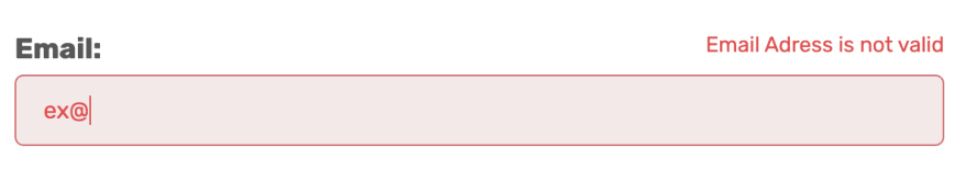
Validating email
We saved email for this late stage because it is a tricky one. Of course, you can test an email Regular expression using enforce(data.email).matches(SomeEmailRegExp), and this is fine.
Another option is to extend enforce with a custom function.
In our example, let's extend enforce with isEmail from validator.js:
import vest, { test, enforce } from "vest";
import { isEmail } from 'validator';

enforce.extend({ isEmail })
and now you can add to your suite the email test:
  test("email", "Email Address is not valid", () => {
    enforce(data.email).isEmail();
  });
And for the last time, in src/Form.js, add the error messages and classes to our email input:
      <Input
        name="email"
        label="Email"
        value={formState.email}
        onChange={handleChange}
        errors={result.getErrors("email")}
        className={cn("email")}
      />
Fixing weird confirm behaviour
One thing you may notice when the password is empty and deleting whatever was inside confirm_password, it goes green - which is technically correct, the both password and confirm_password are empty. But this is kinda of wonky.

This is fairly easy to fix, simply wrap the confirm_password test in a condition that it should not be validated unless password is present.
  if (data.password) {
    test("confirm_password", "Passwords do not match", () => {
      enforce(data.confirm_password).equals(data.password);
    });
  }
Now, whenever the password is empty, confirm_password will not be validated at all.
Handling the submit button
Our very last step is disabling the submit button on error:
Let's add a disabled prop to our Button component, with the value of result.hasErrors().
result.hasErrors() Is a function that checks if we have any errors in our suite. If we also pass it a field name as an argument, it returns a boolean only for that field.
<Button disabled={result.hasErrors()}>Submit</Button>
Wrapping up.
That's it! I hope you have enjoyed this tutorial of Vest.
You can see the even with little effort you can write pretty complex form validations that's still easy to read and maintain.
You can carry on by yourself using Vest's documentation site, contribute to the on project on github, or hit me directly on twitter

Top comments (4)
This is very interesting to use unit testing idioms…it does seem like it will make it easier to learn the surface API. I saw your pres at svelte conference too and I have vest on my queue to try with my AgnosticUI form components. Thanks for building this project and sharing!
Yeah, I had a chance to play with it over the weekend and hooked it up to my agnostic-svelte package and it worked great! I didn't use the
classNamesstuff and the validation only kicks in on touched but it's working quite nicely: See the demo.It will definitely also work very nicely in React, Vue 3, and that's good news for AgnosticUI. Great stuff Evyatar — thanks for building this!
Very intriguing!
Thanks for the comprehensive post Evyatar.
Thank you, I appreciate it.