
Welcome to the Widget of the Week series, where I take gifs or videos of awesome UI/UX components, and bring them to life with code.
Today we are going to create a password submit form, that validates the user input in real time.
The inspiration comes from this submission created by ramykhuffash and looks like this:

Preparations
For today's widget we will be using Vue.js, and for some animations we'll use TweenMax.
If you want to follow along you can fork this codepen template that already has the dependencies.
The markup
I always try to match the design as close as possible, but in this case there are some graphics that cannot be done unless I spend a couple of hours using a vector editing program to generate them, so instead of that I'll match the most important interactive and animated elements.
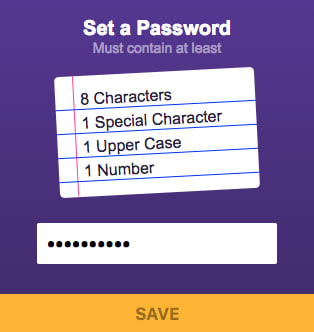
Let's start by setting an app-container class to our main div, because we will need to style it. Bellow we should have a title and subtitle that correspond to the instructions of our widget
<div id="app" class="app-container">

  <h1 class="title">Set a Password</h1>
  <p class="subtitle">Must contain at least</p>
Now for the list of rules we will make a rules-container, followed by an empty div for the pink-line that will make it look like a notebook sheet.
  <div class="rules-container">
    <div class="pink-line"></div>
Next, we will use an unordered list for our rules-list, it will contain four rules-items each with a rule-text for the label and an empty green-line that will cross the rule when fulfilled.
    <ul class="rules-list">
      <li class="rule-item">
        <div>
          <span class="rule-text">1</span>
        </div>
        <div class="green-line"></div>
      </li>

      <li class="rule-item">
        <div>
          <span class="rule-text">2</span>
        </div>
        <div class="green-line"></div>
      </li>

      <li class="rule-item">
        <div>
          <span class="rule-text">3</span>
        </div>
        <div class="green-line"></div>
      </li>

      <li class="rule-item">
        <div>
          <span class="rule-text">4</span>
        </div>
        <div class="green-line"></div>
      </li>
    </ul>
  </div> <!-- rules-container -->
Last but not least, we will make a form that will contain the password input and its submit button:
  <form>
    <input class="password-input" type="password">
    <button class="save-button" type="submit">
      <strong>SAVE</strong>
    </button>
  </form>

</div> <!-- app-container -->
We should have a really basic no-style form, like this:

Making it look nice
We have quite some work ahead, right now our widget doesn't look anything like the original post.
Let's begin with the app-container.
I'll constrain the width to be fixed to 320px and centered. Also I'll set a white color for the text and a font. Then just a gradient background color to match the reference.
.app-container {
  width: 320px;
  margin: 0 auto; /* center */
  color: white;
  font-family: Arial, Helvetica, sans-serif;
  background: linear-gradient(#553096, #40266D); /* purple gradient background */
}
The next step is to style the text titles. It is actually really simple, we just need to center them and adjust sizes, margin and padding.
.title {
  text-align: center;
  padding-top: 20px;
  font-size: 20px;
  margin-bottom: 0;
}
.subtitle {
  text-align: center;
  color: rgba(255, 255, 255, 0.5); /* semitransparent */
  font-size: 14px;
  margin: 0;
}
The rules-container will be our "sheet" of paper, so it should have a white background color, some border-radius for the rounded corners, a fixed width of 200px and also will be centered. It should also have a slight angle, transform: rotate should do the trick:
.rules-container {
  width: 200px;
  margin: 0 auto; /* center */
  margin-bottom: 30px;
  color: #2A1E49;
  background-color: white;
  border-radius: 5px;
  transform: rotate(-3deg);
}
Now for the rules, we will basically set the spacing using padding and margins. We don't want to see the default lists bullet points, so list-style-type: none takes care of that. Also a blue border-bottom should help with the notebook sheet lines.
.rules-list {
  padding: 15px 0 10px 0;
}
.rule-item {
  position: relative;
  list-style-type: none; /* remove bullets */
  width: 100%;
  margin-bottom: 5px;
  border-bottom: solid blue 1px;
}
.rule-text {
  /* set text beside the pink line */
  margin-left: 25px;
}
Now for the lines, both will have a position absolute, because they need to be positioned freely on top of the elements.
With the pink line, the height was kind of a trial and error, because it depends on the number of rules, so if you plan to add or remove rules you should change that.
The green line is different because it appears in every rule and should be ready to cross them, in this case we will start with no crossed rules, so the default width will be 0.
/* pink left line to make the list look like a notebook sheet */
.pink-line {
  position: absolute;
  border-left: solid #f84194 1px;
  height: 120px; /* depends on container height */
  left: 18px;
}
/* line that croses each rule */
.green-line {
  position: absolute;
  background-color: #32B997;
  height: 3px;
  top: 8px;
  left: 22px;
  transform: rotate(2deg);
  width: 0; /* starting width so it doesn't show */
}
To finish styling our component we need to set the styles for the password-input and the save-button. They have some pretty straightforward rules, like removing the default border and outline for those elements, calculating the center, font size, etc. The most interesting part is with the save-button, it has a transition property to be able to animate the background color, and along with that a valid class rule that should be changed when the form is validated and has no problems.
.password-input {
  width: 220px;
  outline: none;
  border: none;
  padding: 8px 10px 10px;
  border-radius: 2px;
  margin-bottom: 30px;
  margin-left: calc(50% - 120px);
  font-size: 20px;
}

.save-button {
  outline: none;
  border: none;
  width: 100%;
  padding: 10px;
  color: rgba(0, 0, 0, 0.4);
  font-size: 17px;
  background-color: #EDEDED;
  transition: background-color .3s; /* will animate the backround color when the class changes*/
}
.save-button.valid {
  background-color: #F9B800;
  cursor: pointer;
}
We should have now a nice looking widget like this:

The interaction
Now for the interesting part, let's code the widget interactions, but before getting into the Vue instance I'll create an object that will help us with the password validation rules.
In the original gif, the password needs to be 8 characters long, and have 1 special character, 1 upper case letter and 1 number. The first rule can be checked easily by just comparing the length of the password string, but the rest will need some Regular Expressions to easily detect if the password contains those characters.
const specialCharsRegex = /[!@#$%^&*()_+\-=\[\]{};':"\\|,.<>\/?]/
const upperCaseRegex = /[A-Z]/
const numberRegex = /[0-9]/

const validationRules = [
  {
    label: '8 Characters',
    validate: input => input.length>=8,
    labelWidth: 100 // this depends on the label length
  },
  {
    label: '1 Special Character',
    validate: input => specialCharsRegex.test(input),
    labelWidth: 150
  },
  {
    label: '1 Upper Case',
    validate: input => upperCaseRegex.test(input),
    labelWidth: 110
  },
  {
    label: '1 Number',
    validate: input => numberRegex.test(input),
    labelWidth: 80
  }
]
We could also have used a method that would go through each character and compare them, but RegEx have a better performance and we'll need that to compare in real time when the user writes its password.
Now that we have a list of rules with their validator, we can start binding those to Vue and use them to fill the HTML rules too:
new Vue({
  el: '#app',
  data: {
    password: ''
  },
  computed: {
    rules () {
      return validationRules.map(rule => {
        return {
          label: rule.label,
          isValid: rule.validate(this.password),
          labelWidth: rule.labelWidth
        }
      })
    }
  }
})
As you can see we are only declaring a password property that will hold the user input as they type it in. After that we create a computed rules property that basically takes the validationRules we did in the previous step and apply the validator to the password property.
To reflect those changes, we need to replace the rules-list with one that is binded to our new Vue computed properties:
    <ul class="rules-list">

      <li v-for="(rule, index) in rules" :key="index" class="rule-item">
        <div :ref="`label_${index}`">
          <span class="rule-text">{{rule.label}}</span>
        </div>
        <div class="green-line" :ref="`line_${index}`"></div>
      </li>

    </ul>
Probably you noticed that apart from cycling through the rules I also declared a couple of refs for the label and the green line, they will be of use when animating them later.
Now we just need another computed property to know if the form is valid and a stub method that will be called when the form is valid and submitted.
  // computed...
    validForm () {
      // returns false if at least one rule is invalid
      return !this.rules.some(rule => !rule.isValid)
    }
  },
  methods: {
    submitForm() {
      if(this.validForm) {
        console.info('TODO: connect to your back-end');
      }
    }
  }
And in the HTML code we can bind those to our form like this:
  <form @submit.prevent="submitForm">
    <input class="password-input" type="password" v-model="password">
    <button class="save-button" :class="{'valid': validForm}" type="submit">
      <strong>SAVE</strong>
    </button>
  </form>
Notice the @submit.prevent part, that's a shortcut to avoid having to write in your method event.preventDefault() and helps us to trigger the submitForm method without refreshing the page.
We are almost there, actually if you set a password that fulfills all those requirements you can see the SAVE button change color:
The animations
So technically the widget is fully functional but it is still missing the animations that tell you which rule is already checked when writing your password.
First we will create a method that will take any rule and animates it depending if it is valid or not. When valid, the green line should increase its width to strike through the text, and at the same time the text should have some transparency and move horizontally a little. When it is not valid it should get back to normal.
  // methods ...
    animateRule(index, isValid) {
      const rule = this.rules[index]
      const greenLine = this.$refs[`line_${index}`]
      const ruleText = this.$refs[`label_${index}`]

      const greenLineWidth = isValid ? rule.labelWidth : 0
      const textOpacity = isValid ? 0.6 : 1
      const textPositionX = isValid ? 7 : -7

      // animate green line's width to strike element
      TweenLite.to(greenLine, 0.3, {
        width: greenLineWidth
      })

      // animate text transparency
      TweenLite.to(ruleText, 0.3, {
        opacity: textOpacity
      })

      // move the text to the side a little bit and then get back
      TweenLite.to(ruleText, 0.15, {
        x: textPositionX,
        onComplete: () => { // when the animation finishes, get it back
          TweenLite.to(ruleText, 0.15, {
            x: 0
          })
        }
      })
    },
Basically what I'm doing in that method is get the animated elements by reference (remember the "refs" we declared before?), and then calculate the final state of each of them.
After that, using TweenLite, I just tween the desired property to that final state, or in the case of the text horizontal movement it goes back and forth by setting another TweenLite tween in the onComplete method.
For this to work we need to trigger the animation only for the rules that changed, but how can we "inspect" our rules to see which ones were invalid and on are valid or the other way around?
We can do that with a watcher.
A watcher is a method that you can execute each time any of your application data changes, and it receives both the old and the new value of that specific property.
Let's create a watcher that compare the rules values, if their isValid property got changed then we can call our animateRule method and animate only the rules that changed:
  watch: {
    // method that triggers when computed rules change
    rules: function (newRules, oldRules) {
      newRules.forEach((newRule, index) => {
        const oldRule = oldRules[index]
        if(newRule.isValid !== oldRule.isValid) {
          // rule changed its valid property
          this.animateRule(index, newRule.isValid)
        }
      })
    }
  },
And now the final result!
That’s it for this Widget of the Week.
If you're hungry for more you can check other WotW:
Also if you want to see a specific widget for next week, post it in the comments section.

Top comments (0)