Theming web apps is especially useful for 2 purposes: enhancing brand expression and improving user experience. In this guide, I will share some best practices on creating and applying custom themes using Kor UI to help improve your app in both of these points.
🏷️ Enhancing brand expression
For companies developing apps based on an open source design system such as Kor UI, it is important that the visual appearance of UI components expresses the brand identity through elements such as fonts or colors.
While the re-use of components and patterns reduces the learning curve for users, having a UI that is excessively uniform with those of other similar products can be a missed opportunity for brand expression.
❤️ Improving user experience
Users of web or mobile apps nowadays expect them to allow setting preferred color schemes either automatically (e.g. based on preferred browser or OS theme) or manually (e.g. through user preference settings).
It is also important to mention that theming is a powerful method of improving accessibility for users with color blindness or other types of visual impairments, or even to improve readability of text for apps being used in places with excessive or low ambient light.
🎨 Customizing colors
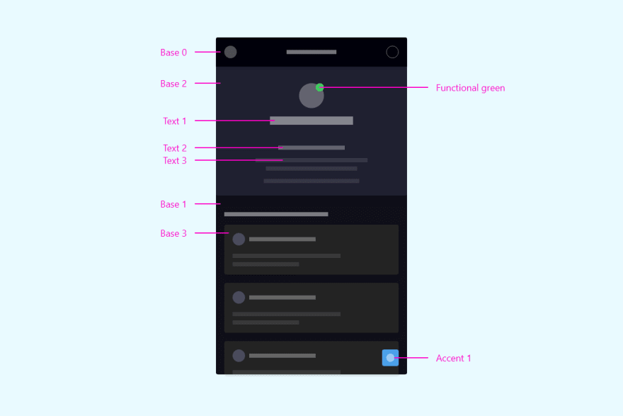
As a starting point to understand how to customize colors, let's take a look into how the default themes are defined, which variables are available: and how they are categorized:
*[theme="dark"] {
  /* neutral colors are used mostly for text, icons, and lines */
  --neutral-1: 255, 255, 255;
  --neutral-2: 0, 0, 0;
  /* accent colors are used mostly for indicating active states in components */
  --accent-1: 60, 100, 240;
  --accent-1b: 70, 110, 250;
  --accent-1c: 50, 90, 230;
  /* base colors are used in containers and follow a layering approach */
  --base-0: 0, 0, 2;
  --base-1: 15, 15, 15;
  --base-2: 25, 25, 25;
  --base-3: 35, 35, 35;
  --base-4: 45, 45, 45;
  /* functional colors are used for indicating status */
  --functional-blue: 20, 120, 220;
  --functional-red: 220, 40, 40;
  --functional-yellow: 220, 160, 40;
  --functional-green: 40, 160, 40;
  /* text colors are used to define the font/icon colors and define hierarchy through opacity */
  --text-1: rgba(var(--neutral-1), .90);
  --text-2: rgba(var(--neutral-1), .60);
  --text-3: rgba(var(--neutral-1), .20);
  /* shadow colors are used for the layering of cards, app bar and other containers */
  --shadow-1: 0 2px 8px rgba(0,0,0,.2), 0 1px 4px rgba(0,0,0,.15);
}
Here are some tips when customizing each of the 6 existing color categories:
-
Neutral colors should take into consideration the lightness of the theme. If a theme is mostly dark (e.g. dark blue), set
--neutral-1to be white (or another light color) and--neutral-2to be black (or another dark color). - Accent colors should convey a call-to-action and therefore have sufficient contrast with the background (base) colors. It is not good practice using colors that could clash with the functional ones (red, green, blue) as this could lead to user error or confusion.
-
Base colors are used as the background of containers and by default follow a layered approach, meaning that the deepest layers (
--base-1) are darker than the ones closer to the surface (--base-4). If your app does not intend to use layering, you can just set all base colors to be the same. - Functional colors should convey meaning to the user (e.g. an error has happened) and therefore it is not recommended to change them drastically. Always look for accessibility or safety standards when updating them to avoid for example that users will ignore error messages.
-
Text colors should also go from strongest (
--text-1, headline text) to lightest (--text-3, disabled text). -
Shadow color is defined following the
box-shadowdefinition (offset-x | offset-y | blur-radius | color). If you would like to use outlines instead of shadows, you can define it as0 0 1px rgba(0, 0, 0, .4), for example.
Modifying vs. creating a theme
Kor UI comes with two pre-defined themes ready to be used: light and dark. When creating a new theme you should decide whether you would like to modify these defaults or create another one from scratch.
If you go for the first approach, you have the option of only modifying a few variables while keeping the others as-is, and if you go for the second you would need to define all of them:
/* here, only the accent colors are modified on the default dark theme */
*[theme="dark"] {
  --accent-1: 100, 100, 240;
  --accent-1b: 110, 110, 250;
  --accent-1c: 90, 90, 230;
}

/* while here all the variables have to be defined and a new name has to be given */
*[theme="high-contrast"] {
  /* ... */
}
After a new theme has been created, you can use it just like the default ones:
<html theme="high-contrast"> ... </html>
🗛 Customizing fonts
The definition of fonts in Kor UI is done on a document level, and two font families can be declared: one for headings (display) and another one for body text.
/*
@font-face {
  font-family: 'my-body-font';
  src: url('./assets/fonts/body-font.woff2') format('woff2');
}

@font-face {
  font-family: 'my-display-font';
  src: url('./assets/fonts/display-font.woff2') format('woff2');
}

html, body {
  --body-1: normal 14px/24px 'my-body-font';
  --body-2: normal 12px/16px 'my-body-font';
  --header-1: bold 16px/24px 'my-display-font';
  --header-2: bold 14px/24px 'my-display-font';
  font-family: 'my-body-font', sans-serif;
}
The steps to modify the default fonts are:
-
Import font-face if you are not using a standard browser or system font. The files should be provided as an asset of you application and imported through css using the
@font-facerule. -
Update the variables to match you newly imported font. The variable is defined following the css
fontdefinition (font-weight | font-size/line-height | font-family). If you want body and header fonts to be the same, just use the same font family for all four variables. -
Assign the default
htmlfont-family to be your newly defined body font.
Conclusion
In this guide we have covered the basics of customizing themes in Kor UI. Further customization is available by applying css to the components themselves (e.g. modifying the border radius of buttons) to make it fit even more your brand identity.
In a following post I will share some tips and best practices on applying themes based on user preference, browser presets, persistent theming and so on. I hope you enjoyed my first post and until next time!

Oldest comments (0)