
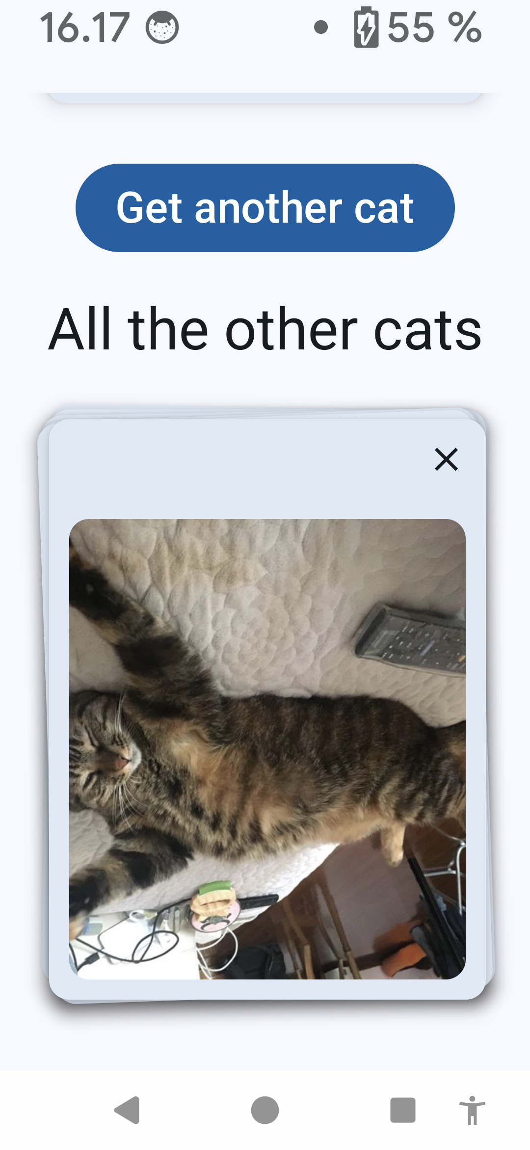
A couple of weeks ago, I published a blog post Stacked Cards Layout With Compose - And Cats. The layout has some accessibility issues, and I aim to fix some of them in this blog post. There are a couple of issues I'm not fixing here because of the scope of this blog post; instead, I'm discussing the problems they're causing and possible solutions.
This time, I will also be pointing out some things that are good about the layout. I feel like I'm often just talking about problems and trying to find them, but this time, I'll share something that's working well, too.
Before we dive into the different aspects I chose for this blog post, here is a fair warning: This list is not extensive and doesn't contain all possible accessibility problems that this kind of layout might have. I didn't test with every possible assistive technology or setting. My goal was progress over perfection, and I believe that the modifications I'll list are already significant improvements to the accessibility of this layout.
Switch Access
The first assistive technology I'm going to talk about and improve the app for is Switch Access. It's a service that lets the user navigate their phone with one or more switches. If you want to learn more, the Android Accessibility Checklist I've created has a section about Switch Access: Test with Switch Access.
When testing with Switch Access, there was one problem I could find: When removing a card from the stack, the focus didn't go anywhere. It just disappeared. The reason for that is that the component on which the focus was had been deleted, and the accessibility service lost the focus.
One way to fix this issue is by moving the click event to the stack-component instead of the card itself. We can do this by adding a semantics-modifier with an onClick-lambda to the CardStack's modifier-property. Let's also move the lastItem outside the CardStack so that we can use it in the function we add:
// MainScreen.kt

val lastItem = catIds.value.last()

CardStack(
    Modifier.semantics {
        onClick {
            deleteCat(lastItem)
            true
        }
    },
) { ... }
TheonClick function returns a boolean value because, under the hood, it's an AccessibilityAction. Accessibility actions return a boolean indicating whether the action was successfully handled.
This solution is not perfect - but it's progress. This way, the focus stays in place, and the user doesn't need to navigate back to the stack to be able to delete the next card.
Voice Access
One thing that could be improved for Voice Access usage is enhancing the content labels for the delete buttons. Even if we disable the buttons under the topmost card, there are two delete buttons: the topmost card and the single card at the top of the screen.
Why is this a problem? When a Voice Access user says "Tap Delete," there are two options for deleting. How Voice Access works is that when there is more than one available action with the same label, it displays numbers for each action, and then the user can select from them. So, in this case, to delete the card from the stack, the user would need to say something like "Tap Delete. Two."
That all works and doesn't sound like much of a problem, but if you're navigating with your voice all day, any way to save using it would be preferable. To be honest, I'm not sure if there is a good way to solve this issue for this particular case and if it's a priority to solve it (compared to some more obvious cases), but this is good to keep in mind.
Screen Reader
There are a couple of problems for screen reader users. The most clear one is that this application displays images, and no content descriptions are available for any of the pictures. As the app uses images from an API, the responsibility of writing the content descriptions would fall under the API developers, and the app should just be able to use the descriptions.
Of course, if we wanted to improve the experience, we could think about some AI solutions to write text alternatives for the images. This solution could be an improvement, especially if the text is more descriptive than "Can be an image of an animal," as Facebook did (does? I'm not on FB anymore) automated captions. However, there are always risks, too - there is no human control over the generated texts, and they could end up being anything. That's why I'm advocating for the responsibility of the ones providing the images to write the text alternatives for them.
Another issue for screen reader users is related to the same thing as with Voice Access users: Delete buttons and their labels. Right now, especially without the content descriptions, screen reader users just have two delete buttons, with no context on what the heck they delete. To be honest, this UI right now (without the content descriptions) really sucks for anyone who can't see and relies on a screen reader for navigation.
Another problem I discovered was the same as for Switch Access: The focus disappeared after pressing the Delete button. Luckily, the same code also fixes the issue for a screen reader user, so we can mark that issue resolved.
The last improvement for screen reader users we're going to do is that we'll add semantic information for headings to help with navigation. We'll do this by adding a semantics modifier to the Title-component:
// MainScreen.kt

@Composable
fun Title(text: String) {
    Text(
        modifier = Modifier.semantics { heading() },
        text = text,
        style = MaterialTheme.typography.titleLarge,
    )
}
This way, the title is annotated as a heading.
Keyboard
The following accessibility consideration relates to keyboard navigation. When testing the app with a keyboard, I found two issues: First, all of the cards' delete buttons in the stack were focusable, and when a card was deleted, the focus was lost.
A note before continuing: If you're wondering why I'm mentioning the focus issue again, the reason is that focus works differently for keyboards and accessibility services like screen readers and switch devices. That's why the problem needs to be handled twice.
Focus Only on Visible Buttons
First, we should make only the topmost card's delete button focusable and remove the focusability from the others in the stack. We will need a couple of things for this: First, the card should know if it's the topmost card, and we should set the focusProperties based on that.
Let's pass the last id on stack to CatCard, check if the current card is the last one, and set the focusability based on that:
// CatCard.kt

@Composable
fun CatCard(
    ...
    lastIdOnStack: String,
    ...
) {
    val isLastOnStackPerIds =
        remember(id, lastIdOnStack) {
            id == lastIdOnStack
        }

ElevatedCard(...) {
    IconButton(
        modifier =
            Modifier
                .focusProperties {
                    canFocus = isLastOnStackPerIds
                },
    ...
    ) { ... }
This way, we remove the focusability of the delete buttons under the topmost card, as they're not focusable if the id is not the same as the last card.
Recovering Focus After Delete
The second thing we'll need to do is fix the disappearing focus after deleting a card. The solution sounds straightforward: We'll need to make the previous card's delete button focusable and move the focus to it. In code, this requires a bit more work.
We'll need a function to handle the deletion of the card. We'll need to wait a bit after calling the ViewModel's delete function to allow the second item in the stack to be focusable. After that, we'll need to use FocusManager to move focus to the previous item. In code, this would look like this:
// MainScreen.kt

val scope = rememberCoroutineScope()
val focusManager = LocalFocusManager.current

fun deleteCat(id: String) {
    scope.launch {
        viewModel.deleteCat(id)
        delay(1000)
        focusManager.moveFocus(FocusDirection.Previous)
    }
}
We'll need to switch to using this function instead of calling the viewModel's function we did before:
// MainScreen.kt

CardStack {
    ...
    AnimatedCatCard(...) {
        deleteCat(id = id)
    }
}
After these changes, the focus goes to the previous item after card deletion.
Cognitive Considerations
While the app is simple, it does have some cognitive accessibility considerations. One thing that I noticed is that the delete button only has an icon — not any text accompanying it. Not everyone recognizes or remembers that the X-icon means deleting (or closing) something. They might feel confused when seeing that and not know what to do with it or how to remove an item from the card stack.
We could improve this by introducing accessibility settings for the app and adding a toggle to show the labels with icons. I've written a blog post about how to do that: Toggle Labels With Icons - Personalizing Accessibility.
Screen Orientation
I also tested the app with landscape mode, an important accessibility feature. As I did not lock the orientation to portrait mode, and as the data is stored in data store instead of state within a composable, everything works well, as you can see in the video:
If you want to learn more about supporting both landscape and portrait modes for your app, I've written a blog post: Don't Lock the Screen Orientation! Handling Orientation in Compose.
Larger Font And Increased Display Sizes
As the app doesn't have much text, increasing the font size works rather well, and the text scales. Also, the layout is flexible in size, so it works with increased display sizes. Here's a screenshot from when the font size is on the biggest one and the display size is on the largest selection:
Wrapping Up
In this blog post, we've looked into ways to improve accessibility of a stacked cards layout. We've discussed Switch Access, keyboard, Voice Access, and screen reader accessibility, as well as screen orientation, larger font sizes and increased display sizes, and cognitive considerations.
This commit contains all the changes mentioned in this blog post. It also contains some other minor changes, as the app has a bit more than just the stacked cards, so I had to modify other aspects to work with these changes as well.
Did you learn something from this blog post? Have you improved the accessibility of custom layouts in some ways? Please share!

Top comments (1)
I’ve had a fantastic experience with lucky star since I started playing here. The site offers a huge selection of games, including some of my favorite slots and live casino games. What sets it apart is how smoothly everything runs no lag, no issues, just pure gaming enjoyment. The bonuses are also a big draw, offering real value and enhancing the overall experience. If you’re on the hunt for a new online casino, Lucky Star is definitely worth a visit.