
When writing tests for your app, you should also consider testing for accessibility-related things. And I get it; it can be challenging to know where to start. So, I decided to write this blog post about how to test some accessibility aspects.
In this post, we will add some accessibility-related tests for three custom components constructed with the help of clickable, selectable, and toggleable modifiers. These components were built in a blog post I wrote: Improving Android Accessibility with Modifiers in Jetpack Compose.
What Are We Testing?
The tests we're writing verify that the components have names, roles, and values. But where does this group come from? The background is that Web Content Accessibility Guidelines (WCAG) has a success criterion, "Name, Role, Value", which ensures that every element has a programmatically determinable name and role. Also, states, properties, and values that users can change are programmatically changeable.
And now, if you wonder why I'm mentioning something named "Web," the WCAG is also used to determine the minimum level of accessibility for mobile apps as well, despite the name.
Name, in this case, means the accessible name—so, the textual representation of the element. It can be, for example, a button's text, an icon button's content description, a label for a switch, or similar. It's what anyone using a screen reader hears. Voice access users use it to activate interactive elements.
Role, on the other hand, is the role of the element. It can be, for example, a button - which tells the user that, hey, this is a button, and it should behave as a button. A role is a promise of how things should work, so if you add a role, be sure to add the correct interactions as well. However, roles are used less on Android than on the web.
Value can refer to an element's state, property, or value. The exact thing is different per element. For example, with a checkbox, the value tells if it is checked, or with an accordion, it's the state that tells if it's opened or closed.
In the next section, we'll examine concrete examples of how to test the "Name, Role, Value" success criterion for a couple of custom components mentioned in the intro.
Writing the Tests, an Example
As mentioned in the beginning, these tests are written for components for a blog post I've written previously. We'll look into how to test three components: A switch, a radio button group, and a clickable row.
As the components in the blog posts were simplified for the sake of an example, these tests are also streamlined. With production-grade code, you usually have a bit more sophisticated strategies for, for example, finding the components that are being tested.
Toggleable
The first component we're testing is a switch like in the picture:
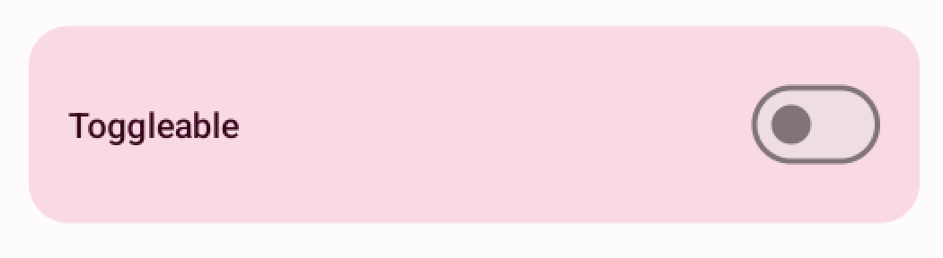
We want to test three things: First, we want to ensure the component has an accessible name (so, the label of the switch). Second, the role should be correct—it should be a toggleable component. Third, the value should be correct before and after toggling the switch, so whether the switch is on or off.
Let's write a test:
class ToggleableTest {
    @get:Rule
    val composeTestRule = createComposeRule()

    @Test
    fun hasRoleNameValue() {
        composeTestRule.setContent {
            ModifiersExampleTheme {
                ToggleableScreen()
            }
        }

        val toggleableElement =
            composeTestRule.onNode(hasTestTag("accessible-toggle"))

        // Assert accessible name
        toggleableElement.assertTextEquals("Toggleable")
        // Assert role
        toggleableElement.assertIsToggleable()
        // Assert value
        toggleableElement.assertIsOff()
        toggleableElement.performClick()
        toggleableElement.assertIsOn()
    }
}
First, the test needs a setup, so we need things like the composeTestRule and setting the content. Then we get the testable component with a test tag accessible-toggle. Finally, we have the tests for name, role, and value.
The test for checking the name is straightforward: We want to ensure that the element's text content equals the word on the label. We can assert that with assertTextEquals. To test the role, we can use a useful assert function, assertIsToggleable. Finally, to check if the value (so, the checked state) is correct, we can also use the utility functions assertIsOff and assertIsOn and, for toggling the state, performClick.
Selectable
The next component we're testing is a radio button group, as seen in the picture:
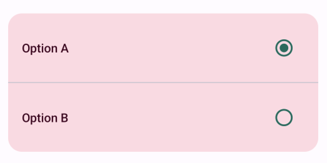
For this component, we ensure that both of the options have a name (so, the labels "Option A" and "Option B"), role as selectable, and value if the item is selected.
The test for this component is:
class SelectableTest {
    @get:Rule
    val composeTestRule = createComposeRule()

    @Before
    fun setup() {
        composeTestRule.setContent {
            ModifiersExampleTheme {
                SelectableScreen()
            }
        }
    }

    @Test
    fun hasRoleNameValue() {
        val selectableElements =
            composeTestRule.onAllNodes(hasTestTag("accessible-selectable"))

        // Assert accessible name
        selectableElements[0].assertTextEquals("Option A")
        selectableElements[1].assertTextEquals("Option B")
        // Assert role
        selectableElements.assertAll(isSelectable())
        // Assert value
        selectableElements[0].assertIsSelected()
        selectableElements[1].performClick()
        selectableElements[0].assertIsNotSelected()
        selectableElements[1].assertIsSelected()
    }
}
The structure is very similar to the previous test; first, the setup, then getting the elements, and then asserting name, role, and value. We're using the same assertTextEquals to check the elements' labels (so, names). Similarly to the toggleable, there are functions for asserting the role and values for the selectable: isSelectable(), assertIsSelected(), and .assertIsNotSelected().
Clickable
The final custom component for this blog post is a custom button that can be used to bookmark an item:

We want to ensure that it has a name (so, the text "Bookmark this item"), the role of a button, and a state that communicates whether the item is bookmarked or not.
The following tests ensure that:
class ClickableTest {
    @get:Rule
    val composeTestRule = createComposeRule()

    @Test
    fun hasRoleNameValue() {
        composeTestRule.setContent {
            ModifiersExampleTheme {
                ClickableScreen()
            }
        }

        val clickableElement =
            composeTestRule.onNode(hasTestTag("clickable"))

        // Assert accessible name
        clickableElement.assertTextEquals("Bookmark this item")

        // Assert role
        clickableElement.assert(
            SemanticsMatcher("has correct role") {
                it.config.getOrNull(SemanticsProperties.Role) == Role.Button
            },
        )

        // Assert state description
        clickableElement.assertStateDescription("Not bookmarked")
        clickableElement.performClick()
        clickableElement.assertStateDescription("Bookmarked")
    }

    private fun SemanticsNodeInteraction.assertStateDescription(
        stateDescription: String
    ) =
        assert(
            SemanticsMatcher("has correct state description") {
                it.config.getOrNull(SemanticsProperties.StateDescription) == stateDescription
            },
        )
}
Again, the setup and checking of the name are similar to the other two components. But to check if the component has a role of the button, we need to use a SemanticsMatcher.
SemanticsMatcher is a wrapper for matching semantic nodes. We want to ensure that the element's semantic property Role matches Role.Button. We can do it by wrapping our check with a SemanticMatcher, and getting the element's SemanticProperties.Role from the element with it.config.getOrNull(SemanticsProperties.Role) and checking its value.
The same pattern works for testing the element's state description. To avoid code duplication, I've created an extension function, assertStateDescription, which is used to check the state description of the element.
Wrapping Up
In this blog post, we've discussed writing accessibility tests for the WCAG success criteria 4.1.2: Name, Role, Value. While they're not always relevant to mobile accessibility, this blog post aims to give an example of how to write accessibility tests.
Have you written tests for accessibility on Android? Please, share what you've learned!

Top comments (2)
Absolutely love this!!! thank you for this!
Thank you so much!