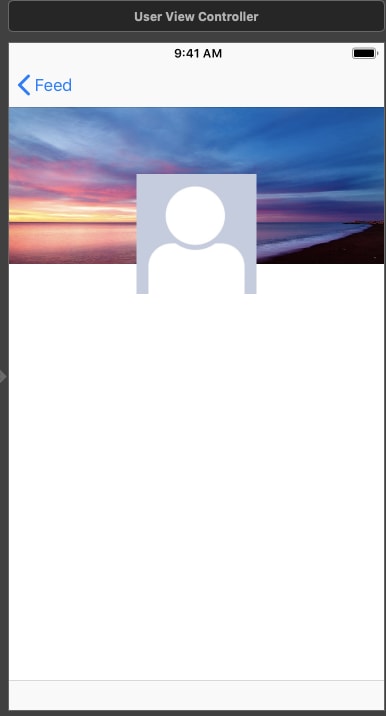
A really common thing to do in iOS interfaces is make interface elements either circular or into a squircle (squircular?). This is a common thing to do when displaying user avatars, for example.
If you’re building your interface in a storyboard, though, you’ll find one big problem when you add the code to make your view circular: Your storyboard doesn’t look like your app.
Ugly. This just won’t do.
Luckily, there is a really simple way to make your storyboard controls match your app controls.
First step, we’ll start with the code that implements the circular view in the app itself. Setting the cornerRadius in layoutSubviews() is important because the frame of the view will change as a result of the layout process, and the corner radius size needs to be half of the frame size to make it circular.
class CircleView: UIView {

    // ...

    override func layoutSubviews() {
        super.layoutSubviews()
        if (frame.width != frame.height) {
            NSLog("Ended up with a non-square frame -- so it may not be a circle");
        }
        layer.cornerRadius = frame.width / 2
        layer.masksToBounds = true
    }

    // ...
Second, when you add your view to your storyboard or XIB, set an Aspect Ratio constraint to make it 1:1 by setting the frame size with equal width and height, and then adding the constraint. This will enforce the square frame (as long as Auto Layout doesn’t break that constraint for some other reason).
Now, to tackle the square view problem:
You need one more bit: add @IBDesignable to your UIView declaration:
@IBDesignable class CircleView: UIView {
And voilà:
While we talked about this specifically for making your circular view should up correctly in Interface Builder, this works anytime you create fully custom views, or Interface Builder’s visualization of a view doesn’t reflect everything you have implemented in code.
It works because @IBDesignable is telling Interface Builder is that it should call into the compiled version of your view to do the drawing and layout. With that simple annotation, Interface Builder used the custom layoutSubviews(), which applied the appropriate circular layer mask, which Interface Builder than displayed.
Use it to make your storyboards look that much closer to your real app’s interface.
Did you like this tip? The next tip on adding manual app badges to your app is already waiting for you.
Or sign up to get every tip straight to your inbox, plus newsletter-only tips and deeper dives on website articles and discounts on future product launches.
This post originally published at Apps Dissected.


Top comments (0)